Neri&Hu's atmospheric Valextra store is based upon the layout of a library
Located in a shopping centre in Chengdu, China, this store Neri&Hu designed for Italian accessories brand Valextra, features hovering walls and a conical light funnel modelled on the Pantheon in Rome.
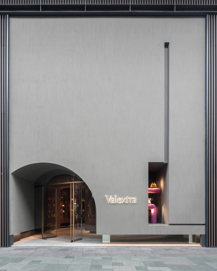
To create the store the existing shopfront, which was designed to match its neighbours in the shopping centre, was demolished and replaced with an imposing solid wall of dark concrete that spans two stories.
A strip of glass runs around the bottom of the black wall, making it appear as if it is hovering above the ground.
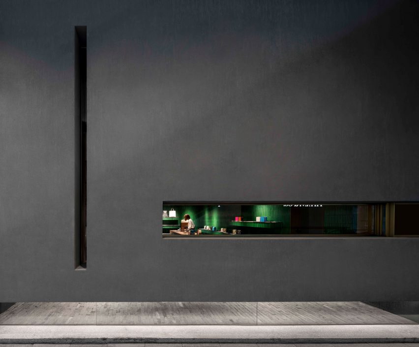
Narrow vertical and horizontal windows are carved into the thick wall to provide glimpses of the store within, while a deep set arched entrance with a curved glass door detailed in brass and curved green tile is positioned off centre.
Inside, the 160-square-metre store is divided into two connected spaces: the library and the reading room.
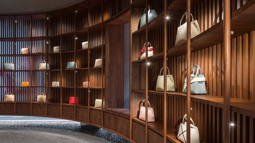
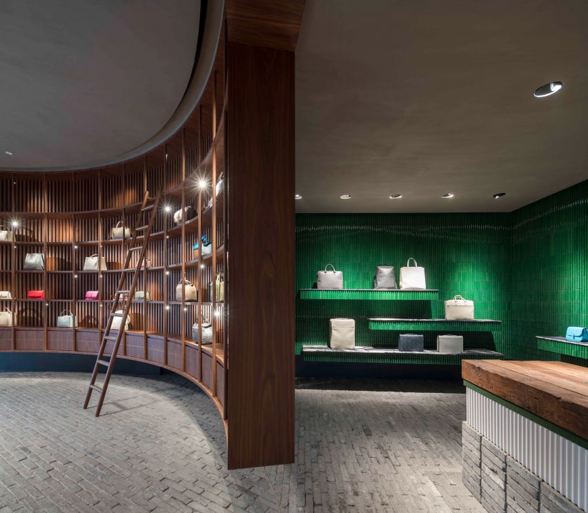
Upon entering the store, the customer is welcomed into a circular library space lined with a grid of walnut shelving. The shelving, which displays the Italian accessories brand's spotlit merchandise, is backed by walnut baton screens that are suspended from the ceiling.
Like a library, ladders are used to access the merchandise placed on the upper shelves.
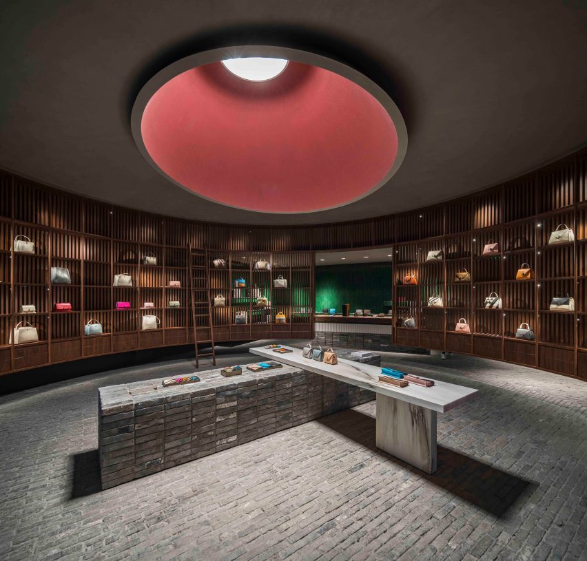
Reclaimed grey bricks are laid on the floor, sliced and twisted in a circular motion, reflecting the deep conical light funnel in the ceiling above – a design element that Neri&Hu said was used to recall the oculus of the Pantheon in Rome.
Lit like a museum, the space uses both artificial spotlighting and natural light, which penetrates the space from the deep façade windows. At the centre of the library the grey brick rises from the floor plane to meet a slab of solid white marble that forms a display table.
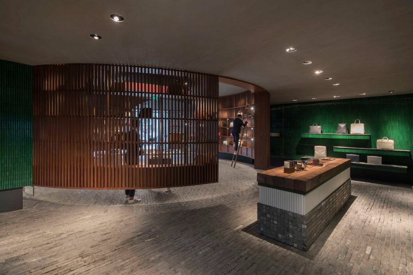
Through the library screen, customers enter the rectilinear reading room, which is clad in vertically placed rectangular bright green tiles. The tiles' curved glazed surface create a reflective undulating effect that the designers said adds "texture and depth".
Here, Valextra's most exclusive products are presented on a monolithic table made up of layers of reclaimed grey brick, white porcelain tile, green fabric and solid reclaimed wood.
The Italian brand is well versed in working with renowned design studios and artists on its store interiors and displays.
Last year during Milan design week, to mark its 80th anniversary, Valextra unveiled a pop-up store filled with clouds of folded fabric created by New York studio Snarkitecture.
Photography is by Pedro Pegenaute.
Project credits:
Architecture and interior design: Neri&Hu Design and Research Office
Design team: Lyndon Neri & Rossana Hu (founding partners, principal in charge), Federico Saralvo (senior associate), Jacqueline G. Min (associate), Alfie Huang, Callum Holgate, Nicolas Fardet (associate, product design)