"This should be definitely rebuilt, regardless of the cost"
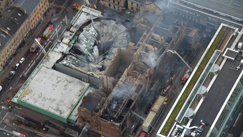
In this week's comments update, readers rallied against the suggestion that the Glasgow School of Art should not be rebuilt following a major fire.
Rebirth: Emotions were running high as Dezeen readers flocked to the comments section to support the Charles Rennie Mackintosh-designed Glasgow School of Art being rebuilt to it's original design, after it burned down yet again last week.
"Very sad. A masterpiece is gone," wrote a distraught MrDelvoye.
"It can and should be restored. Building something 'new' will inevitably fail to be as good," underlined Chris defiantly.
Sorperdida joined the chorus demanding that the building be rebuilt: "This should definitely be rebuilt to its original design, regardless of the cost."
Going against the current, Archi suggested it was time for a new architect to take the mantle: "I would love to see Holl do a complete redesign to meet the school's current and future needs, or have someone like Zumthor work with the existing stones."
But Ay ay ay wasn't having any of it: "Oh please, Holl? Have you seen the Reid building? As for Zumthor, well, the repair bill for rebuilding the Mack would still come in cheaper."
"The spatial and material quality of Mackintosh's work is preserved in drawings, surveys and models. It can, and should be rebuilt. We must resist the urge for architectural hubris and do the right thing," cautioned Humdrum.
This reader's thoughts were occupied elsewhere.
Should the Glasgow School of Art be rebuilt as before? Join the discussion ›

Silly money: Belarusian designer Andrey Avgust reimagined American banknotes as vertical designs made up of translucent flexible plastic, which delighted some readers, but others found a few oversights.
"These are really nice as a proposal for a revamping of the US bills. I hope someone from the treasury department is a Dezeen reader!" exclaimed Arc*.
"Beautiful, forward thinking. One thing, time to retire 'In God we trust'," added Freddy H.
"In Satoshi Nakamoto we trust," joked Fastship, making reference to the alleged name of the creator of Bitcoin.
Tony felt the banknotes could suffer from mistaken identity: "Artistically interesting, but they look more like collectable cards than money."
"Better than what we currently have, but they look a bit too gloomy," added Adam, who was hoping for a more vibrant look to the currency.
A guest commentor suggested Avgust had to even up another aspect of the designs before they could become reality.
Read the comments on this story ›

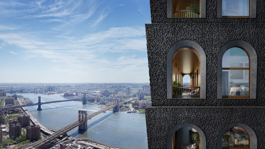
Droning on: Commenters responded to British architect David Adjaye's planned 130 William skyscraper in Manhattan this week, as he praised the suitability of the projects textured concrete exterior for drone footage to the media.
"Curious to see this finally get built. There is a reason why you normally neither have balconies nor massive concrete panels on buildings this high," wrote a whimsical Davide.
"The amount of edits this has gone through may not inspire confidence, but this is the best model yet," added Rthko uncertainly.
Karol B was not a fan of Adjaye's outlined direction for the tower: "Designing buildings for photography is aberration on the profession."
"I love this building," countered a positive Pink Tiger.
This reader felt there was a massive oversight to the design of the facade.
Read the comments on this story ›

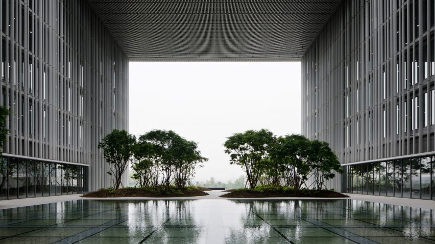
Up the garden path: Readers were split over the David Chipperfield Architects-designed headquarters for Korean beauty giant Amorepacific in Seoul, which features voids that serve as platforms that the firm describe as "hanging gardens".
"Architecturally competent, but God is it grim and depressing to look at," wrote an underwhelmed Jon.
Clichy felt the project didn't match the city: "As a one time resident of Seoul, I find this lumpen cube awful."
But Dik Coates was mesmerised by the locale: "A lovely tranquil setting. I almost want to set up my tent. Extremely well done."
"This is an incredible building. Has the detailing you'd expect from Chipperfield and the form from REX. I love the repetition of the facade fins and those elevated courtyards are surreal," wrote Archi, who was also full of praise for the design.
This reader was seriously impressed by the architects.
Read the comments on this story ›