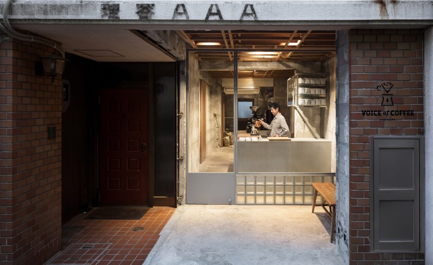
Located in a former barber shop, the stripped back Voice of Coffee in Kobe, Japan, features exposed wooden beams and unfinished breeze block walls.
Designed by Tokyo-based firm Yusuke Seki, Voice of Coffee is located next to a bustling district in the city of Kobe.
The interior of the coffee shop has been kept intentionally raw with rough concrete walls, an exposed original timber frame ceiling support and simple panes of glass.
"Almost all of the structural elements were left as they were found during the demolition process," explained Yusuke Seki.
Original features that the architects elected to retain include a wooden screen that they found behind some plasterboard during the renovation.
Installed below the ceiling, the screen is the original timber frame that held up the suspended ceiling in the shop's previous life.
The workers also uncovered the original breeze block walls, which had been hidden behind a covering, and even the three letters above the entrance, AAA, are a vestige of the unit's former use.
"Paradoxically, this subtractive approach has an accumulative effect: every detail came to light, every inscription left behind by a worker a generation ago, serves to make history visible, adds to the sense of time passing," said the architects.
To continue the store's emphasis on the passing of time, the architects applied a subtle rectangle of silver leaf to the wall near the back of the store. Over time, as the silver oxidizes, the rectangle will morph from silver into a warm gold.
To showcase the store's intentionally unfinished interior, the facade, which used to extend to the street, has been set back and opened up as a glass front.
This intervention creates an Engawa, which is a traditional Japanese threshold space between the street and the shop interior, where guests can sit and enjoy their drinks while protected under a roof.
"While the setback reduces the actual amount of space inside the store, the addition of another spatial layer between interior and street ends up making the store feel deeper, and thus more spacious, than before," said the architects.
The architects incorporated a number of unusual elements into the coffee shop's design that they said will "throw visitors momentarily, giving them pause and a chance to take a closer look".
These details include the use of glass bricks on the lower half of the front of the shop.
"Whereas glass bricks are usually kept in place by a general metal frame," explained the architects, "these elements are held together by the binding concrete alone – an unprecedented construction in Japan."
In addition, the shop's front door handle is made of two panes of glass, glued using a special adhesive on both sides of the glass door to create a completely transparent doorway.
Inside, the architects installed a glass and steel cupboard with a gull-wing mechanism developed especially for the store.
Other architects that embrace intentionally unfinished interiors include Japanese architect Jo Nagasaka, who stripped away the walls of an inherited house in Tokyo, revealing an arrangement of timber columns.
Meanwhile architecture firm Woods Bagot used "New York City grit" as an aesthetic reference for the interiors of its Downtown Manhattan offices.
Photography is by Takumi Ota.

