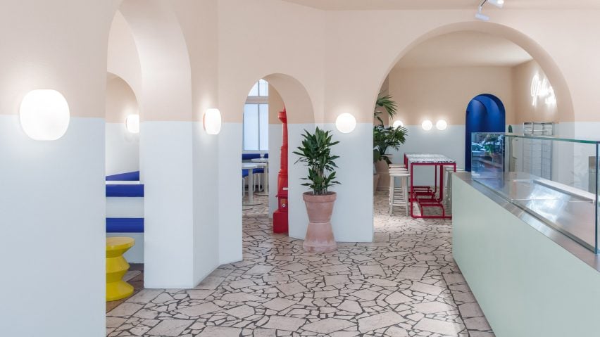
The forms and colours of a David Hockney painting are referenced in this Berlin poke restaurant, designed by Ester Bruzkus Architekten to feel "as relaxed as a day at a California pool".
LA Poke, which serves Hawaiian-style Poke Bowls, is based on Hockney's 1967 painting A Bigger Splash, which depicts a splash in the swimming pool beside the British artist's modernist Malibu beach house.
"It embodies the chill mood of the West Coast for me," explained Bruzkus, who is also based in Berlin.
Fresh pastel shades of pink and blue are infused with vibrant splashes of bright yellow, blue and red. To represent Hockney's pool, these are accompanied by tubular furniture, reflective stainless-steel surfaces and patio-style flooring.
A "horizon line" at eye level bisects the walls of spaces at the front of the restaurant.
Below the "horizon line, the wall is painted in the Le Corbusier colour Outremer Gris, meaning ultramarine grey. This light bluish-grey colour is intended to create a soft room atmosphere.
Above the horizon line, and extending onto the ceiling, the architects chose the colour Terre Sienne Pâle, or pale earth, described by Le Corbusier as "sandy, subtle and restrained." The aim was to give the impression of the summer sun shining on a clay wall.
The two sections of colour are connected by round outdoor glass lights.
Ester Bruzkus Architekten also designed the lightweight furniture that fills the space, to further emphasise a relaxed, pool-side atmosphere.
These include banquette seating upholstered in Yves Klein's famous blue, with soft and round forms that the studio says are reminiscent of an air mattress.
Thin, wire filigree chairs are paired with solid round tables, while bulky Corian counters are topped with thin worktops made of stainless steel.
In the central room, a large black-and-white terrazzo tabletop contrasts with the thin, bright red frame that supports it.
"I enjoy working with unexpected moments of surprise," said Bruzkus. "This brings excitement to the interior."
The walkway to the washrooms, including the walls, ceiling and floors, is painted in the same deep blue as the upholstery.
Archways define this route, but there are also numerous other archways dotted through the space, set at different heights, widths and depths. Although some of these arches existed before the renovation, the design team added in more to make the space more playful.
The alignment of some arches creates the illusion that they are large mirrors rather than curved openings.
Additional decorative elements are kept to minimum, but include a neon sign covering one wall, and large cacti and plants in terracotta pots.
Ester Bruzkus founded her studio in 2002. Other projects the team has completed in Berlin include the Generator Berlin Mitte hostel, completed in 2013.
Photography is by Jens Bösenberg.

