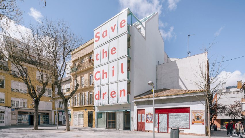
Madrid-based Elii used unusual materials, plants and bright colours to give the interiors of this headquarters and childcare facility in Madrid a sense of personality to encourage users to interact with it affectionately.
The studio, headed by Uriel Fogué Herreros, Eva Gil Lopesino and Carlos Palacios Rodriguez, was selected from an invited competition to oversee the transformation of a 1950s building into a headquarters for the Save The Children Foundation.
The project involved altering the existing structure to make it capable of supporting several extensions required to provide the space needed the foundation's operations.
The rear of the building in the city's San Diego neighbourhood was partially demolished to allow for the addition of a circulation and service core. A double-height extension, flanked by front and rear terraces, was also added to the roof.
A new facade comprising a system of eaves, canopies and planters is suspended from the top floor to provide thermal insulation and shade from the intense Spanish sunshine.
Retractable vertical blinds can be pulled down to prevent the sun from entering different rooms. These are printed with letters that spell out the foundation's name and give it a distinctive presence when viewed from the adjacent square.
Some of the building's key features are a direct response to regulations relating to its use by children, as well as to studies suggesting that caring for pets or plants helps to promote qualities including self-confidence, responsibility and affection for others.
"The building is equipped with certain elements to allow interaction and appropriation of the spaces by the users as well as an emotional attachment to the new headquarters," said the architects.
"Some of these approaches are transferred to the architectural support, with a series of spatial, material, chromatic, furniture and design actuations."
The building's interior features flexible classrooms with movable wall panels including giant blackboards that can be easily reconfigured to suit the needs of their users.
Portable furniture including wheeled shelving units in the library also allows the children to interact with the interior architecture and make the spaces their own.
Pot plants positioned throughout the building introduce natural touches, as well as providing something for the children to care for on a daily basis.
Materials are carefully chosen to promote a connection between the centre and its surroundings, with the paved surface of the square extending into the waiting area. The mirrored ceiling of this space also reflects the views of the outdoors and makes it feel larger.
An office for staff and a room for family support at the front of the ground floor are enclosed in translucent polycarbonate so the activities taking place within are partially visible from outside.
Colourful finishes are used throughout the building to give different spaces their own personality. The staircase combines coral pink with cyan hardware, while a mezzanine and projection room on the uppermost storey feature sunshine-yellow floors.
In response to the children's wishes to be able to see the stars from the rooms a large skylight was incorporated into the roof of the screening room, which opens onto a roof terrace overlooking the skyline.
Other architectural spaces that were designed to trigger a particular response from children include classroom furniture designed to help children concentrate and a playground that challenges kids to climb and jump.

