TAO converts huge Beijing warehouse into moody office and exhibition space
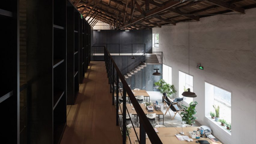
Towering steel bookcases divided up this warehouse building in Beijing, which Trace Architecture Office converted into an office for a local magazine publisher.
The office designed by Trace Architecture Office (TAO) for Lens Magazine is located in a warehouse previously operated by the Beijing Municipal Commission of Transportation.
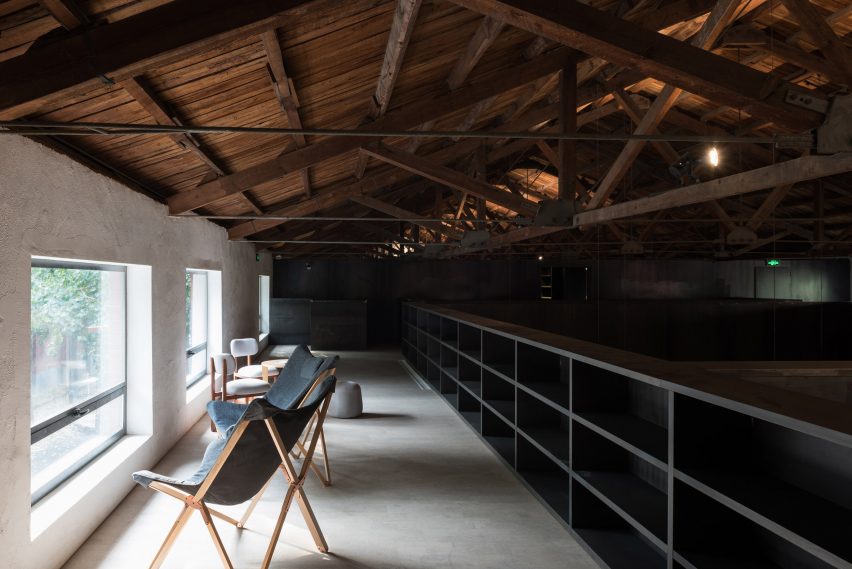
The building was constructed in 1958 and has a typical industrial aesthetic, with a large pitched roof supported by rows of timber trusses and iron tie rods.
The architects sought to retain the overall spatial quality of the building whilst creating distinctive zones that are scaled to suit their specific purposes.
"As a restoration project [the design] mainly interprets the strength of time by reconciling the old and new," said TAO. "The design strategy intends to present the trace of time through spatial sequence and materials."
A corridor lined with monumental bookshelves extends along the centre of the building, creating a division between the open office on one side and smaller spaces including meeting rooms and utility areas on the other.
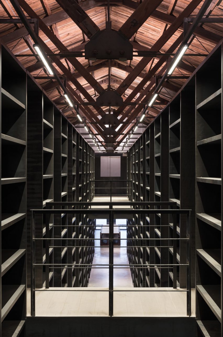
The towering walls of shelving are constructed from dark steel that complements the warehouse's industrial character.
The shelves are also intended to draw the eye up towards the roof structure and provide ample space for the reading material that is central to the magazine's cultural identity.
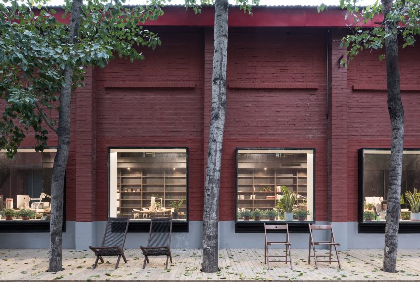
The main office is accommodated on the south side of the central partition. This double-height space receives plenty of natural light from windows facing the street outside.
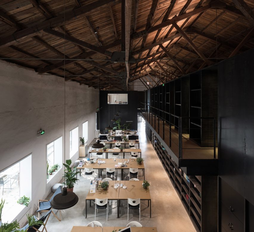
The original windows were too high and were consequently filled in, with the new lower windows positioned at a more appropriate level for looking out and bringing daylight in.
The building's northern elevation is punctuated by simple bay windows that frame specific views and illuminate the more intimate spaces on this side of the building.
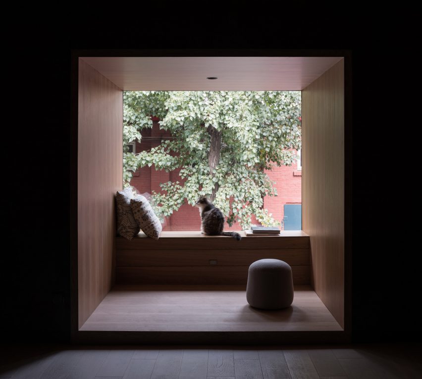
Lower ceilings add to the more domestic feel of these areas, which include the glass-walled meeting rooms and a lounge overlooking the exhibition space.
The central corridor extends from a reception and dining area at one end of the building toward the exhibition hall at the other.
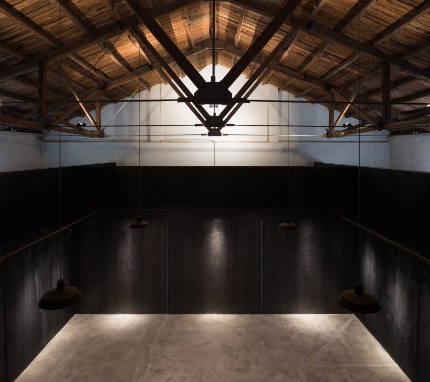
The hall is enclosed by pivoting steel panels that function both as partition walls and display boards for artworks.
Open panels provides a fluid connection between the hall and the rest of the building, while closing them transforms the space into a private room that frames a view of the roof structure.
Former industrial buildings around the world continue to be repurposed. In Los Angeles Studio Unltd converted a light filled warehouse into a restaurant, while in Singapore Asylum and Zarch Collaboratives transformed a spice warehouse into boutique hotel.