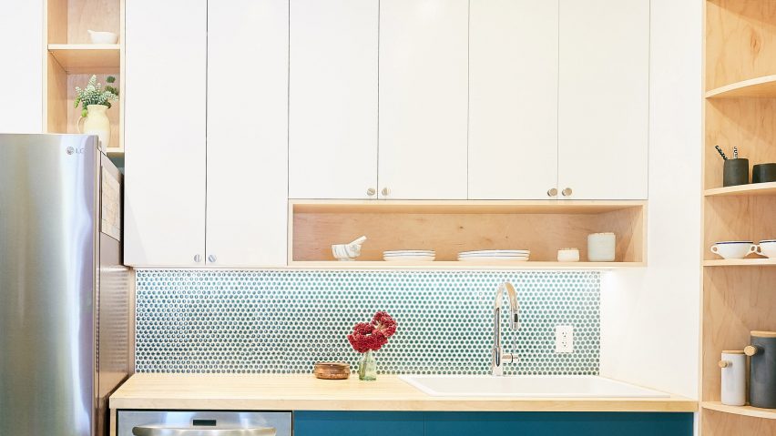
Interior design studio Handwerk has retrofitted the kitchen in a New York apartment with features including a pegboard wall for hanging mugs, aprons and other items, to make the most of the small space.
Handwerk Art and Design redesigned the gallery-style Fifth Avenue Kitchen for a couple that makes documentary films, after first seeing how they used the space.
The studio reconfigured the existing kitchen by removing part of a wall, which allowed them to alter the layout of doors to adjacent rooms, and helped improve the flow into and around the cooking space.
"Starting with a study of their cooking habits and spatial needs, we designed a set of custom cabinets for the whole kitchen that placed everything specifically and precisely," said the studio, led by Gregory Bugel and Fiona Sanipelli.
"The owners came to us with some uncertainties," they continued. "They wanted a kitchen that was finely tuned to their space and way of living, and were suspicious of off-the-shelf cabinets, and how well they might perform in a small New York City kitchen".
Located in a pre-war apartment building in Harlem, the kitchen measures 160 square feet (15 square metres), so hooks and nooks were incorporated to make the most of viable storage areas.
The new layout comprises an oven and an eat-in counter on one side, with a refrigerator and sink opposite.
"Working iteratively, we hit on a design that allowed the clients to use their kitchen in a much more efficient and performative way than before the redesign," Handwerk said.
A focal point of the space is a lightwood pegboard wall at one end. Holes cut into the wood accommodate pegs that can be used for hooking and storing items on, without the need for shelves.
Open storage areas include cubbies above the sink and fridge for kitchen tools and spices, and a tall bookshelf in one corner.
White doors conceal the upper cabinets, while vibrant blue is used for the cupboards below. In between, the backsplash features small, round turquoise tiles.
The juxtaposition of colours and materials, balanced against other white surfaces and light-toned floor, makes the kitchen appear roomy yet cosy.
"The clients wanted something that brightened the home and acted as a focal point, so we went through an extensive colour study before deciding on the palette of green, blue, grey, and natural wood," said the studio.
New York City apartments where the kitchen also formed a key part of renovation work include a pied-à-terre and a long narrow home – both in Chelsea – and a rowhouse in Queens.
Photography is by Perry E Hall.

