Starling bank launches vertically orientated debit card
Digital-only bank Starling has launched a debit card with a vertical design to align with the way people usually make payments.
Starling Bank's art director, Mark Day, created the vertical design to reflect the way people use their debit cards today – inserting them into ATMs and card machines in a portrait orientation, or tapping them to make contactless payments.
The bank card follows several currencies that have been redesigned vertically, with Canada's latest $10 banknote reorientated 90 degrees and Andrey Avgust designing a conceptual series of vertical US-bank notes.

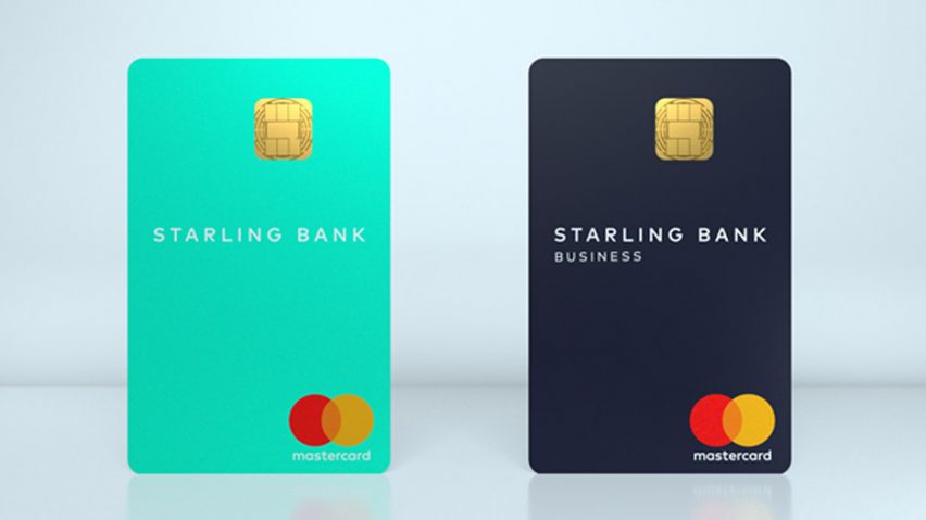
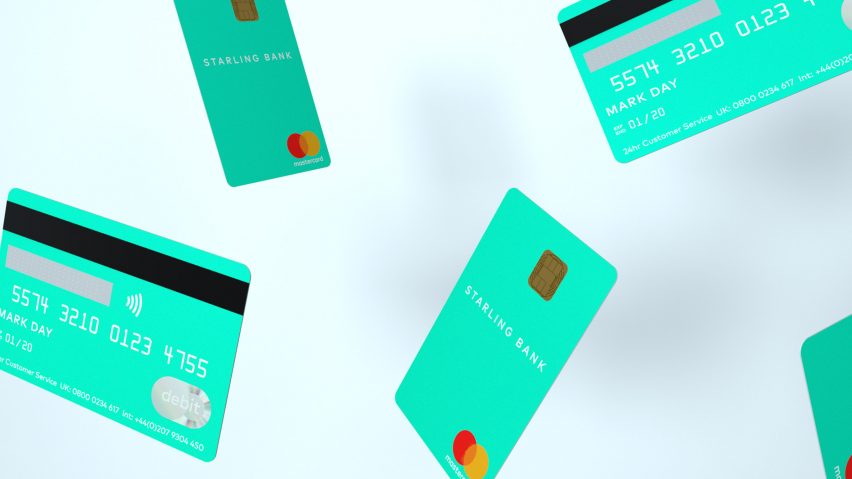
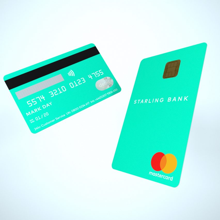
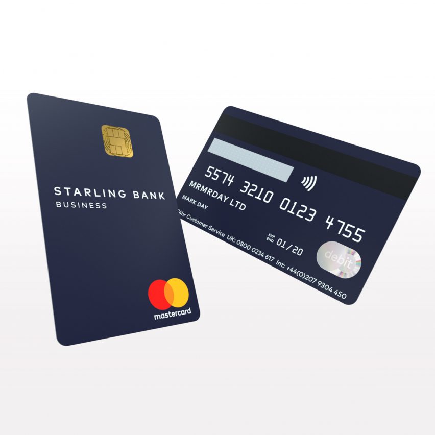
On Starling's card all of the "clutter" of the customer's details, including name, card number and expiry date, is placed onto the back of the card, leaving the front minimal with just the bank's name, chip and MasterCard logo.
According to the mobile-only bank, this discreet design improves security by making it harder to copy personal information.
"Great design is about more than just making things look good," said Day. "It's about finding a better way of doing things, being responsive to cultural and technological shifts and adapting the outdated to meet emerging needs."
"Our lives are largely lived in portrait now, even down to how we use our phones. A bank card in portrait reflects how we actually use our cards today; it's intuitive, instinctive, and in short: it's just common sense," he added.
Distributed to customers last week, the cards have been billed as the first of their kind for a UK bank.

The new orientation has been applied to two debit cards, one for regular personal accounts and one for business accounts.
A vibrant shade of teal was chosen for the personal account card, inspired by the blue-green tones of the feathers of the starling bird.
The company believe this hue grants the card an "understated" and "cool" feel. It was also chosen to reflect the bank's digital history, as the colour was one of the 16 original "web colours" formulated in 1987 to display web pages.
In contrast, the business account card is coloured in dark navy. Both have a pearlised finish to produce a smooth, premium feel.

"At Starling we are committed to disrupting the market by challenging old ways of doing things and reorienting banking so it works for our customers. Our new card design does exactly that," said Starling CEO Anne Boden.
Founded in 2014, UK-based Fintech business Starling offers a mobile-only current account on Android and iOS for personal and business customers.
The minimal card includes the MasterCard logo, which was given its first design in 20 years by Pentagram in 2016.