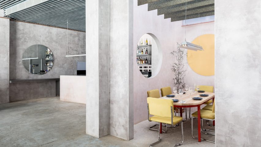
Pastel furnishings contrast against concrete walls in Seville's Casaplata restaurant
Spanish studio Lucas y Hernández-Gil looked to the subdued paintings of artist Giorgio Morandi when creating the greyscale interiors of this restaurant in Seville.
Casaplata is located in the city centre, and belongs to a pair of young restaurateurs who had wanted to open a new food and cocktails spot in Seville.
After sourcing a site, which had formerly been a coffee shop, they tasked Madrid-based studio Lucas y Hernández-Gil with the overhaul of its dated, 90s-era interiors.
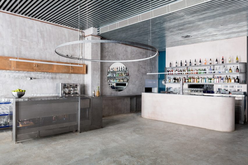
To begin the studio completely stripped the space, only keeping the existing floors intact and coating the rest of the walls in concrete.
They then erected a partition wall that is punctuated by a large porthole. It looks through to a separate dining area, which is centred by a long timber dining table and butter-yellow chairs.
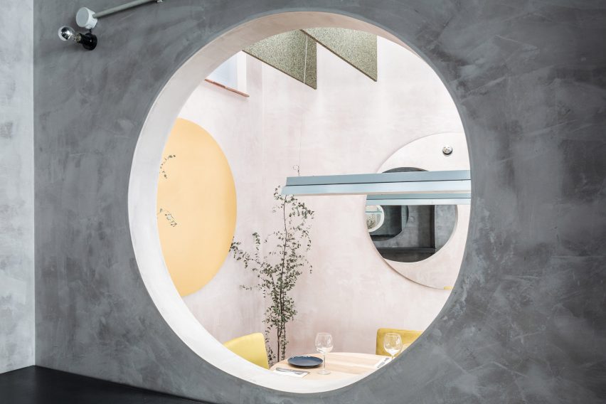
The room's walls have been coated in pink-hued gypsum – a soft mineral often used to make blackboard chalk or plaster – they also used this material in the revamp of a cafe in Spain's capital.
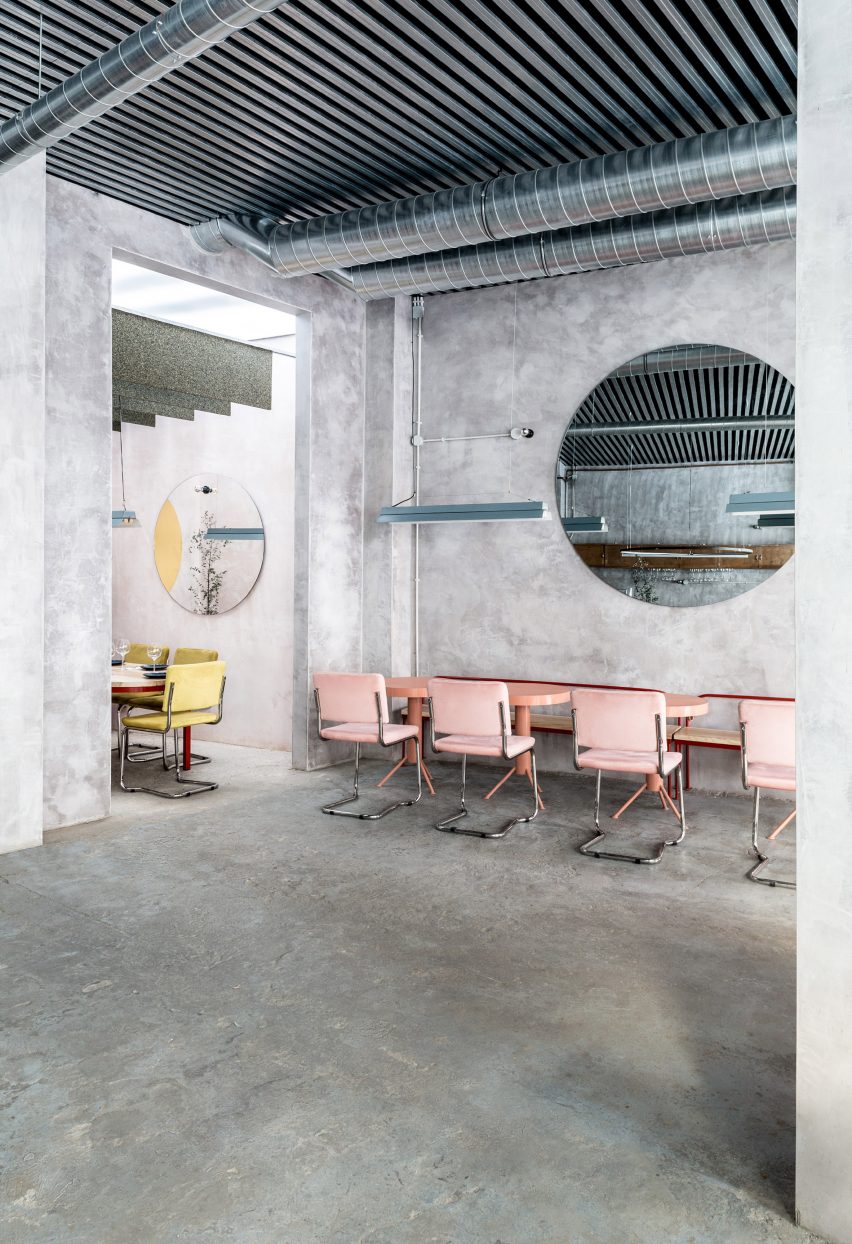
Pops of colour go on to appear in the restaurant's main room, where there are a selection of red or salmon-coloured seats arranged beside perforated, sea green tables.
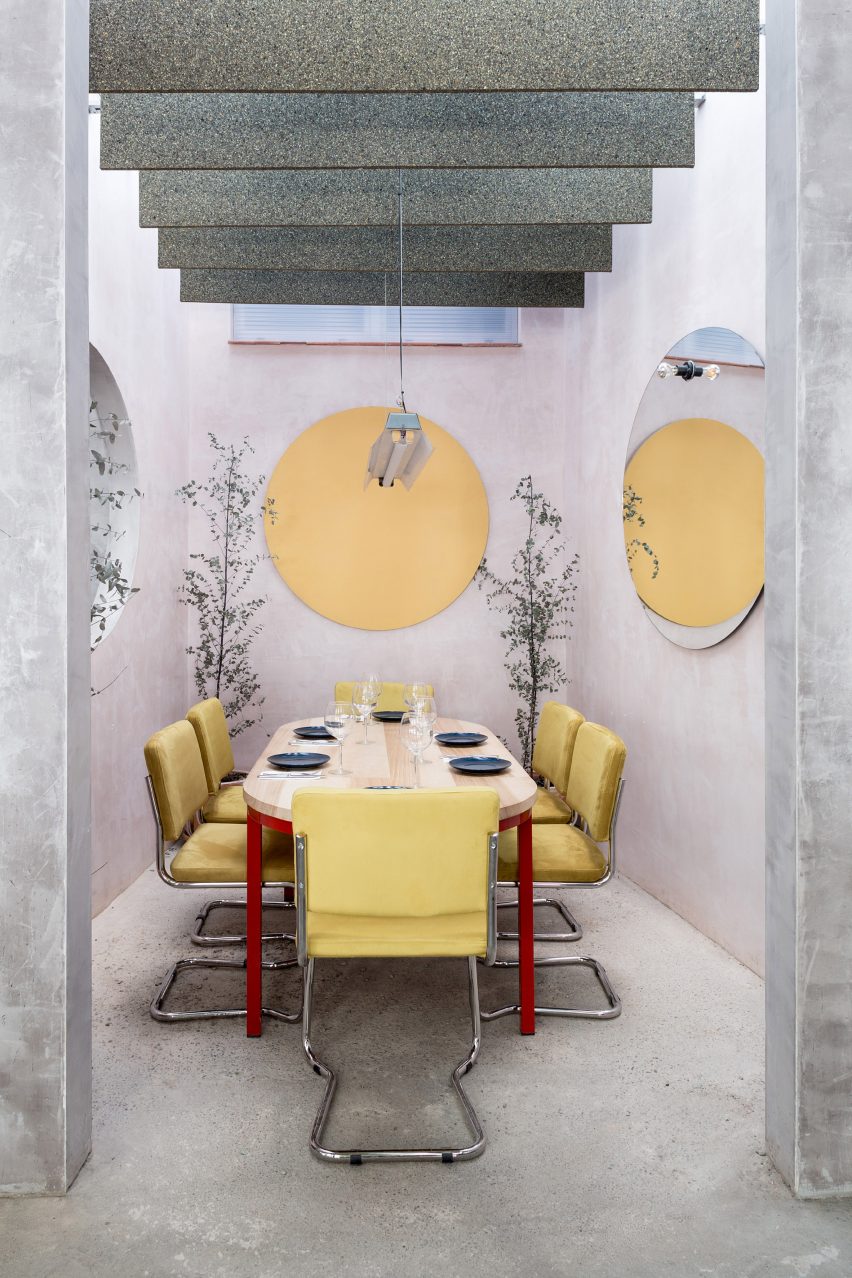
The studio were inspired to pair bold furnishings with the restaurant's grey-toned surfaces after closely studying the works of 20th-century Italian artist Giorgio Morandi, who's still life paintings typically feature bright household objects set against muted backgrounds.
The architects also hoped that the restrained palette would improve customer's culinary experience by "blurring the lines of the environment to focus on what is within reach".
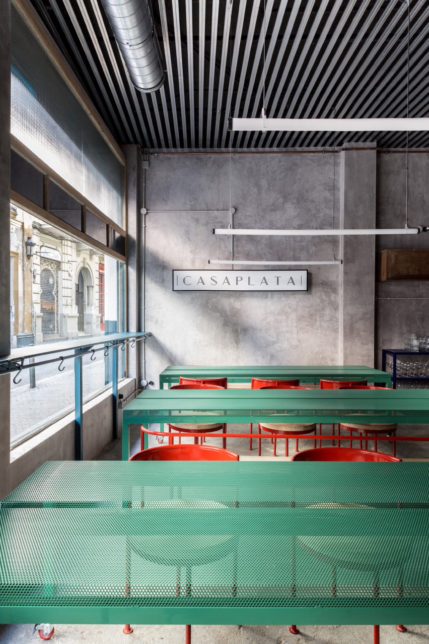
Circular mirrors and oversized ring lights have also been dotted throughout the space to echo the shape of the porthole, while metal piping has been left exposed on the ceiling.
Last year, New York-based studio Grzywinski + Pons introduced vibrant ochre feature walls and bench seats to the concrete shell of a restaurant in London's Whitechapel. Canadian practice Appareil Architecture also paired dark blue upholstery with the bare concrete columns and floors of an eatery in Montreal.
Photography is by Juan Delgado.