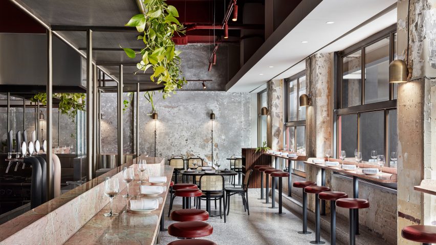
Australian studio Biasol paired worn concrete walls with pink marble and rich red accents for the interiors of this Italian restaurant in Melbourne, which takes visual cues from Ancient Rome.
Pentolina is set inside a 100-year-old building on Little Collins street, surrounded by a host of other eateries and shops.
Its owner had been a barista at a nearby Italian espresso bar, Pellegrini's, for 19 years, when he decided to follow in the steps of his father and open a pasta restaurant. He charged local studio Biasol with the task of designing it.
"He wanted to bring out the nostalgia of traditional Roman pasta bars in a contemporary way fitting to Melbourne's thriving hospitality culture," Jean-Pierre Biasol, principal of the studio, told Dezeen.
The studio immediately decided to leave the patchy concrete walls of the building largely untouched in an attempt to "suggest the stone facades of historic Roman laneways".
A round-edged counter has then been crafted to run almost the entire width of the restaurant, fronted by grooved Tasmanian oak and topped by rose-hued marble that's meant to resemble the pink granite often seen in old Roman architecture.
"The counter unifies the key functions of the restaurant – bar, cook line, pasta making and dining – and in true Italian fashion brings guests together to engage with each other and the staff," the practice explained in a statement.
Overhead lies metal shelving lined with greenery designed to counter the lofty ceilings and create a greater sense of intimacy amongst diners.
While the floors have been completed in grey terrazzo, burgundy leather has been used for the seats of the bar stools. This colour has also been applied to some of the ceiling's pipework and light fixtures. Metallic accents are provided by brass wall lamps with bell-shaped pendants.
The studio were also tasked with forming the brand identity for Pentolina, whose name they decided should be a loose, handwritten style to match the organic forms of handmade pasta.
Biasol are among several studios and designers to celebrate unfinished surfaces in projects – Charlène Bourgeois made a crumbling masonry wall the focal point of a Japanese restaurant in Quebec City, and Yusuke Seki created a stripped-back coffee shop in Kobe which featured exposed wooden beams and rough breeze block partitions.
Photography is by Jack Lovel.
Project credits:
Interior designer: Biasol
Builder: RCON Shopfitters
Engineer: Vert Engineering / DPC Engineering
Lighting: Sphera Lighting / Anaesthetic

