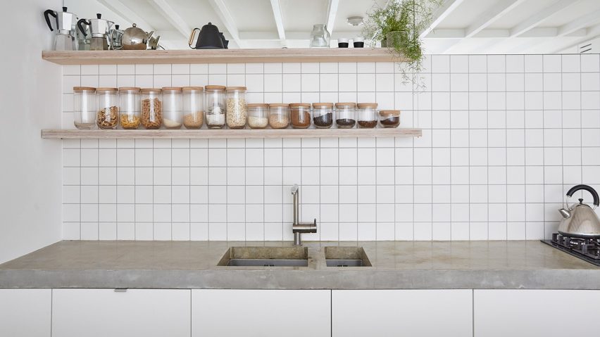
Hutch Design reconfigures Hackney mews to create space-saving family home
Architecture office Hutch Design has renovated and extended a mews house in north London, incorporating folding walls, mirrors and hidden storage to make the most of the compact space.
The studio, founded by Craig Hutchinson in 2017, updated the two-bedroom house situated off Broadway Market in Hackney for a professional couple with two young children.
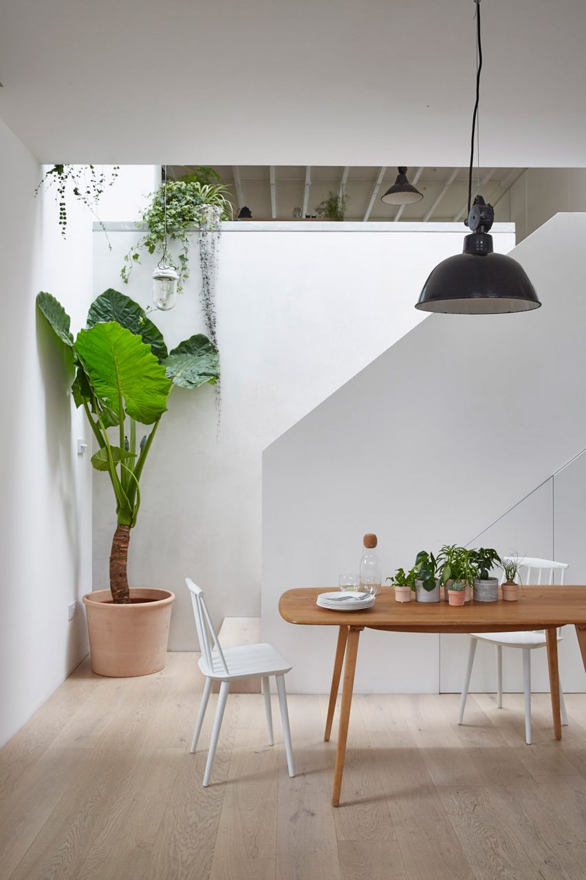
As the original brick building is enclosed at the side and rear by other buildings, and had low ceilings in the kitchen and living room, the house suffered for a lack of natural light.
Hutch Design added a side extension and re-oriented the staircase to create the sort of bright and airy spaces that would suit the client's lifestyle, while also appealing to tenants should they wish to rent it out in the future.
"To turn a small property, into a larger, more usable home for a young family, we had to be inventive in the use of space," the studio explained.
"We did this by adding a small side extension, reconfiguring the staircase and opening up the kitchen to the living area by demolishing a load-bearing wall."
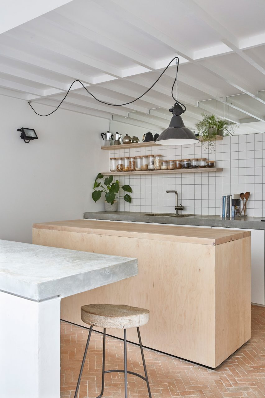
One of the key alterations Hutch Design implemented to improve the sense of volume within the property was lowering the ground floor to increase the overall ceiling height.
The reconfigured interior is now arranged over a series of three split levels. The connected spaces create a sense of continuity rather than separation, which is accentuated by the consistent use of materials throughout the interior.
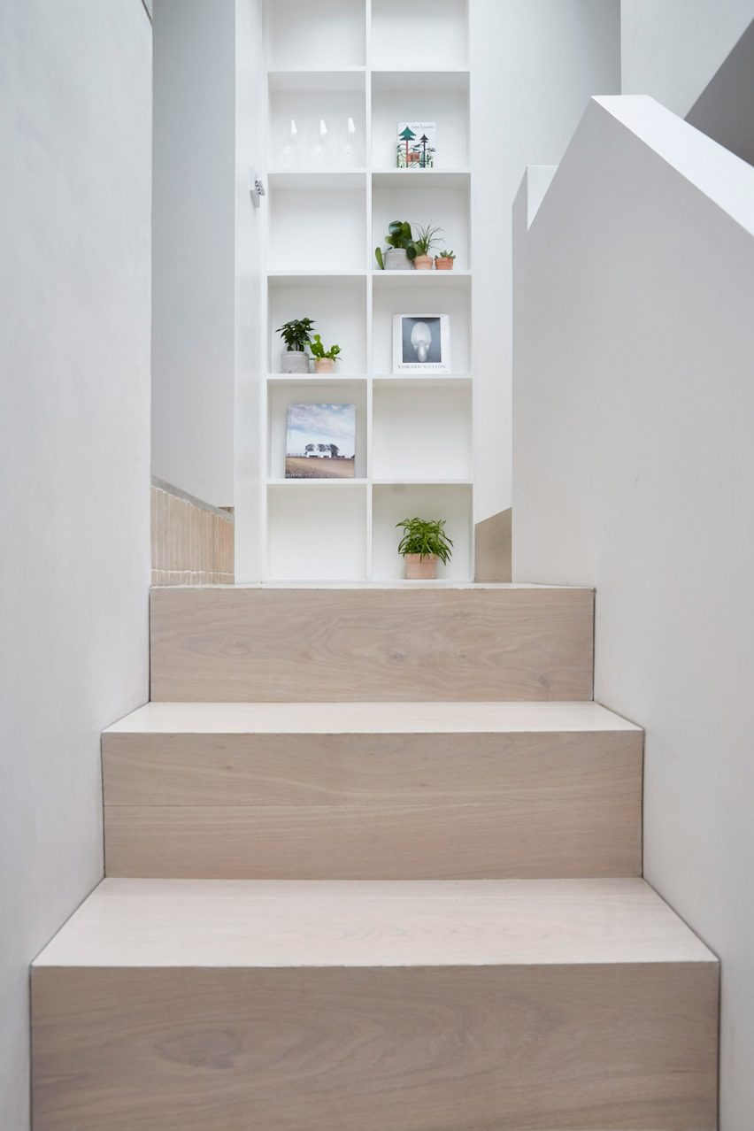
To address the need for better natural illumination, the studio increased the size of window openings at the front and side of the building and inserted new timber-framed windows.
A full-width roof light above the repositioned staircase also allows daylight to reach the centre of the house and the kitchen at the rear, while the clever use of mirrors enhances the spacious feel.
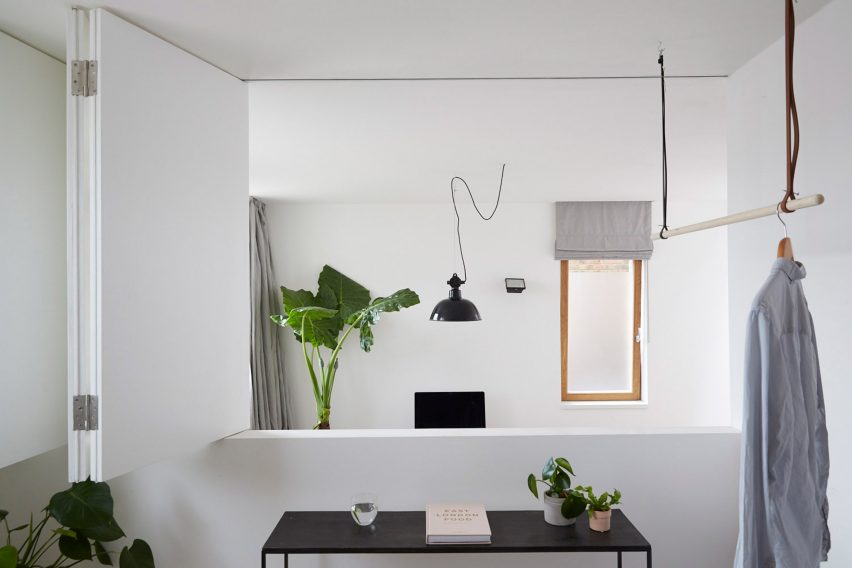
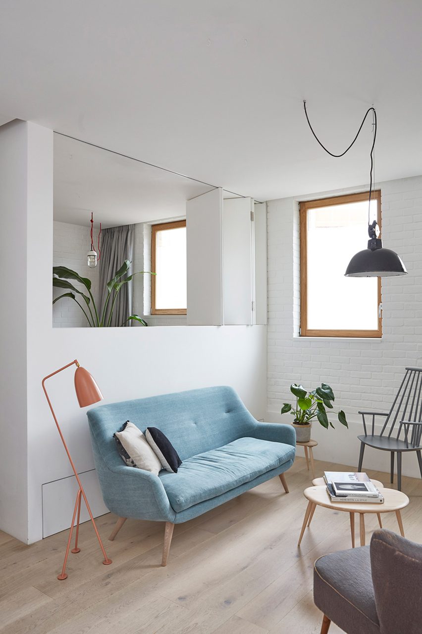
"A high-level mirror in the kitchen reflects the newly exposed ceiling joists, giving the illusion of continuous space beyond," the architects added.
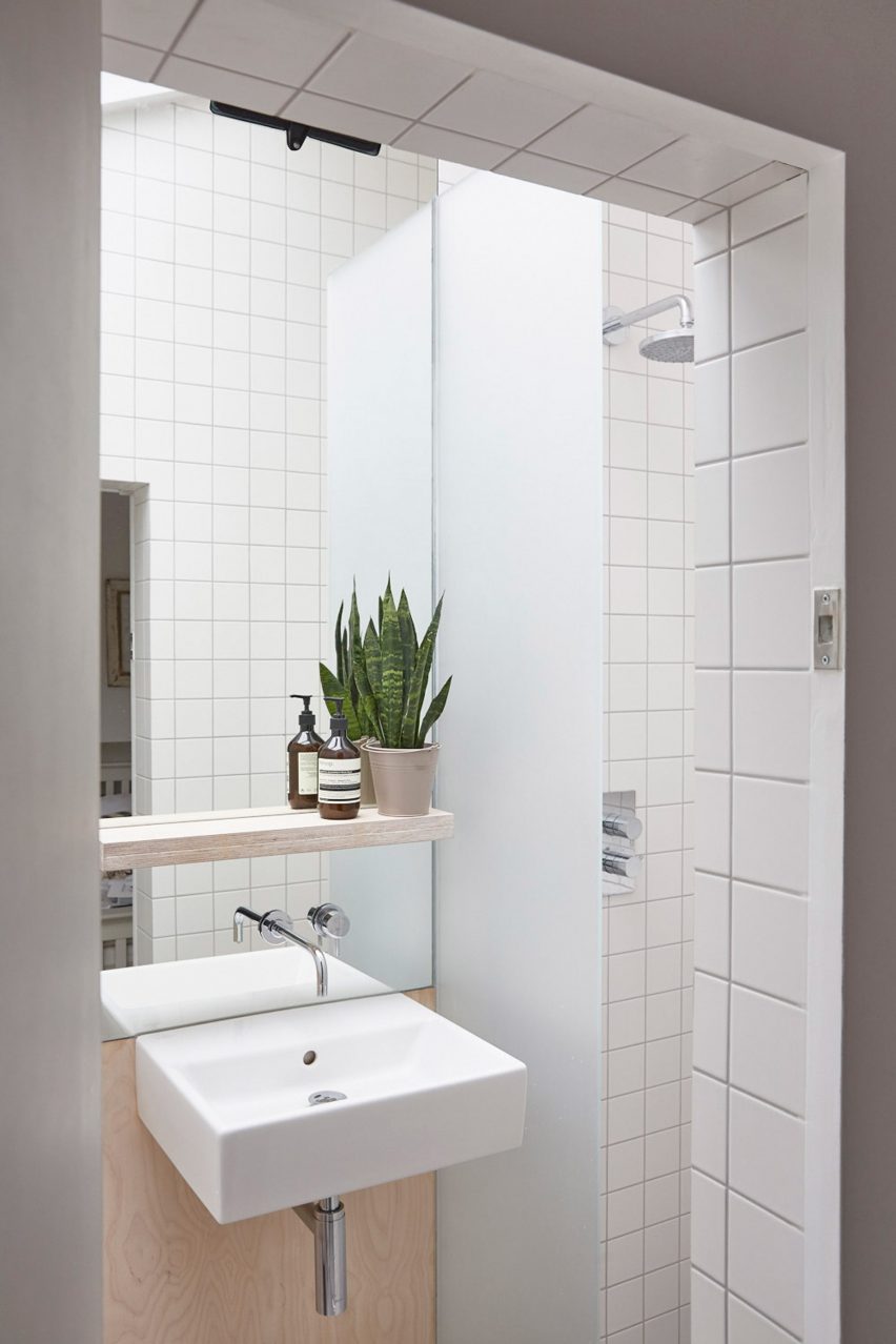
"In the downstairs toilet and upstairs ensuite, mirrors make these rooms feel much larger and lighter."
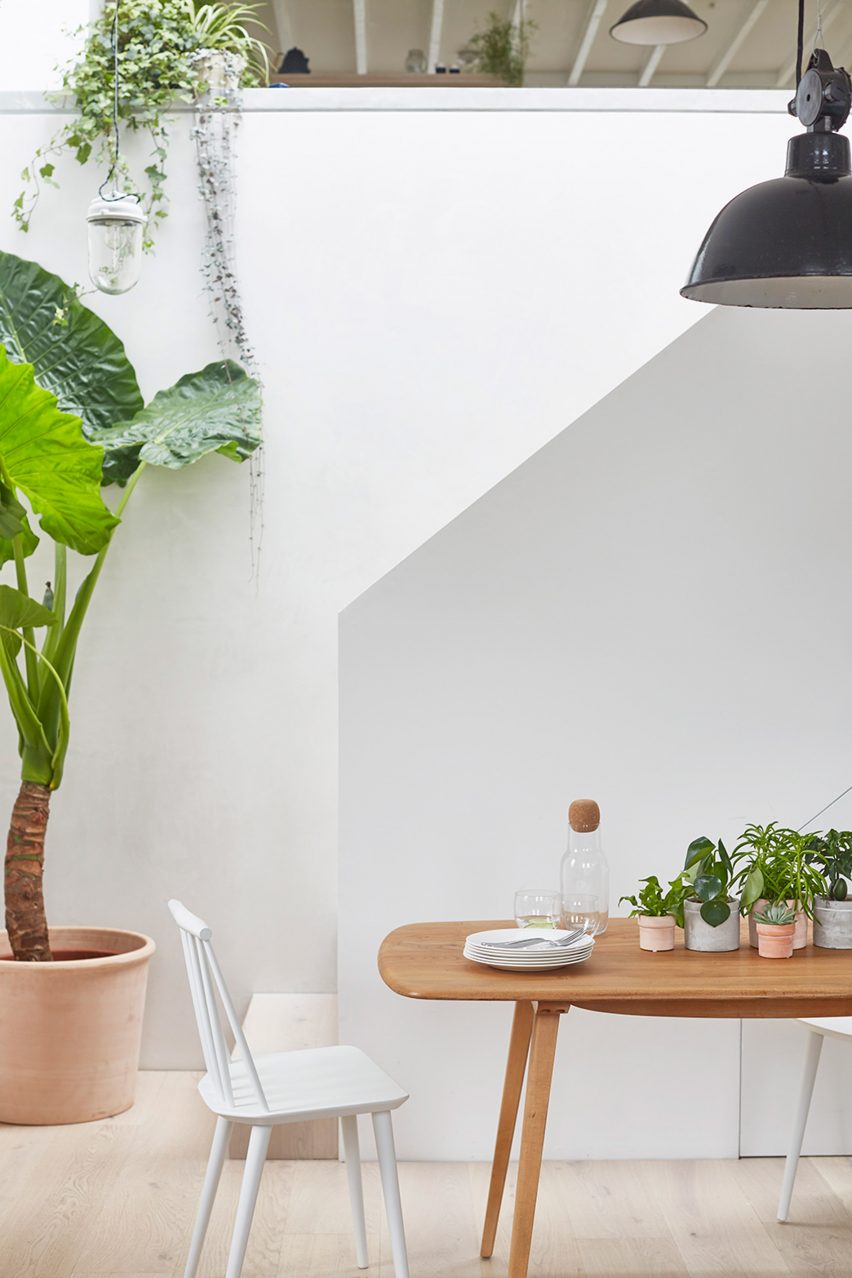
The main living and dining area is overlooked by the open-plan kitchen, and adjoins a new multipurpose room that can be used as a home office or third bedroom if needed.
The new room is contained in a compact side extension and can be connected to the living space by opening up a concertina partition in the upper section of the dividing wall.
Another space-saving solution implemented by the architects involved incorporating storage that sits flush with the wall finishes, including a drawer tucked away at the base of the wall of the home office and cupboards under the stairs.
A simple palette of modern and textured materials including white-stained oak flooring and exposed white-painted brick walls helps to enhance the bright and warm feel of the spaces.
A nearby house on a narrow site in Hackney was designed by architecture studio Liddicoat & Goldhill with skylights and large glazed surfaces that open onto a secluded courtyard allow natural light to pour into the interior.
Photography is by Helen Cathcart.