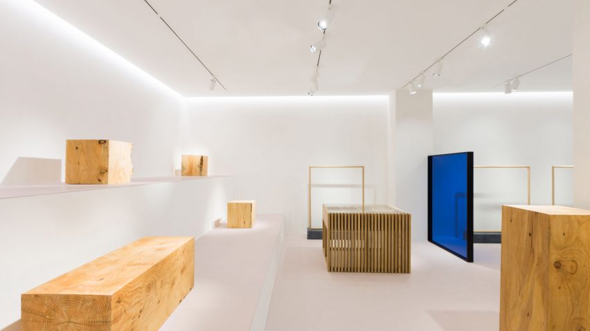
Pensando en Blanco has dotted blue glass partitions and jagged offcuts of grey marble throughout this otherwise colourless clothing store in northern Spain.
Established in 1995, Loreak already have a host of stores across Spain in locations such as Madrid, Barcelona and Bilbao.
For the interiors of its two-storey San Sebastian branch, the fashion label approached local design studio Pensando en Blanco to create a space that accurately reflected the brand's minimalist identity, specifying that it should include a handful of "surprise factors" to visually engage customers upon each visit.
To begin, the studio painted the 270 square-metre store – which had formerly been a dark, cramped office – entirely white.
The space has then been loosely divided by a series of timber or black metal square frames, some of which are covered with sheets of cobalt blue-coloured glass.
"In all our stores you will find panels where glass, transparency, and colour take on an important role," Maite Basterra, design assistant at the studio, told Dezeen. "These panels help to distribute the space, avoiding secrecy through holes and transparencies."
"[The panels] are part of the carefree nature that the brand has always had, and their ability to adapt to the constant changes and concerns that arise in the creative world," she continued.
Further splashes of colour are offered by a mustard yellow cushion seat and a large, pale blue rug.
Jagged chunks of Marquina marble resting on planks of wood have been placed at key points throughout the store, in subtle reference to a short film set in a quarry-like landscape that the studio produced for Loreak.
"We had the opportunity to move stones of more than two tonnes of weight [for the film], and some of them we used for shoots and campaign images, as well as for the decoration of the new store," Basterra explained.
"[The marble] pieces will mutate constantly, transformed with graphic elements and garments of each campaign."
While upstairs clothes hang from the ceiling on thin wire rails, dressed mannequins have been placed on a two-tier stage in the shop's basement.
Similar to Pensando en Blanco, French designer Mathieu Lehannuer kept the interiors of Maison Kitsuné's New York flagship largely simple by pairing white-painted surfaces with iridescent metal display rails that snake through the rooms of the store.
Photography is by Iker Basterretxea.
Project credits:
Design and site management: Pensando en blanco - Aurora Polo
Art direction: Borja Garmendia
Design assistant: Maite Basterra
Lighting design: Islada Lighting
Window display: Jon Ander Beloki

