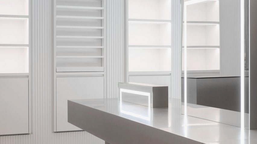
Batek Architekten create gallery-like backdrop for Zalando beauty store in Berlin
German practice Batek Architekten combined pale surfaces with concrete and steel accents to draw customer's attention to the products on offer in this beauty store in central Berlin.
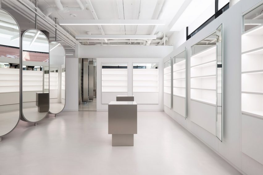
The shop is located close to the city's busy Hackescher Markt square and is Zalando's first bricks-and-mortar store – the brand previously only sold high-street fashion, shoes and accessories online.
Local practice Batek Architekten – that has offices just 15 minutes from the store's site – were given free reign to design the store's interiors. Keeping the brief largely open, Zalando only specified that the retail space should have a sizeable counter and enough room to host pop-up events.
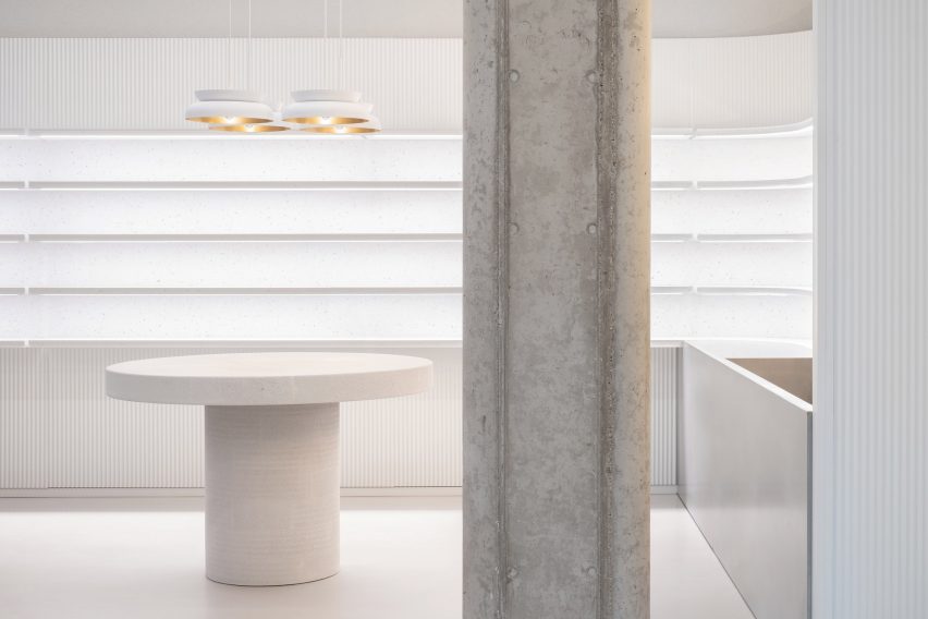
The architects began by removing all of the store's existing partitions, leaving behind a handful of chunky concrete columns that punctuate the floor plate.
"We wanted the space to be visible, we wanted the room to be able to breathe," Karen Kröger, architect at the practice, told Dezeen.

All surfaces have then been completed in a shade of off-white, offering a neutral backdrop for the products on show. Textural interest is offered by the peripheral walls, which have been clad in fluted metal, and eggshell-coloured tables and stool seats made from concrete.
"We always thought of the store as a gallery," Kröger explained. "We aimed for a colour palette to provide a minimalist and sleek background that would put the products at centre stage."
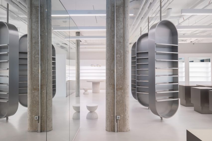
At the centre of the store sits three large, oval shelving units backed with mirrors to give the illusion of more space. These can be swivelled to partially conceal the room's rear or create a more open-plan feel.
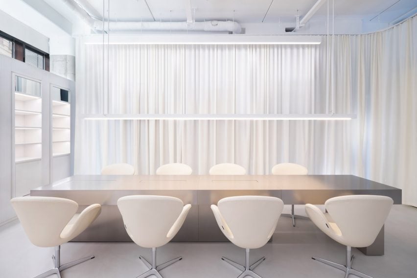
Stainless steel has been used to craft blocky display stands that can be aligned to form temporary areas for events. A white, full-height curtain set on a curved track can also be drawn to close off a four-metre long service table.
London-based studio O'Sullivan Skoufoglou opted for a much warmer aesthetic for the interiors of a skincare shop in Lincolnshire, England, where they paired wooden cabinets with peach-hued cane and travertine walls.
Photography is by Marcus Wend.
Project credits:
Architecture: Batek Architekten
Team: Karen Kröger, Patrick Batek