Neri&Hu animates Little B store in Shanghai with white-glazed tiles and neon lights
Chinese studio Neri&Hu has paired curved white-glazed tiles with stainless steel at this high-end convenience store in Shanghai, designed for lifestyle brand The Beast.
The Little B retail store sits amongst the narrow alleys that make up Shanghai's central Xintiandi district, which is made up of reconstructed mid-19th-century Shikumen – or "stone gate" – houses.
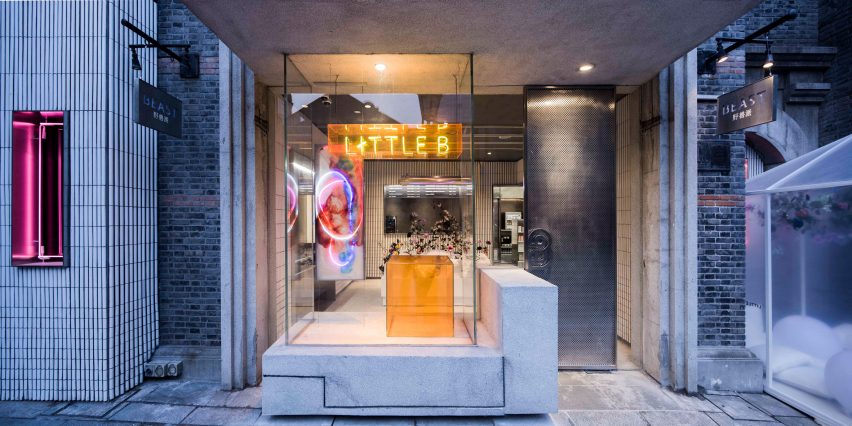
Neri&Hu wanted the storefront design to respect the classic detailing of the existing architecture, while also introducing fresh elements and materials.
Leaving the original facade largely unchanged, the duo took the light grey concrete found in the original base, lintels and mouldings of the structure and extended it to form a canopy above the entryway.
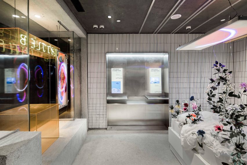
This canopy covers a new storefront window display, which includes the stores name written in neon. A new addition to the left of the existing facade was added to serve as a space for selling seasonal food and drinks direct from a window.
This extension has been clad in curved, white-glazed tiles aligned vertically, to contrast to the heavy construction materials of the existing exterior.
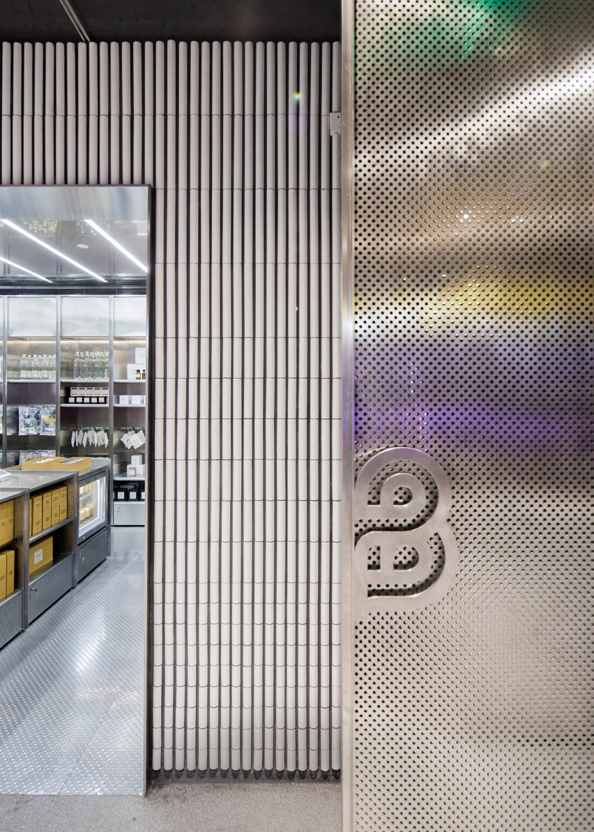
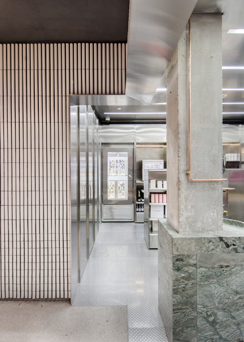
Neri&Hu extended these white tiles into the interior, not only to tie together the three distinct parts of the store – the facade, extension and interior – but also to provide a subtly textured backdrop for the shop's colourful contents.
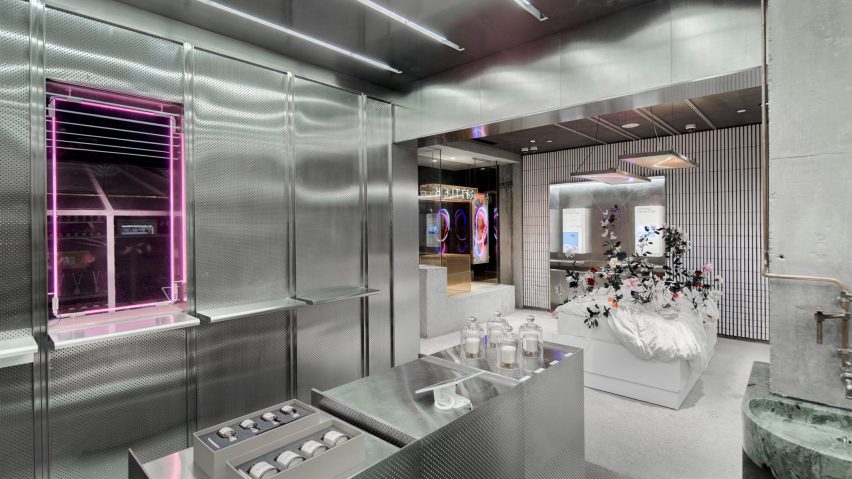
According to the duo, the curved shape and glazed finish of the white tiles add both shine and texture to the rough concrete exterior, while the reflective surfaces of the stainless steel elements provide a sleek material contrast.
These reflective surfaces also emphasise the bright pink and orange neon light fixtures dotted around the store.
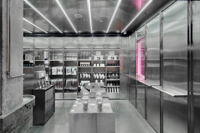
Like any other ordinary convenience shop Little B it offers light food and drink, personal care items and basic home accessories.
Unlike standard stores, each item in Little B is sourced from various high-end brands that, according to The Beast, have been carefully selected to suit the "culturally astute and increasingly discerning taste of Chinese consumers."
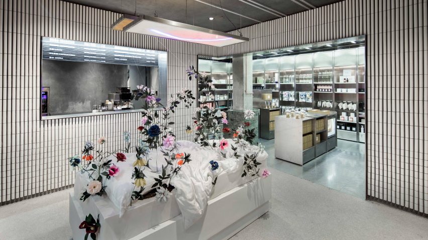
Neri&Hu wanted their design to reflect this new take on the retail store, and looked to the aesthetic of pop-up shops to give the space a "spontaneous" feel by leaving the entrance relatively empty.
This area is left blank to accommodate seasonal and temporary art installations that have been curated by the brand. The current installation features a plinth topped with bedding that is sprouting with colourful flowers.
The undefined, multi-purpose space could also be used to install feature brands, to host pop-up events, and to accommodate large scale visual merchandising.
"We encouraged the client to not just fill the entire space with products, but instead to leave some undefined space as an extension of the public realm," said Neri&Hu.
"This area is left raw with concrete floors, in the spirit of the temporary nature of pop-ups – it's a blank space that allows for any possibility," they added.
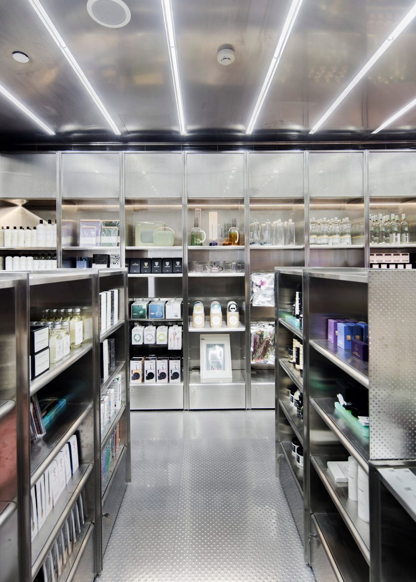
In the retail area of the store, display and shelving fixtures made from stainless steel wrap around the perimeter.
"Stainless steel, a rather sterile material, is brought to life by the layering various finishes: including brushed and polished, perforated and bump textured," said the duo.
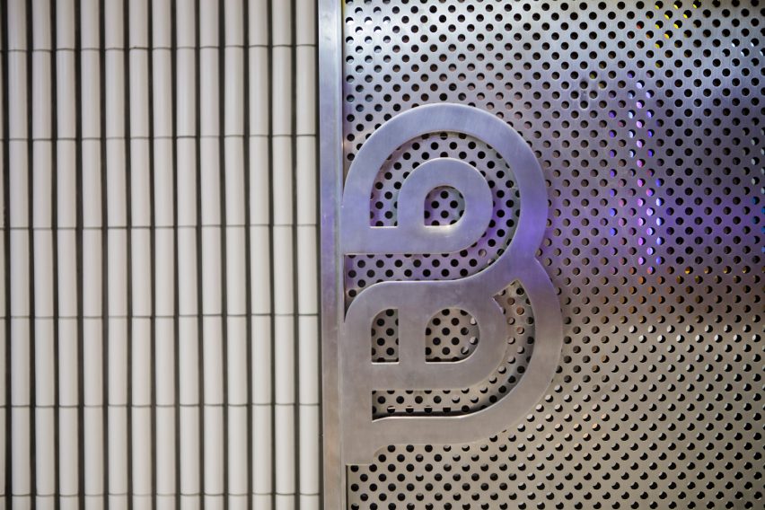
"The vibrant packaging of the products, the colours and shapes from the feature artwork, as well as the signage lighting begin to reflect off of each other, blur boundaries, and activate the space," they continued.
Concrete and stainless steel were also favoured materials of German practice Batek Architekten, who combined chunky concrete columns with pale surfaces to draw customers' attention to the products on offer in the Berlin-based beauty store.
Photography is by Shen Zhonghai.