Sky-high Manhatta restaurant by Woods Bagot borrows colours from outside
The colours of the sky are echoed in the furnishings and fittings of this lofty Manhattan restaurant, which architecture studio Woods Bagot designed so the views could "steal the show".
Manhatta is perched at the top of the 60-storey 28 Liberty – a skyscraper formerly known as One Chase Manhattan Plaza, which was completed by SOM in 1961 as first International Style building in Lower Manhattan.
The space was redesigned as part of an overhaul of the tower, which is largely offices, undertaken by its original architects.
The 90-seat restaurant and adjacent Bay Room event space encompass 38,000 square feet, occupying the full floor plate.
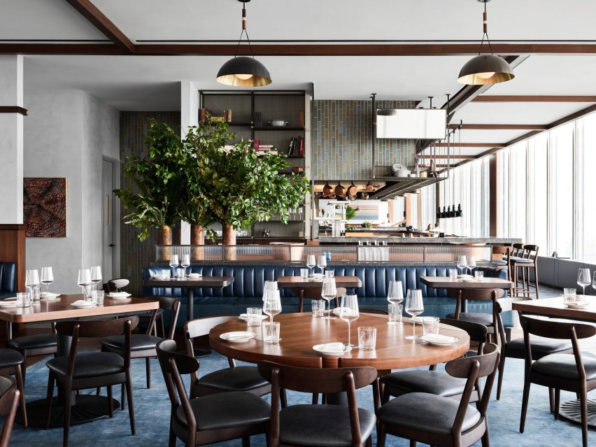
This means it enjoys views of some of New York's best-known sights from all four facades. These include Midtown to the north, the Hudson River and Statue of Liberty to the west and south, and the bridges to Brooklyn to the east.
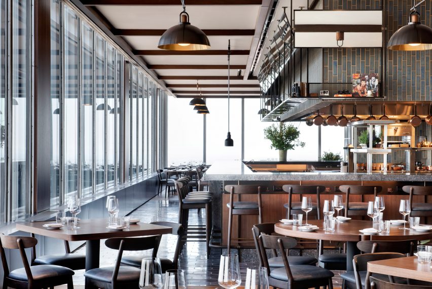
Global firm Woods Bagot – which recently redesigned its own offices in the city – wanted to emphasise the impressive vistas with the interior design.
"The design intent was to create a home in the sky that feels warm and relaxed enough for casual meals and drinks, while establishing a sense of place for the jaw-dropping views," said Woods Bagot principal Wade Little.
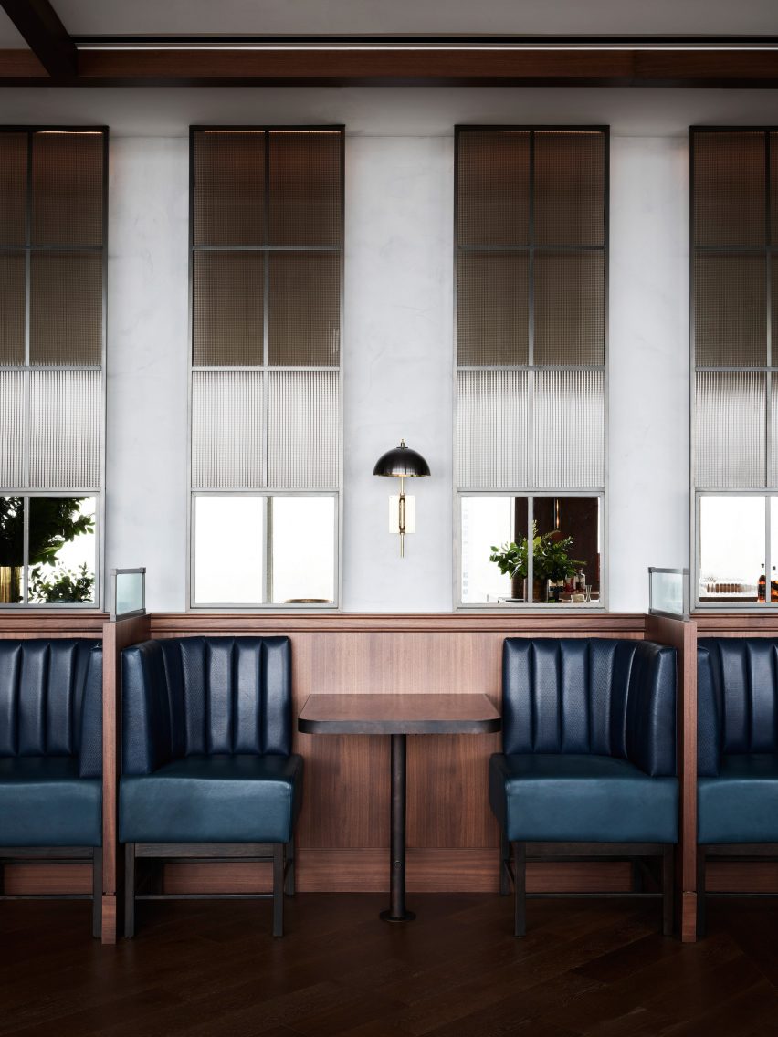
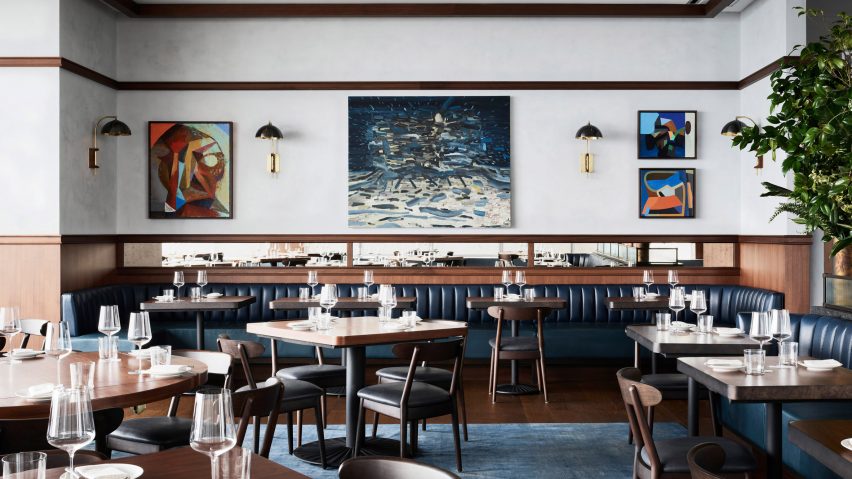
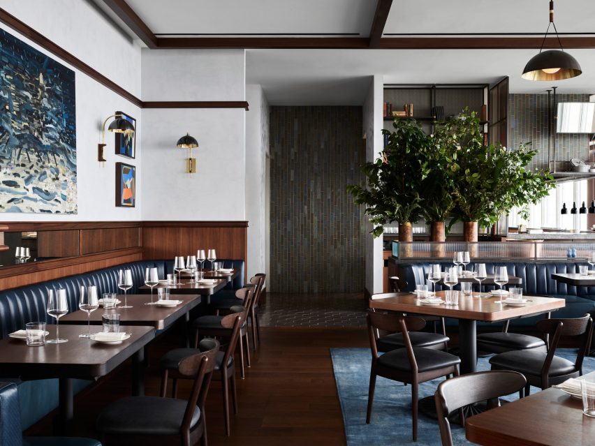
The team therefore selected a relatively muted palette to compliment the "surrounding sky", plastering the walls with a "cloudy finish" and finishing other elements in a tonal range of blues.
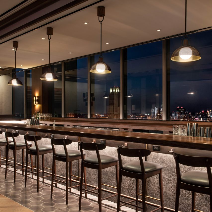
Navy leather upholsters booth seating that surrounds the perimeter, built from walnut to match the 40-foot-long bar facing the skyline beyond and leading to the open kitchen.
Dark wood is also used for mid-century-style chairs, table tops, wall rails and ceiling details, as well as portions of the floor that aren't covered by a dusty blue carpet.
Large walls of windows are left unobstructed, and the perforated-bronze pendant lights are designed to minimise reflections on the glass.
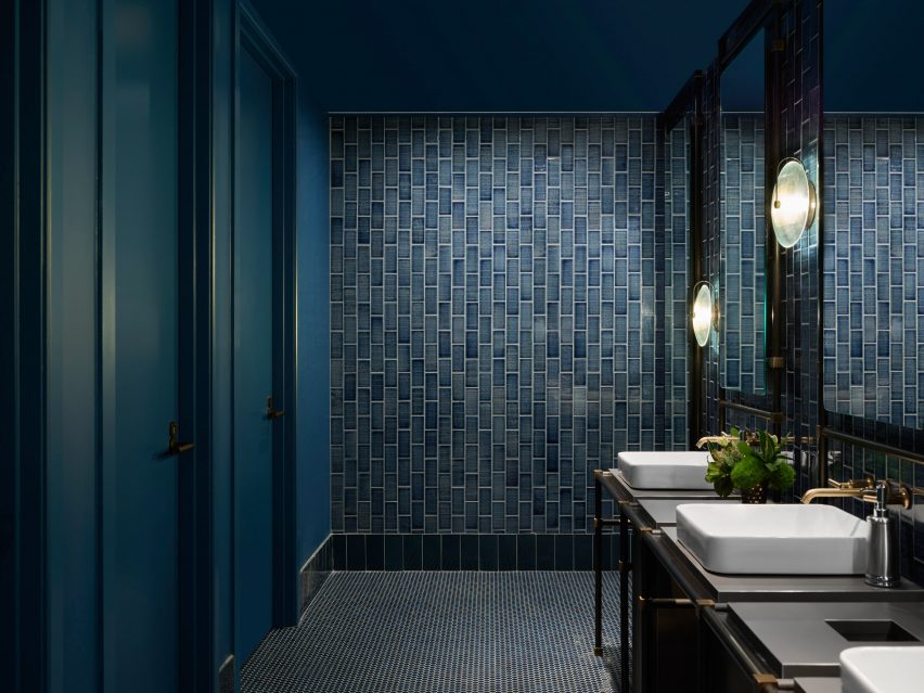
The private dining area is lined with blue silk wallpaper and fluted walnut panels, with a thick-piled carpet across the floor. In the bathrooms, darker blue shades of subway tiles, flooring and other surfaces create a "nocturnal ambience".
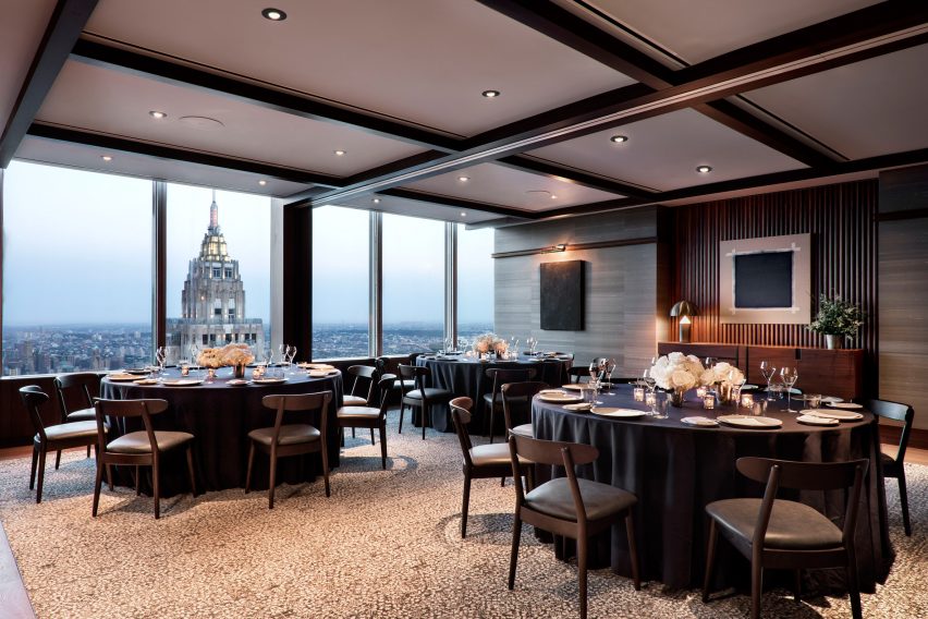
"Manhatta is an eyrie of sophisticated restraint, humble enough to allow the city itself to steal the show," said Little.
The Bay Room can be divided into different-sized areas depending on the event, and features a neutral design to provide a backdrop for those using it to adapt.
The restaurant and event space accessed via a dedicated lobby on the ground floor, which is similarly decorated in a subdued colour scheme to set the mood before ascending.
Stone wall panels and dark plaster are accentuated with cove lighting, while "a blood red couch adds a touch of drama".
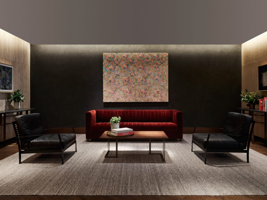
Over 100 artworks are scattered across all of the spaces, selected by Danny Meyer from the Artists Pension Fund.
New York's dining scene is ever-evolving, with fine-dining restaurants to hole-in-the-wall takeout options coming and going weekly. Recent additions that feature notable interiors include a Vietnamese spot in Greenpoint, a noodle shop in the East Village and an Italian-American eatery in the West Village.
Photography is by Brook Holm unless stated otherwise.