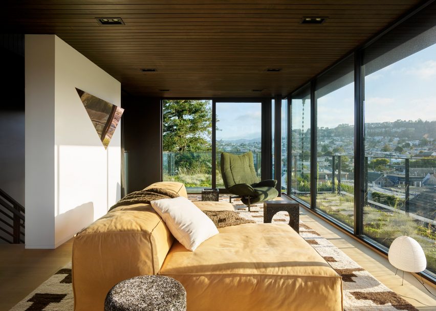
Los Angeles architect Jamie Bush has overhauled this house in San Francisco with an eclectic array of furniture and items, to make it look like a collection amassed over time.
Bush designed the interior for the speculative house – a property built to be sold – in the Californian city's Noe Valley. The client, a tech entrepreneur, purchased the property while it was under construction and asked for it to feel homey and stylish, but not "too done".
In response, Bush chose to furnish the four-storey residence with an eclectic mix of artwork and furniture designs that could have been collected over a long time.
"The client was very sensitive to the house looking too 'done' and perfect as if he hired a designer, and we purchased everything from an expensive showroom," Bush told Dezeen. "He wanted it to look as if he could have done it himself."
"In the end he wanted a feeling of a curated and collective life, with pieces selected that had a story to tell," he said.
Bush's studio designed a variety of furniture for the residence, including the dark wooden dining room table, a pendant light in the kitchen, two rugs and artworks.
These and other contemporary designs were then paired with vintage pieces. Chosen works intentionally have contrasting features: matt and glossy; wood and glass; dark and light. The shapes of artwork and furniture vary from geometric to organic.
"As we were redesigning the architecture," said Bush, "we were simultaneously designing the interiors with of an eclectic mix of vintage finds with history and patina, paired with contemporary design elements, modern art, while also designing custom pieces for the house."
"I feel the 'key driver' for the project as a whole was to create a language of contrasts throughout the home," he added.
The client also has a keen interest in design. So for each piece of art or furniture that Bush's studio acquired, the team also purchased a book about the artist or designer, for the resident to educate himself further.
Bush's renovation aimed to remedy a number problems with the existing design of the property, particularly details that "were not well selected or executed". Alterations included rearranging the rooms into a more open layout.
The kitchen, living and dining area form one space that runs the full length of the entrance level – accessed via a set of steps from the street.
Despite being open plan, each of the three areas is finished differently. The dining room features pink-painted walls and Bush's irregularly shaped table, while a marble counter, pale cabinetry and white tiles adorn the kitchen, along with the architect's pendant light.
Bold yellow art brightens the living room, complementing the tones of the dark brown leather sofa, wooden table and pink chairs, and a custom steel and white cabinet. Pale curtains are draped in front of sliding glass doors that lead out to a patio facing the back garden, which was also landscaped as part of the project.
Bush chose darker paint for the walls that flank either side of the blackened steel and ebonised oak staircase, which connects the home's four levels.
Similarly "smokey" decor features in the cinema room in the basement, while a muted palette was chosen for the master bedroom suite on the second floor. Walls were demolished on this level to create an office open to the stairs.
Two bathrooms are redesigned with decorative wall coverings: one is adorned with a marble, blue and gold pattern, while the other has a gradient from pink to blue.
On the top floor, a large sofa provides a cosy spot for enjoying the elevated views of San Francisco through large expanses of glazing. A sliding glass door opens onto a rooftop garden – one of series Bush added to make the most of the building's stepped form.
"Perhaps the most challenging aspect of the house was adding the green planted roofscapes to a home which was not originally designed for them," said Bush.
"We hired an engineer and a landscape firm to work with us to design a system to hold up over time and thrive in this specific climate, which as swing dramatically from very hot to quite cold in a matter of just a few hours."
While Bush's project adapted a newly built property, other renovations in San Francisco have focused on adapting the city's more historical designs. Examples include Fougeron Architecture's remodelling of a century-old house and Michael Hennessey's refresh of a mid-century Eichler house.
Photography is by Matthew Millman.

