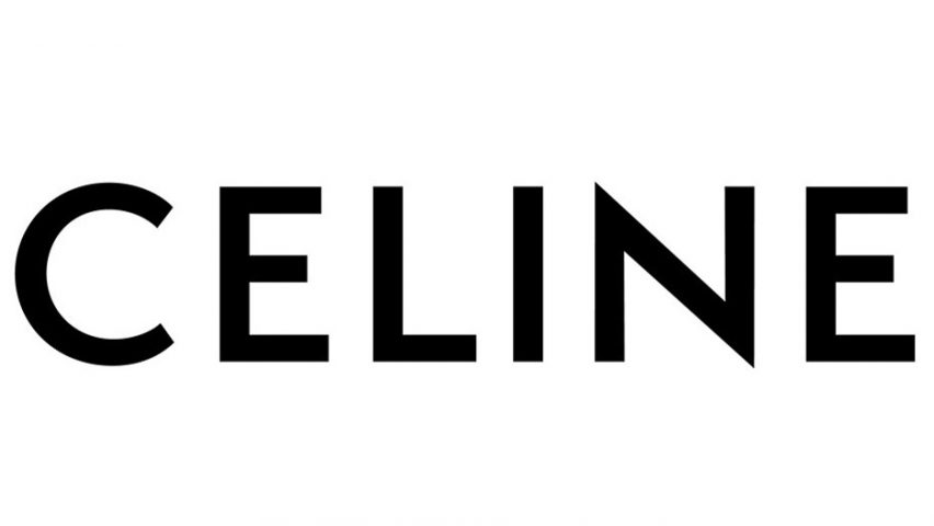
Luxury fashion brand Céline has removed the accent from its name – a move implemented by the brand's new artistic and creative director Hedi Slimane.
The rebrand was revealed to the public via an Instagram post yesterday, 3 September, in a move that simultaneously saw the brand delete its entire Instagram history.
Slimane, who is known for famously cutting "Yves" from the brand formerly known as Yves Saint Laurent in 2012, revamped the logo to better resemble the original 1960s design.
"The new logo has been directly inspired by the original, historical version that existed in the 1960s," the fashion label revealed in an Instagram video post that shows a slow pan-shot across a gold foil curtain.
"The accent on the 'E' has been removed to enable a simplified and more balanced proportion, evoking the Celine collections of the 1960s where the accent wasn't used often," read the post.
According to the brand, the new logo uses modernist typography from the 1930s. The spacing between the lettering has also been narrowed to create a tighter appearance.
"The 1960s version of the logo including the word 'Paris' will be reinstated within the clothing and on packaging, however, 'Paris' will not appear beneath the logo on campaigns," added Celine, who revamped its flagship store in Miami earlier this year to include blue-tinged marble and pyramidal forms.
Slimane was appointed to the role of artistic and creative director in January this year, replacing British designer Phoebe Philo.
The rebrand follows Riccardo Tisci's overhaul of the Burberry logo in August, which – in a similar move towards the brand's heritage – used founder Thomas Burberry's initials "TB" in an orange and white monogram.
Many brands have been refining their logos to feature more simplified forms. Examples include Battersea, who stripped "dogs and cats home" from its title, and Swedish technology giant Ericsson who adjusted its logo of three parallel lines to 18.435 degrees to render it better on computer and mobile screens.

