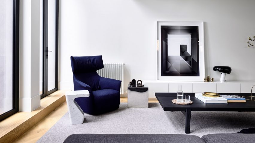
Conrad Architects divides Melbourne townhouse into informal and formal living areas
Conrad Architects has brought a contemporary touch to a townhouse in Melbourne, creating distinct living spaces for different times of the day.
The downstairs living space in the Hornsby Residence is clearly divided into two primary zones: a formal sitting room in the front of the house, and a more informal dining are at the rear of the building.
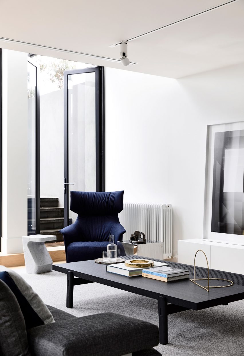
The change in natural light through the course of the day was utilised to set the tone for the two living spaces, with varying ceiling heights, floor levels, lighting installation and interior detailing lend each of two zones a different feel.
The formal living room is primarily used late in the day and evening and so is located on the western side of the house to ensure maximum late afternoon sunlight.
The formality of the room is emphasised with a symmetrical plan that has a classical alignment: the fireplace, furniture arrangement, external doors, and the trees in the adjacent courtyard all sit on a central symmetrical axis.
The ceiling height in this formal space was raised and the dimensions of the room tightened slightly to give a more vertical proportioning to the room.
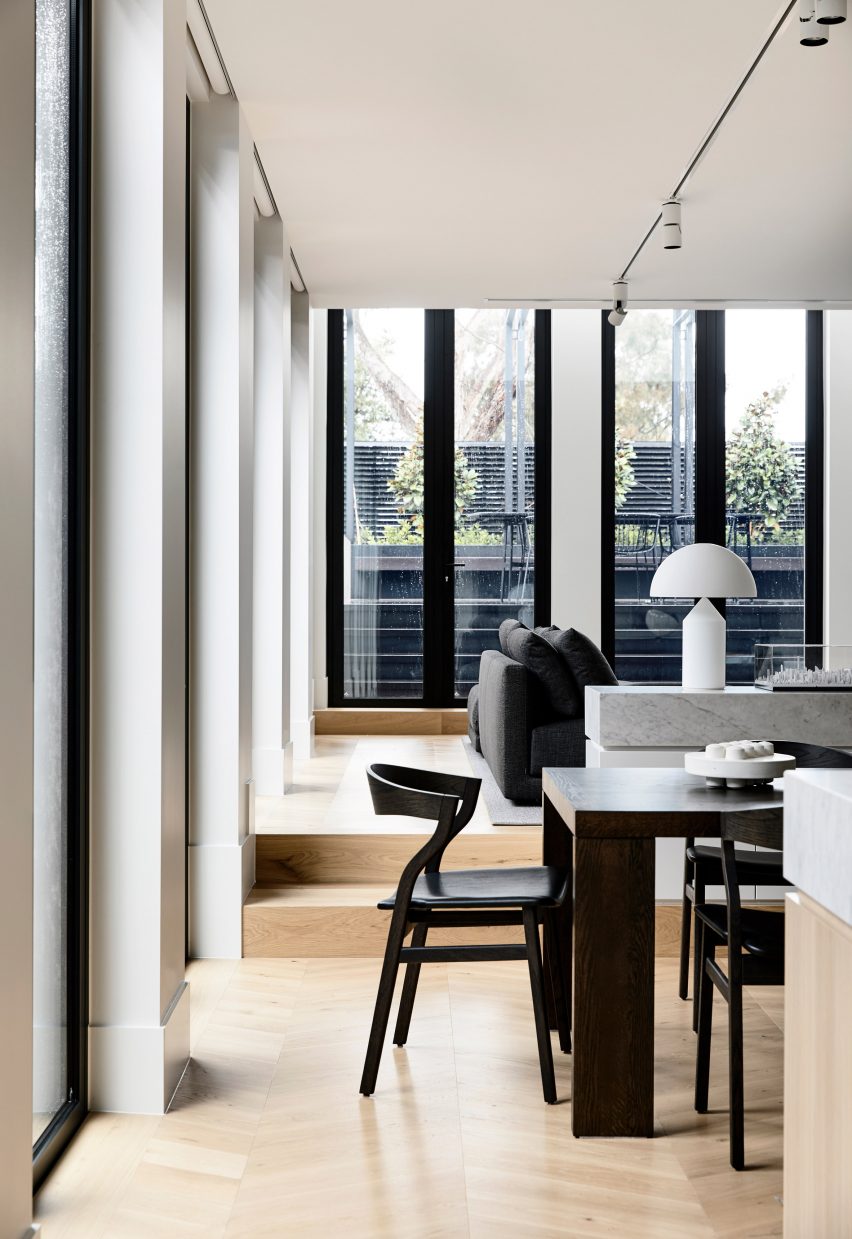
The informal living room on the other hand is used earlier in the day and is positioned on the northern side of the house to receive sunlight throughout the morning and midday.
The floor was lifted by two steps to compress the ceiling height and create a contrast with the formal spaces create spatial separation from the dining area.
The furniture is also more casual to complement the mood.
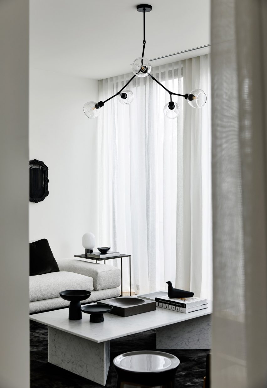
This control of natural light and was considered by the architect as a powerful tool in the design considerations for the Hornsby Residence.
"The way light plays on a space has immense power to generate emotion and facilitate wellbeing," explained Paul Conrad, director of Conrad Architects.
"Its direction, colour, intensity, movement and refection all impact on the way buildings are experienced and materials are viewed.
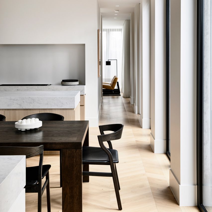
Throughout the residence a restrained material palette centres on the use of marble and oak, giving the whole property what Conrad refers to as a "classical sense of rhythm with a European layering of texture and material".
"Hornsby Residence typifies the Conrad Architects aesthetic; it is contemporary in style but also influenced by a broad spectrum of historical references," said Conrad.
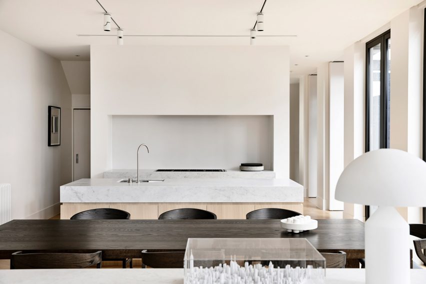
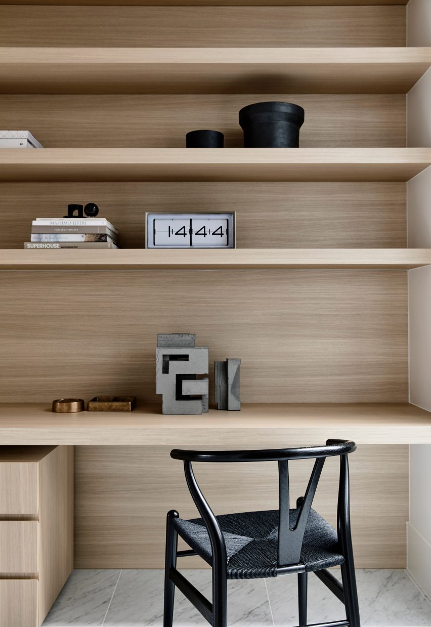
Conrad selected natural materials for the space that will improve with age and are carefully paired with textured fabrics to give the minimalist interior an additional sense of warmth and homeliness.
"The material palette is purposefully pared-back in order to convey a sense of calm and emphasise a minimalist expression," said Conrad.
The largest of the three external courtyards opens from the informal living area at the rear and contains entertainment tables and chairs.
A narrow courtyard runs along the northern side of the dining and kitchen areas, giving them a view of the outdoors and letting in abundant natural light. The third courtyard sits at the front of the house and opens out from the formal living space.
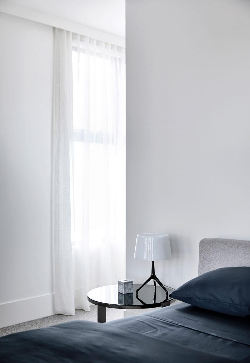
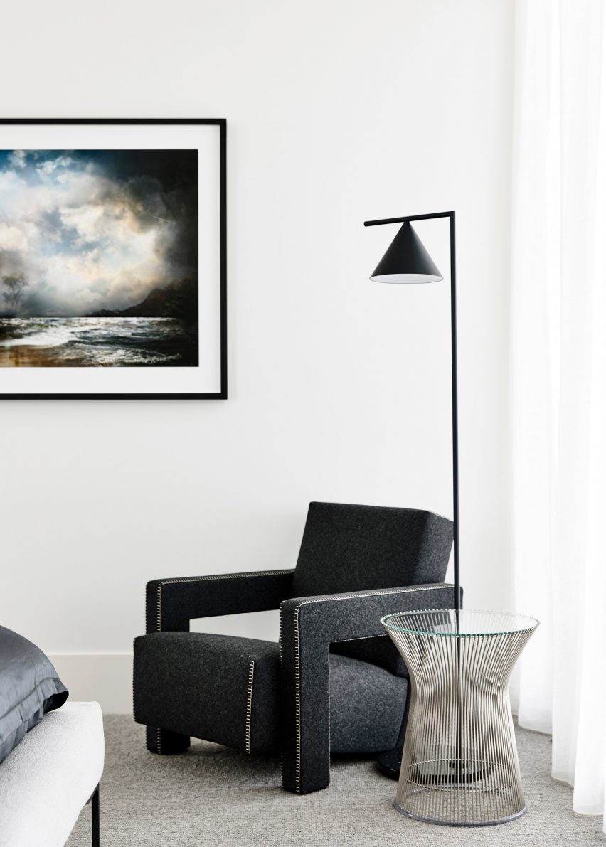
Upstairs, the master bedroom connects to an ensuite bathroom with no door dividing the two rooms. The bathroom walls were left without tiles to avoid a material change and has double vanity basins.
"The primary design idea driving the master ensuite was to create a calm bathing space," said Conrad.
Architecture studio Ritz&Ghougassian recently renovated another Melbourne property that features a minimal material palette and courtyard gardens.
Photography is by Derek Swalwell
Project credits :
Architect: Conrad Architects
Styling: Simone Haag
Landscape design: Jack Merlo
Builder: Agushi Constructions