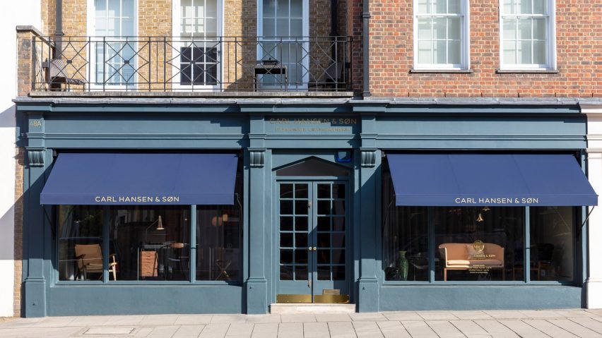
Classic shades of forest green and dark grey create a muted backdrop for Carl Hansen & Son's furniture in its Pimlico store, which has opened as part of the Danish brand's UK expansion.
The store will be Carl Hansen & Son's second standalone retail space in London, joining its Clerkenwell showroom. It opened last week to coincide with London Design Festival.
Measuring 220 square-metres, the branch will seek to cater more to everyday customers and what the brand describes as a "growing global interest" in Danish mid-century design.
"London is a design-led city with some of the world's best architects and interior designers calling it home," explained Knud Erik Hansen, CEO of Carl Hansen & Son.
"With customers demanding great quality and craftsmanship in their furniture, we felt it was time to invest in a retail location as part of our international expansion strategy in major cities around the world."
The brand relied on their in-house design team to complete the store's interiors, which were largely bare upon when the property was purchased.
To reflect the brand's 110-year history, walls have been painted in a selection of heritage shades – colours traditionally used to decorate homes in the 19th century – such as forest green, slate grey and navy blue .
"We were also very inspired by classical museums like the Danish Faaborg Museum," Hansen explained to Dezeen.
"The colours are the original ones chosen by [architect] Kaare Klint for the museum, and match the natural nuances of autumn."
A series of gauzy, full-height curtains have also been erected to close off the store's window displays, which sit on curved platforms. Light-hued timber flooring has also been used throughout.
As well as a selection of pieces by Danish designers like Mogens Koch, Arne Jacobsen, and Børge Mogensen, the store also has a bespoke, blackened-oak kitchen area comprised of Koch cabinets and bookcases where the brand can entertain customers or clients.
Earlier this year Carl Hansen & Son opened a loft-style showroom in San Francisco to capitalise on the American market. Mixing the aesthetic of Danish minimalism with Californian modernism, the store features high ceilings, white-painted walls and exposed ceiling fixtures.

