"Renderers, if you can't show us where we are, show us where we might go"
Whether for client meetings or the silver screen, architectural renderings that sell fantasy need to be grounded in ambitions for improving the world, rather than sugar-coated versions of reality, says Aaron Betsky.
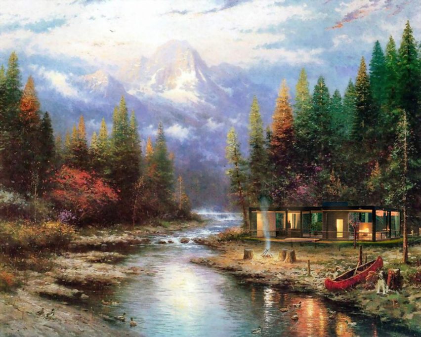
The last embers of a campfire glow by the shore of a river, meandering towards us from a waterfall overshadowed by mountain peaks rising into the clouds. A dog, its tongue hanging from its mouth, guards a canoe that has been pulled onto the shore against the ducks paddling around the river. It is fall; some of the trees – including, strangely, several of the firs – have turned red.
And there, in the centre of this sylvan scene, is the Glass House, turned towards us in three-quarter view, its interior glowing with its own fire, as well as with hidden electric lights. A figure, which we assume is the magician of both modernism and postmodernism, Philip Johnson himself, lurks in the background.

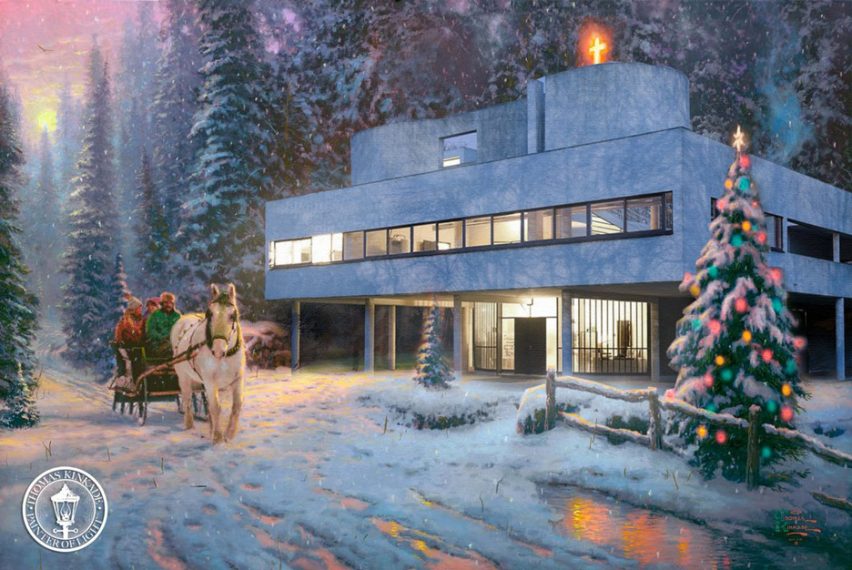
The river of history has rarely run by such a strange scene, at least not along its architecture tributary. The image is one of four released by anonymous Twitter user @robyniko. They are based on the work of the late painter Thomas Kinkade, who trademarked the moniker "Painter of light", and who turned his formula for evoking pastoral splendour into an industry that at one point included galleries all over the United States (and whose heirs zealously protect his trademarks, hence the renderer's anonymity).
In addition to the Glass House image, you can find online a horse-drawn sleigh sliding by the Villa Savoye, which nobody, including the horse, seems to notice. The Farnsworth House is imagined as a suburban pavilion, the sometimes raging Fox River replaced by a lily-dotted pond fed by a waterfall, while spring flowers bloom around a solitary gas-lite lamppost.
Frank Gehry's own house is relocated from Santa Monica to a rocky shore, where that same lamp post competes with a setting sun to set the structure's signature corrugated and galvanised siding aglow.
You can see these images as metaphors for our current political and social climate
Who said that modernism could not be warm and fuzzy? Certainly, it is in these images, although there is, of course, also something quite disturbing about their rosy glow.
From the perspective of modernism, the collages undermine the claim that such structures are – despite their use of mass-produced materials and general or even generic rules for design – tied to a specific site and function, while also epitomising the ability of design to reshape their context according to reason and efficiency.
In these images, nature dominates, and the crisp lines of modernism are only a thin veil over the glow of domestic security they define.

You can also see these images as metaphors for our current political and social climate, in which utopia is just a selling point and you can divorce any statement of ideology – whether in economics, rhetoric, or architecture – from its context.
It is no longer morning in America, as Ronald Reagan promised half a century ago, but sunset, when all hopes have receded into a warm glow reserved for those who can retreat to their suburban fortresses, where cities, factories, refugee camps and hurricanes powered by climate change are invisible.
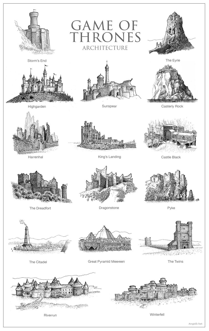
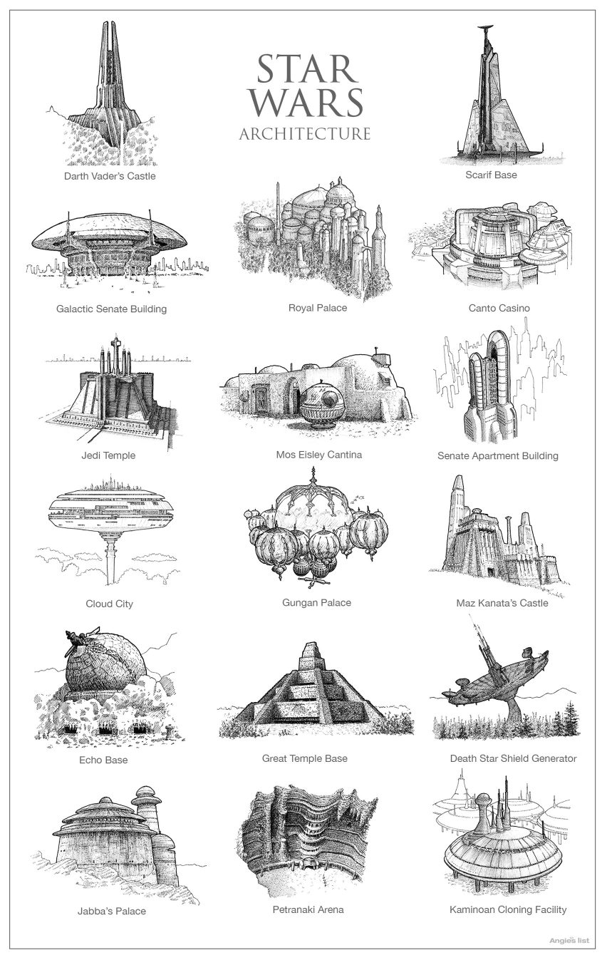
If there is too much reality even in these images, you can retreat even further, into the architecture of a galaxy far, far away. Angie's List, of all sites, the online resource for services provided by women, has cataloged (again anonymously) buildings that appear in the Star Wars, Harry Potter, Game of Thrones, and Marvel Comics universes and had them drawn (again anonymously) in perspectives that recall the sketches Banister Fletcher used to teach us the history of architecture.
Renderings are where and how we think we are
What is remarkable about these images is how banal they seem, especially in comparison to the exotic atmosphere @robyniko gives to what should be familiar icons. The desert cities and Mayan temples that were George Lucas's inspiration. The extrapolations of Lautner's, Calatrava's, and lesser gods' forms in the Marvel myths. The medieval ruins resurrected to be Winterfell or King's Landing. And especially the twee versions of England before the industrial revolution where Harry Potter roams.
They do not transport us to other worlds, but give us back an imagined past, or let us dive into the pages of a travel magazine rather than having to expose ourselves to actual foreign cultures. Without the panoramas and characters the movies spread out in front of us, we are left with the skeleton of what appears to be a much more meagre imagination than we thought was playing out on the silver screen or our laptop.

What is most remarkable about these and other fantasy images – including the ones that set the scene for video games and anime cartoons, let alone the galleries of Kinkade-like or -lite painters – is how amateurish they are compared to our ability to create realities that are both more realistic and more fantastic than such fantasies.
Every day, Rhino monkeys and Photoshop slaves churn out thousands of images of office buildings, apartments, and even whole cities that are much more seamless and believable, while at the same time fantastic exactly for that reason, than these escapist scenes.
What makes them so seductive and frightening at the same time is that they mirror our existing world, albeit in a deformed manner, rather than opening a window into some other place we know we can never inhabit. They give us back where we are, but in a slicker, cleaned up, and refined manner. They are where and how we think we are.
Truly frightening is what most renderings don’t show: the reality of our lives
Truly frightening is what neither the Angie's List and @robyniko images, nor the renderings produced by or for architects' offices, show: the reality of our lives, or of life in general, which includes sights and sites few of those of us who frequent this website will ever experience – from homeless shelters to trailer parks, and from war zones to refugee camps. When we do see those, we regard them either through the filter of art, or in statistical abstractions.
You could argue that @robyniko's images are critical, because there, at least, is an implied perspective or irony. But without knowing who the renderer is or what his theories are, it is difficult to say what the message is.
Others have read critical stances into the sets of such recent movies as Black Panther, but it is equally hard for me to understand how festooning a KPF skyscraper designed for China with a thatched roof is anything more than a cliché.
The modern buildings @robyniko used all had both an idea at their core and an ambition. They wanted to reshape reality, whether they succeeded or not. Some of the best movies have also been critiques of our current political and social conditions, though the ones Angie's List chose are not.
What would be the implications if we drew out architecture's and film's, not to mention designers', ambitions? Here is a challenge to you, @robyniko, Angie's List, and all those renderers slaving away for an alphabet soup of design firms who secretly have other ideas: if you can't show us where we are, here and now, show us where we might go, and how architecture might help us get there.