American architect Robert Venturi has passed away, leaving behind a legacy of postmodern creations. We look back at some of the most important work he completed in the often divisive, but always playful, style.
Vanna Venturi House, Philadelphia, USA, 1964
When asked by his mother to design her a house in the late 1950s, Venturi took the opportunity to create a statement, and the result is now regarded as the first postmodern building.
Many features of the property in Philadelphia draw on those used for functional purposes by modernist architects like Mies van der Rohe and Frank Lloyd Wright. But Venturi also included a host of ornamental details to give it its postmodern edge, like the monumental gabled wall at the front, and an arch that serves no purpose.
"Some have said my mother's house looks like a child's drawing of a house – representing the fundamental aspects of shelter – gable roof, chimney, door and windows," wrote Venturi in Architectural Record in 1982. "I like to think this is so."
Find out more about Vanna Venturi House ›
Fire Station #4, Columbus, Indiana, USA, 1968
In the late 1960s, Venturi was enlisted to design a fire station for the city of Columbus that was an "ordinary building" and "easy to maintain". His design comprises a simple floor plan, with the apparatus room placed on one side and living quarters on the other. A huge hose-drying tower rising in between is adorned with a golden "4" at the top.
White-glazed brick covers most of the front of the building, but stops just short at the edges, where it is replaced with red brickwork. "This crisp, functional building creates an appropriately ordinary, yet distinctive, image for the rescue and social activities associated with a community fire station," said Venturi Scott Brown Architects (VSBA) in a project statement.
Find out more about Fire Station #4 ›
Sainsbury Wing, National Gallery, London, UK, 1991
Venturi completed the Sainsbury Wing extension to London's National Gallery with wife Denise Scott Brown and their firm VSBA. The team chose Portland limestone walls to match the exterior of the existing building, designed by William Wilkins in 1838.
Rather than mimicking the original structure, the front of the addition steps backwards to follow the shape of the street, with large square cut-outs on the lower level to make the building more accessible for visitors. An additional glass wall offers views of Wilkins' building and Trafalgar Square from inside, where galleries are arranged in three different sizes, and spaces are linked by arches.
Seattle Art Museum, Washington, USA, 1991
Terracotta tiles wrap around the bottom of the curved limestone Seattle Art Museum in an undulating pattern, like a signature of Venturi's postmodern flourish. A marble and terrazzo stairway, which leads up the inside of the museum to negotiate its sloped site, is flooded with natural light from south-facing windows.
Venturi, whose design was chosen to replace the existing museum, described his ambitions for the project to the New York Times in 1991: "If you go to Florence, the art is right out in the street, part of everyone's experience," he said. "We couldn't go that far. But we tried to bring it down to the street and make it open and inviting."
Children's Museum of Houston, Texas, USA, 1992
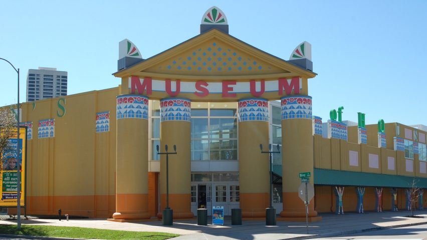
Chunky columns supporting a pediment are patterned and coloured bold yellow at the entrance for the Children's Museum of Houston, designed by VSBA and Jackson & Ryan Architects.
Venturi likely drew on his experience studying child psychology for the 4,100-square-metre building, which is intended to foster early development. The front colonnade exposes a large window behind, while flattened versions run along the side walls and appear to hold up letters spelling out the museum's name.
Museum of Contemporary Art San Diego extension, La Jolla, California, USA, 1996
Shortly after the National Gallery project in London, VSBA undertook another major museum expansion. This time the firm teamed up with David Singer Architect to complete the renovation and extension of the Museum of Contemporary Art San Diego, which occupied a 1915 villa called Scripps House and had already been extended multiple times.
VSBA's additions included a courtyard fronted by a colonnade along the lively Prospect Street to create a sheltered area considered as "a well-loved urban space".
Despite this, the museum plans to demolish parts of the firm's additions to make way for another expansion, this time by Selldorf Architects. The plans have caused uproar in the architecture community, which launched a petition against the proposal earlier this year.
Venturi also applied his Postmodernm maxim "Less is bore" to furniture, when he and Scott Brown created a range of chairs for Knoll in the early 1980s. The collection offered a decorative take on historic furniture styles like Queen Anne, Chippendale and Art Nouveau.
The duo flattened the traditional forms and left just the silhouette to define them – a process that took them five and a half years to refine – and then covered in colourful patterns. They chose materials that would allow the chairs to be cheap and easy to produce, so that they would be available to everyone.
"A vision that Bob had... was that you should be able to use industrial production methods to make furniture, which is also reminiscent historically," Scott Brown told Dezeen during an interview in 2017. "And that decoration is part of communication."
Find about more about the Queen Anne chair ›
Photographs of Children's Museum of Houston are courtesy of the museum.

