Attn Attn renovates Lenox Hill Residence for graphic designer
New York studio Attn Attn Architecture and Design has gutted an apartment in the city, and used light-toned marble against dark colours for a "classic but unique aesthetic".
The 800-square-foot residence in the Lenox Hill area of Manhattan's Upper East Side was overhauled for a graphic designer, who wanted maximum impact on a limited budget.
Attn Attn "started with ambiguous functionality, quirky original details, and deteriorating DIY finishes installed by a previous owner", so ripped everything out and began again from scratch.
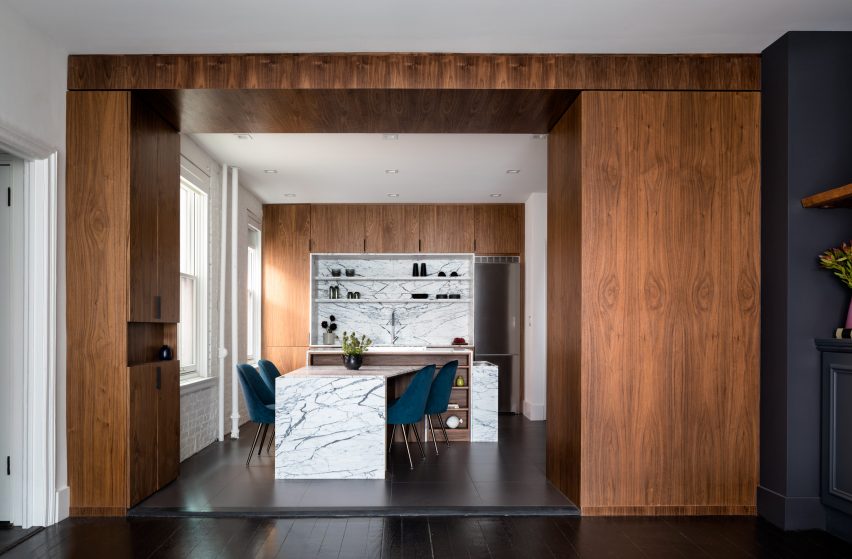
The spaces in the pre-war apartment were reorganised, and a statement threshold was instead used to separate functions in the living space.
This dark wood element forms an arch between the kitchen and the lounge, and also integrates storage cupboards.
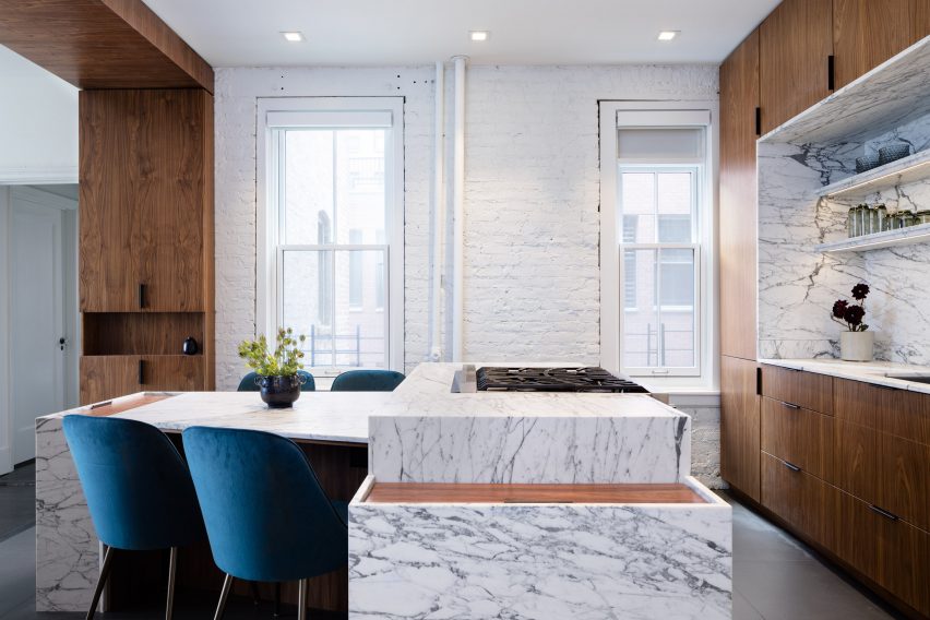
The same wood is used for cabinetry in the cooking area, where units surround a recessed counter and shelves of veiny marble.
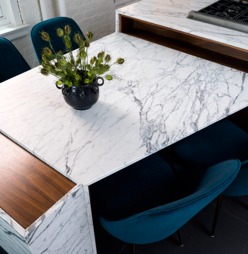
This stone provides an accent material throughout the apartment. It forms a kitchen island, from which a dining table extends at an angle, and surrounds the tub and shower from floor to ceiling in the bathroom.
"In reference to the client's graphic designer sensibilities and appetite for bold patterning," said Attn Attn, "natural stones and woods with contrasting lines and textures were chosen, and carefully manipulated to delineate spaces while simultaneously tying together appropriate functionality."
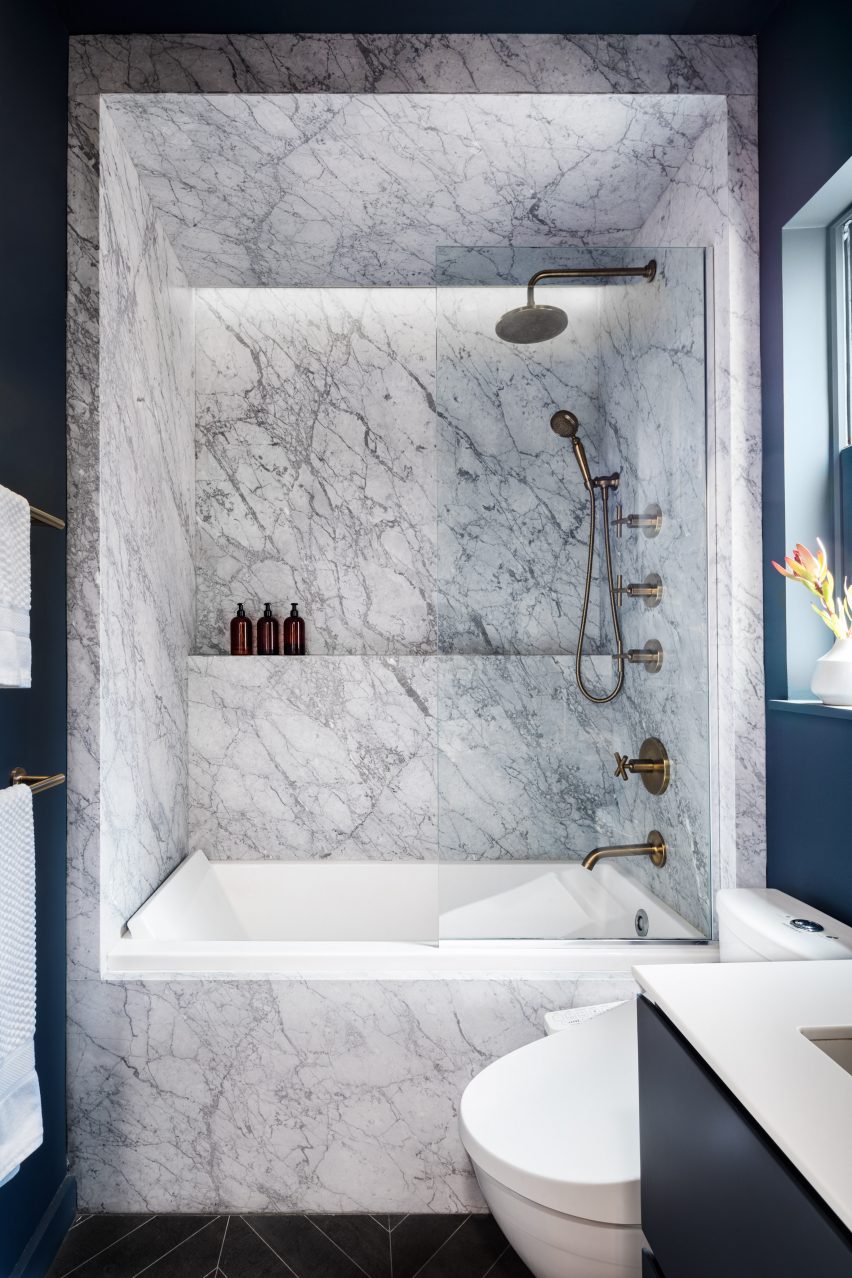
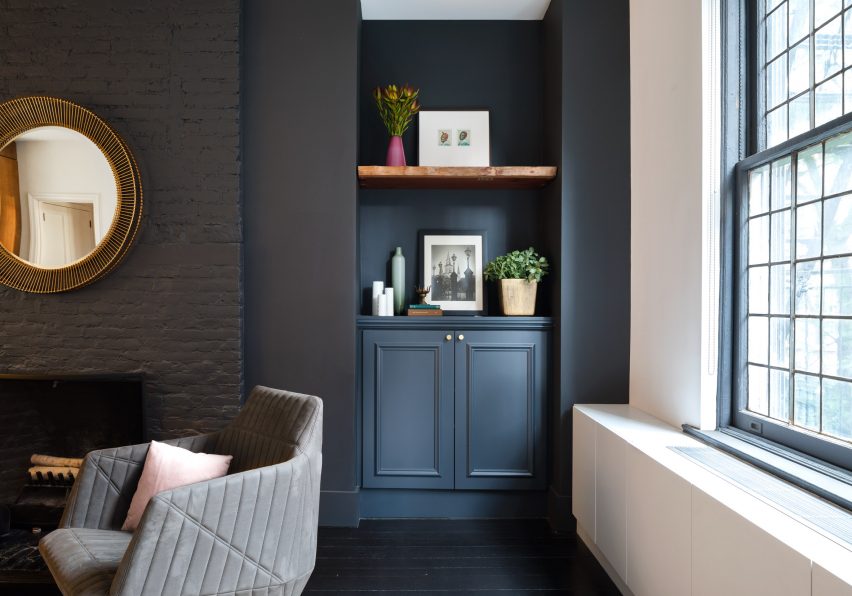
Other surfaces in the bathroom and living area are painted rich blue, and the flooring is black – both to highlight the light shades of the marble.
Walls containing windows are coloured white, while the navy paintwork is matched with the dining chair upholstery.
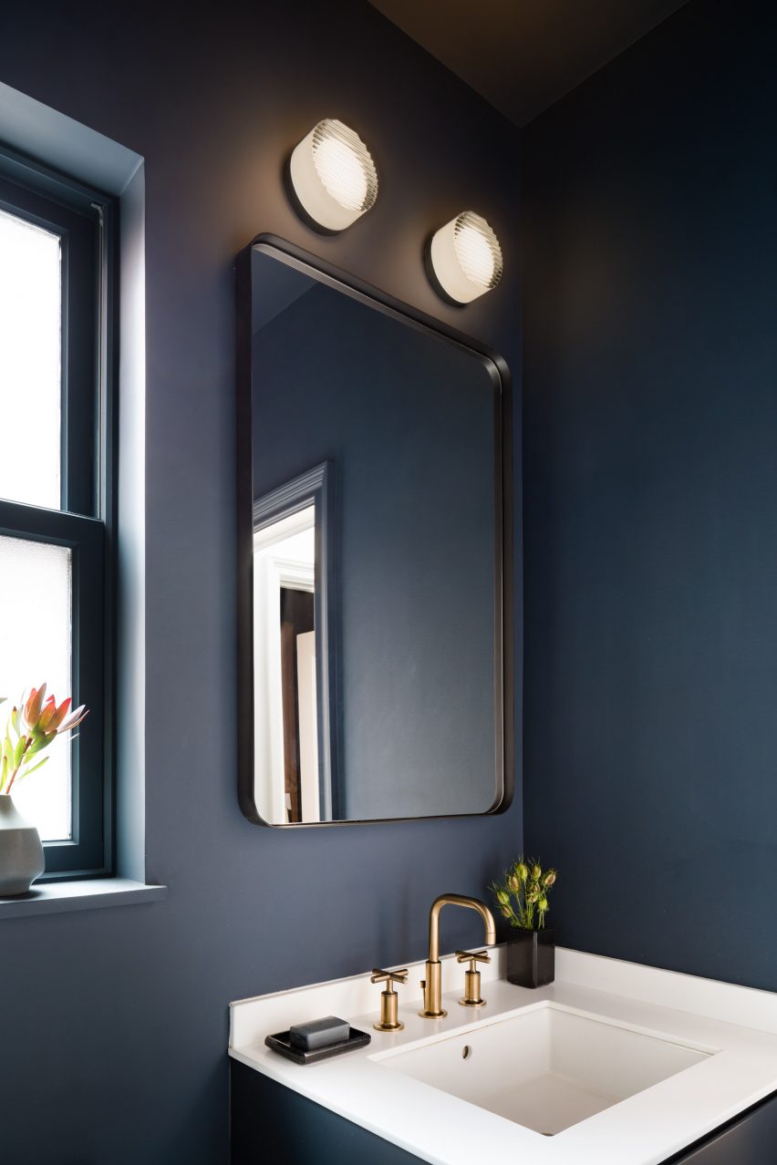
Overall, the Lenox Hill Residence comprises "simple geometries with just a touch of unexpectedness, for a classic but unique aesthetic", according to Attn Attn director Egbert Miles Chu.
New York City's notoriously small apartments often require creative solutions to maximise space. Others that have rearranged layouts to make the most of floor area and natural light include BoND, which renovated a "dark, divided" home in Chelsea, and MKCA, which used custom cabinetry to transform a West Village apartment.
Photography is by Amy Barkow.