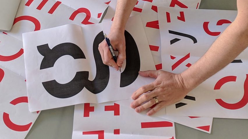
Researchers at Melbourne's RMIT University Behavioural Business Lab have combined design and psychology principles to create a typeface that helps students to remember what they have read.
The font, called Sans Forgetica – a pun on the font names Comic Sans and Helvetica, and the idea of not forgetting – slants eight degrees to the left and has gaps in the structure of each letter.
It aids memory by making it harder for people to read any text written in the font. Putting an obstacle to comprehension in the reader's way forces the brain to work harder to decipher the letters. This is the basis of the desirable difficulty principle.
"Sans Forgetica works by a learning principle called desirable difficulty, which is where an obstruction is added to the learning process in order to promote deeper cognitive processing which results in better memory retention," said Jo Peryman, chair of RMIT University's Behavioural Business Lab.
Faced with an unfamiliar set of characters, the mind seeks to complete the shapes, which slows it down. By dwelling longer on each word, the brain has more time to engage in deeper cognitive processing, which enhances information retention.
"Typical fonts are very familiar so we glance over them and no memory trace is created," said Janneke Blijlevens, a founding member of the lab.
"On the other hand if a font is too different, our brains can't process it and no memory trace is created either. Sans Forgetica lies at that sweet spot, where just enough perceptual rules have been broken to create that memory trace," she continued.
The team designed three fonts for testing, each becoming progressively more broken. In total 100 students came to the lab to take part in tests and a further 300 participated in an online experiment.
The results found that Sans Forgetica was the most effective at improving the amount of the text that the participant was able to remember, with an increase of seven per cent.
The font was created as a collaboration between the behavioural business lab and typographic design specialists from the university's design school, and draws on principles from both disciplines.
"This is the first time ever that specific principles from psychological theory have been combined with specific principles from design theory in order to create a font," said Peryman.
The font was designed with 16 to 17 year olds who have a heavy exam load in mind, but the researchers believe that it could also help people learning languages or elderly people who struggle with memory loss.
The various brands that have attempted to boost their image with the introduction of an attention-grabbing typeface can be see in this roundup of the ten best examples on Dezeen.

