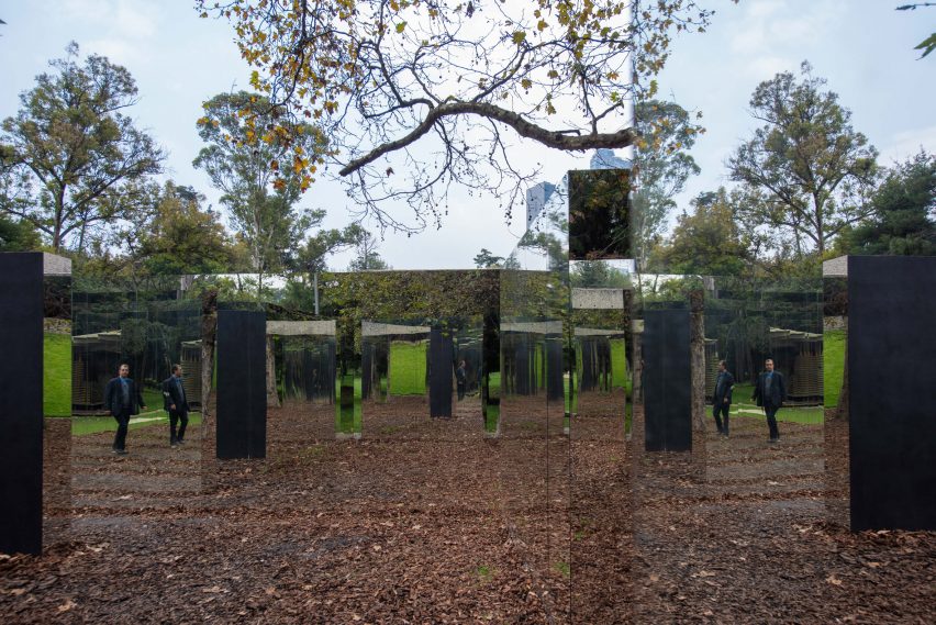
Trees, bark chips and visitors are all reflected in mirrors behind the severe black exterior of this pavilion, which Mexican architect Fernanda Canales created for this year's Design Week Mexico.
Canales' pavilion is built beside Museo Tamayo in Mexico City's Chapultepec Park, close to a path that runs from the art institution to the nearby National Museum of Anthropology.
Called Museo Abierto, or Open Museum, the structure was built for the Design Week Mexico 2018 festival to provide a place for pause at the intersection, where passersby can enjoy the surrounding parkland.
"The idea is to make a really public condition," Canales told Dezeen. "You don't have to buy a ticket, you don't have to make lines, it's open 24 hours, seven days a week."
Visitors are invited to meander between a series of intersecting, matte black walls that are arranged in a long and slender layout around existing trees. Inside, the installation is segmented into three patios, with a large mirrored portion forming the centre.
"Museums are usually closed spaces, and the important part of the museum is mostly the pieces, and not the spectator," said the architect. "We invert that idea: the museum is an open space where the participants are part of the exhibition."
In the reflective section, slender gaps in the walls offer glimpses to the park, while a large opening leads to a grassy slope beside Museo Tamayo. Benches built inside allow visitors to sit and rest.
Canales, who is based in Mexico City, left the walls of the two flanking patios completely black to draw a distinction to the mirrored areas.
"The outside is really closed off," she said. "It's a black, really shut off structure."
"When you're inside, where it's supposed to be enclosed, it's where the space opens up," Canales continued. "You enter the central area, the internal space, and that completely opens up and multiplies, and it takes the vegetation inside and the people outside."
The architect came up with the labyrinthine layout of the structure in response to a tight budget and timeline. The pavilion was designed in four weeks, and built in the following three.
The simple wall arrangement draws on the works of Mexican architect Luis Barragán and Portuguese architect Álvaro Siza, according to the architect.
But the materiality aims to draw a direct contrast with that of the paler Museo Tamayo, which was completed by architects González de León and Abraham Zabludovsky in the 1980s.
"It's a dialogue of opposites," said Canales. "One is monumental, the other is ephemeral."
"One is closed, the other is one is open," she continued. "One has a rough texture, the other is smooth. One is almost white, the other is black."
A pavilion is installed annually in the same location to coincide with the citywide Design Week Mexico event, which took place this year from 10 to 14 October 2018. Last year's was completed by Mexican architecture studio Materia, and took the form of a slatted, white concrete yoga hub.
Backed by both the museum and design week, the structure is seen as Mexico City's equivalent of London's Serpentine Gallery Pavilion and Melbourne's MPavilion.
Canales, whose black concrete Casa Bruma is on the Dezeen Awards 2018 shortlist for the world's best new building, joins a host of female architects commissioned for the similar projects in the UK and Australia.
Fellow Mexican architect Frida Escobedo's Serpentine Pavilion opened earlier this year, while Spain's Carme Pinós recently unveiled her MPavilion.
Photography is by Jaime Navarro.

