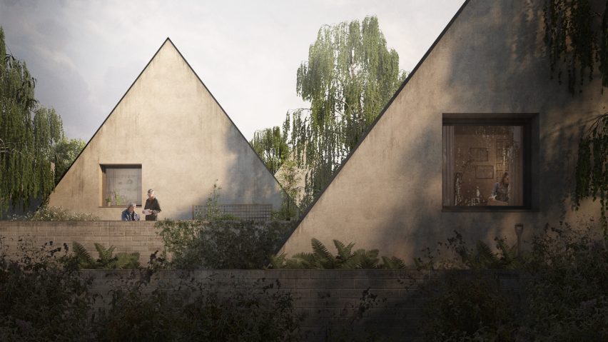
After architectural visualisers received a bad rap from Aaron Betsky and Es Devlin, Troy Hodgson defends his profession and explains why renderings don't always exactly match the finished buildings they portray.
As the cost of a full architectural education and qualification increases and the profession contracts, new careers and spin off industries are being forged on the periphery of architecture itself – linked and engrained in design, but divorced from the practicing of every-day architecture.
In practice we learn about design and we may learn to design – but we are also expected to rapidly understand the workings of everything from the detail of a door handle to the demographics of a city.
Stifled by this overwhelming expectation to be an expert in so many separate fields, at so many separate scales, it is easy to forget how to effectively communicate the core product of practice to our audience prior to its delivery.
Some of us find ourselves in practice becoming more engaged by this strain of communication than the creation of the product itself. This typically starts out by being "the one" who produces drawings and nice sketches, and further down the rabbit hole can end up working with 3D software to produce visualisations, either in-house, or moving to a specialist architectural visualisation studio.
Our work is sometimes blamed for the delivery of bad architecture
Yet our studios, and those of us who are visualisers (Render Monkeys/Photoshop slaves according to Aaron Betsky) often get bad press, and our work is sometimes even blamed for the delivery of bad architecture (by Es Devlin). So in the context of this press and Betsky and Devlin's comments, it is alarming clear that the role of the contemporary visualiser, or the work we produce, is deeply misunderstood.
From conception to completion of an architectural project, visualisers (in house or otherwise) are the one tasked with forging a path for the architecture to exist; we are the translators, communicators and facilitators.
We take multiple sources of raw architectural information, and from it sculpt snapshots of architecture understandable to an audience without the skillset to otherwise do so. Planners, investors and end users – they all rely on us to tell an otherwise abstract story.
For every "blue sky and balloons" utopian propaganda image, there are images where supposed less desirable elements take as bigger role in the frame as the architecture itself – puddled car parks, gritty backstreets and lustreless skies.
Why shouldn't architectural images be compelling to our audience?
Our images can embrace the patina and tapestry of real life, demonstrating relationships between proposal and actual place, acting as catalyst for dialogue between designers, planners and public.
Life isn't always perfect, but that doesn't mean it is any less rich or beautiful for it; practices have learnt that imagery can ditch happiness and stop obsessing over reality – instead focussing on firing the imagination with compelling and evocative imagery that distils the very essence of a scheme.
And why shouldn't architectural images be compelling to our audience? You would never expect your new car to deliver the youthful freedom the advert suggests, or your perfume to offer up a life of cinematic passion.
You accept that these things are projected ideas to conjure a feeling, to entice – but not represent how it actually, physically will be in reality. Why do we expect architectural visualisation to be any different?
Visualisation by its very nature can only ever represent an idea
Visualisations are now an expected commodity in architecture. Like photography, visualisation can reveal a moment in the architecture, framed and curated. Unlike photography however, which is the documentation of a finished product, visualisation by its very nature can only ever represent an idea, and ideas are always in flux.
Those of us who produce visualisations are craftsmen and craftswomen, just as much as the architects, joiners or builders who craft actual buildings are. Obviously therefore, just like those who craft on site, there are differing levels of quality on offer, and specific skills which each of us can apply to differing stages of a project – from abstract montages which demonstrate a concept, right through to photoreal marketing collateral for luring sales.
Some of us have moved beyond the glitzy, saturation that is expected of visualisation towards something more honest and appropriate for our time, but it is still naive to view visualisation as anything beyond an advertisement or design intent artefact.
Rather than blaming visualisers for sterile landscapes, or visuals for bad buildings, our work should be celebrated for its ability to package multiple sources of information to effectively communicate an evocative sense of place – but never beaten if it isn’t delivered that way.

