Snøhetta and Dialog's New Central Library for Calgary features vast wood-lined atrium
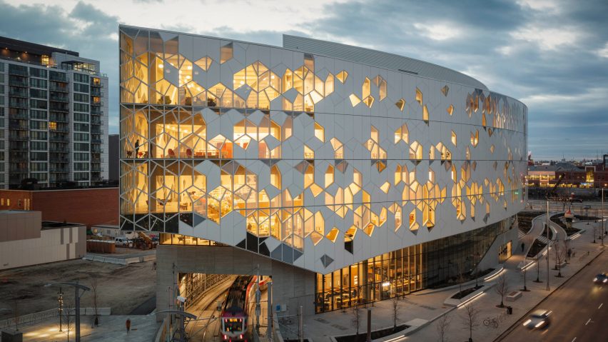
Architecture firms Snøhetta and Dialog have completed a new hub for Calgary's public library system, with a crystalline exterior and an atrium clad in timber slats.
The New Central Library, which opened to the public 1 November 2018, provides a larger home for the Canadian city's literature collection and more space for programmed events.
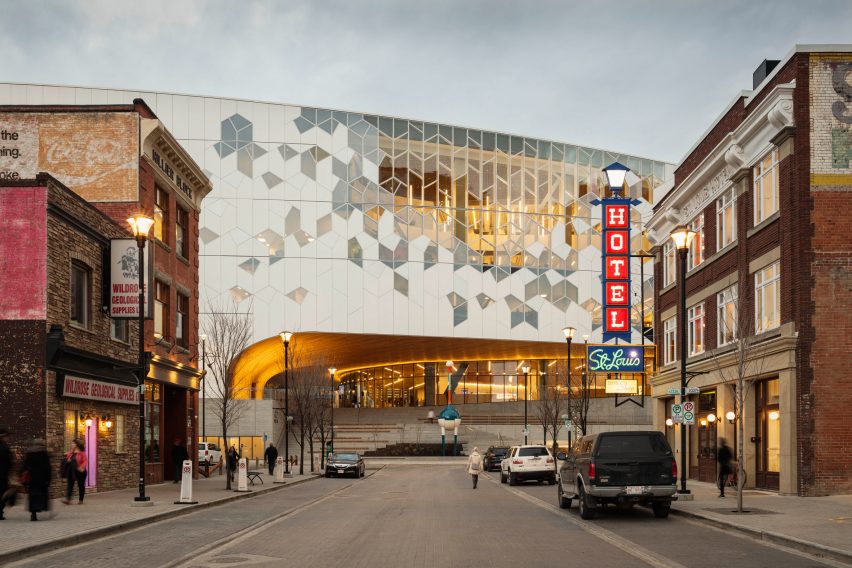
The library sits in a growing cultural area that includes theatres, galleries, and the National Music Centre completed last year.
Snøhetta, which has offices globally, worked with local studio Dialog on the project after winning a competition in 2013.
The shape of the 240,000-square-foot (22,300-square-metre) building is intended to evoke a chinook – a natural atmospheric phenomenon that occurs in the region, which results in dramatic arched cloud formations.
This arch shape is reflected on building's underside, as it spans up and over a raised public thoroughfare – providing a new connection between Downtown Calgary and the developing East Village neighbourhood.
Clad with steam-bent western red cedar, the arch curves in multiple directions above the building's entrance, which is raised substantially above grade to accommodate a light rail track that runs through the site.
The trains enter a tunnel beneath the "prow" of the building, and descend as they pass under the structure. This also necessitated a change in level from the library's entrance to the prow, which is negotiated by ramps inside.
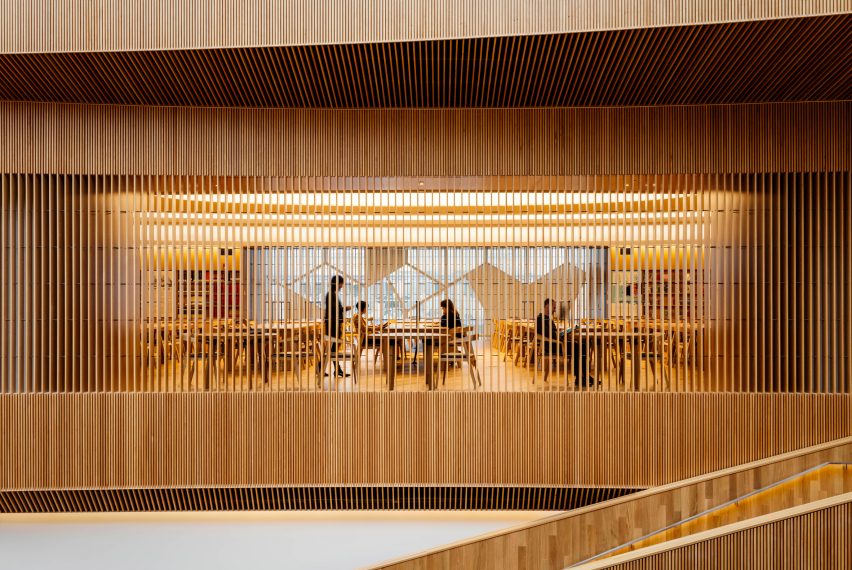
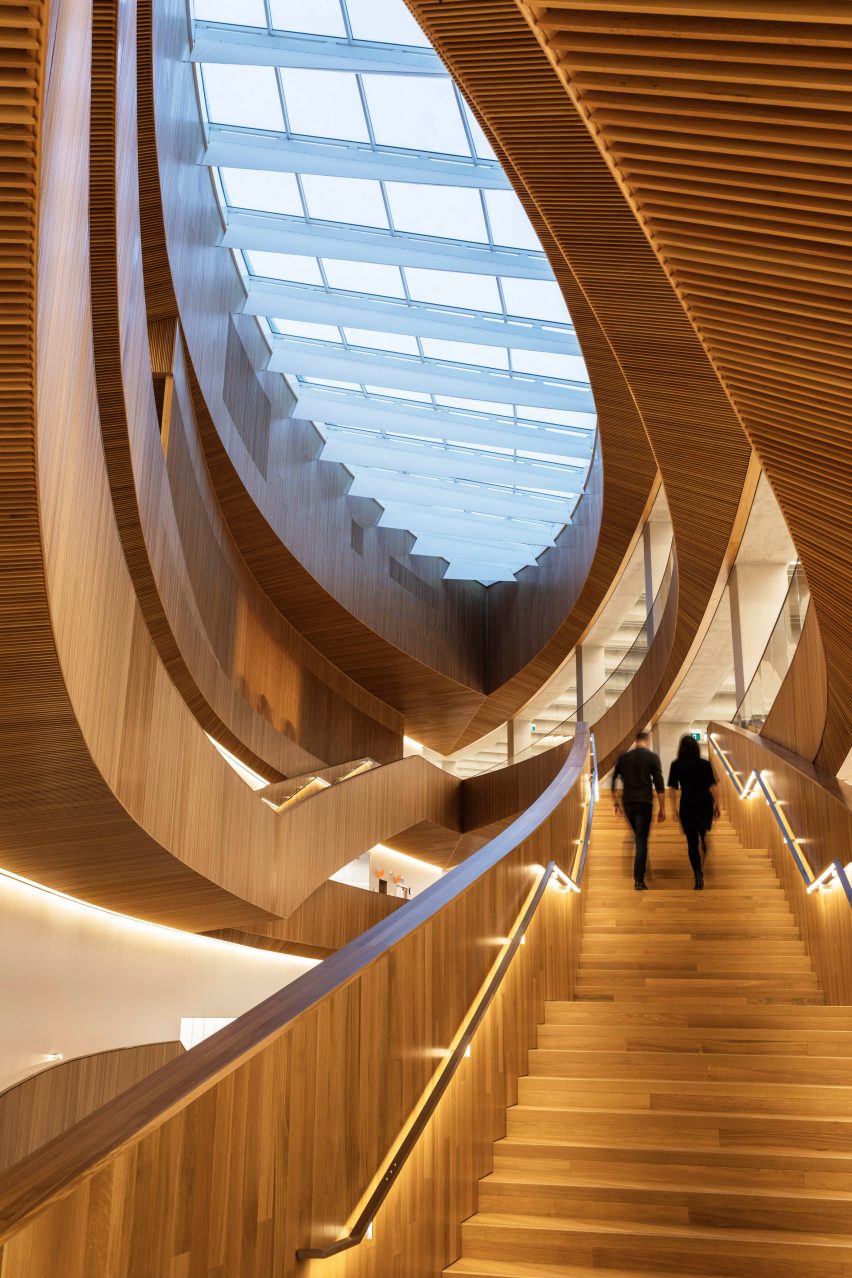
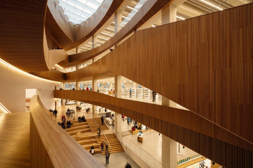
From the covered entrance, visitors arrive into a huge skylit atrium in the centre of the building. The space is shaped like an eye, or a canoe – a reference to Canada's First Nations people – in plan, and is lined almost entirely with hemlock wood slats.
Covering walls, staircases and balustrades up the roof, the material provides a warm aesthetic and helps to control the acoustics in the cavernous atrium.
"As soon as you come in, there's a feeling of a forum or a great collection hall," Snøhetta founding partner Craig Dykers told Dezeen. "A place where people from different groups can come together."
To one side of the entry is the access to an auditorium, which steps down to street level on one side of the train track. Above the line, stadium-style seating provides a gathering space, while the floor ramps gradually upwards on the other side.
At the end, in the building's point, a cafe and more bleachers offer a space for parents to sit and watch their children in the area dedicated to kids' books in front.
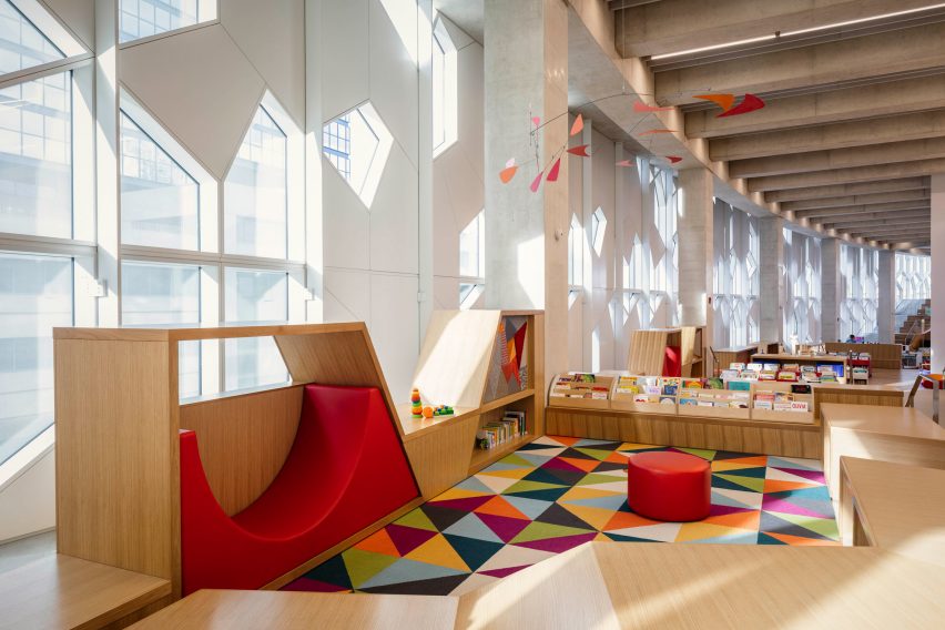
Also ramping and stepping gradually up, this space incorporates a series of areas with child-sized doors, ladders and furniture where they can read and play.
"Traditionally in larger public libraries, the kids are put in the basement," Dykers said. "We wanted them to be out and in the open."
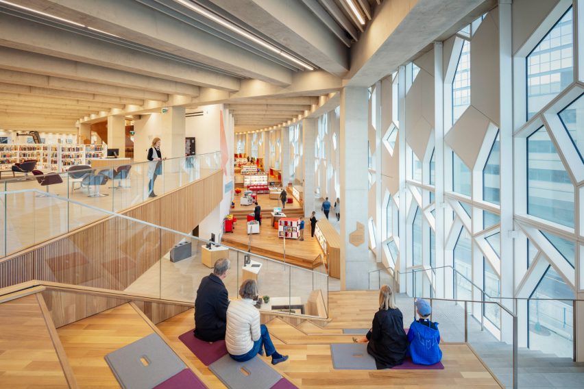
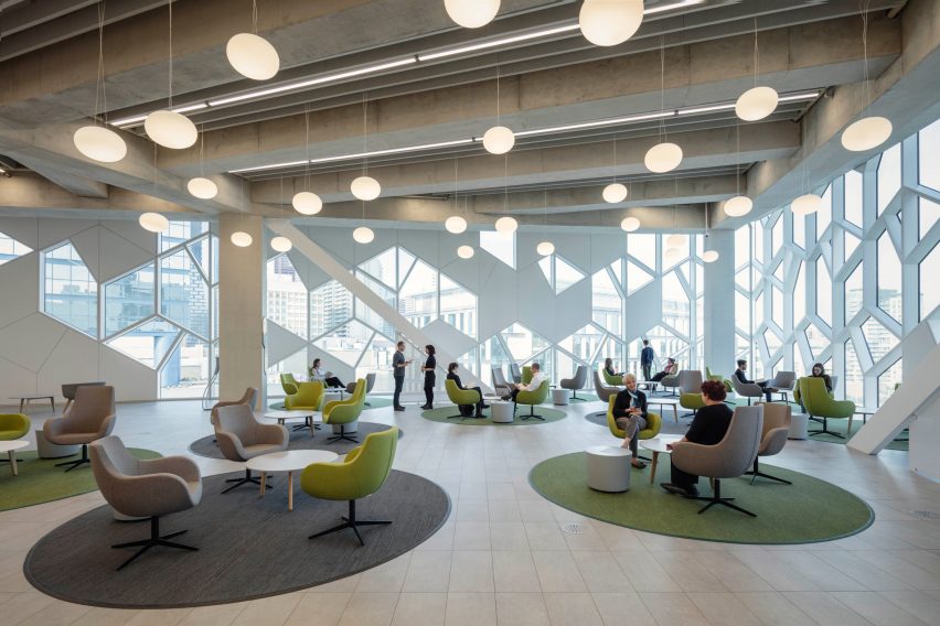
On the levels above, the floor plans are roughly split either by the atrium, so bookshelves occupy one side, and areas for quiet reading, private study, meetings and public computer access are located on the other.
Shelving is designed to be intentionally low so that most users can see over the top. This way, they can appreciate the rhythm of the structural concrete columns – laid out to evoke the stoas public buildings in Ancient Greece.
"It's an unusual approach to library design," said Dykers. "It's very contemporary and very ancient at the same time."
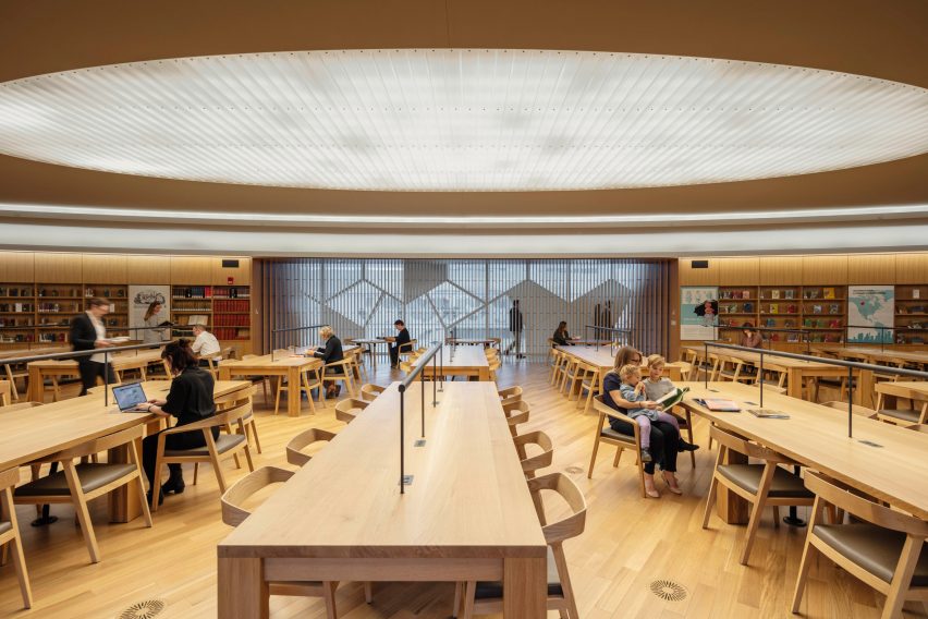
One of the quiet reading rooms upstairs is lined in wood, matching the atrium, with small single-seat nooks in the leftover spaces of the plan also surrounding by the slats.
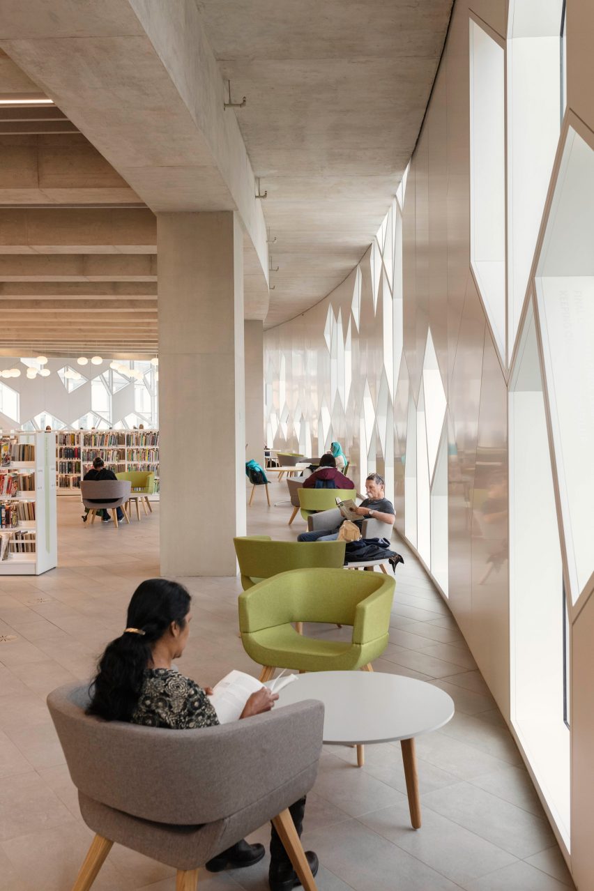
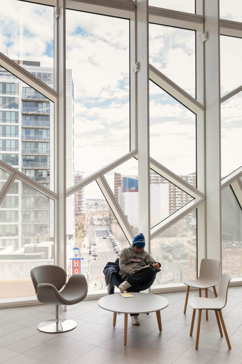
On the outside, the building is covered in glass panels of varying opacity from white to transparent. The modular frames create a pattern that looks like ice crystals, or little houses in some places, forming a motif that has been adopted as the branding for the library system citywide.
Along perimeter corridors, the window frames create shifting shadows throughout the day. At night, the exterior appears to disintegrate towards the prow, where the panes become increasingly transparent and the glow from inside gets more intense.
Another portion of the library building, opposite the main entrance, houses administrative offices and storage areas. This section is accessed separately at ground level, but connects to the larger mass via the upper levels.
Snøhetta joins a list of international firms working in Calgary – a city that boomed in the 1970s thanks to the oil and energy industries, but was hit hard by the global recession in 2008.
Foster + Partners' skyscraper The Bow, Arney Fender Katsalidis's Brookfield Place – now the city's tallest building – and BIG's partially complete Telus Sky tower have also contributed to the recent architectural renaissance.
"The city is having a tremendous rebirth, and we think that this library will be part of the catalyst to get people moving around," Dykers said.
Across North America, his firm has also completed the expansion of SFMOMA, the museum at New York's World Trade Center site, and an overhaul of Times Square.
Photography is by Michael Grimm.