Pastel-pink plaster walls surround a red quartz staircase leading into the Glossier flagship store in New York, which has opened hot on the heels of the beauty brand's new HQ in the city.
Located at 123 Lafayette Street in the city's SoHo neighbourhood, the three-storey Glossier Flagship is designed by local interiors firm Gachot Studios in collaboration with architecture practice PRO.
Glossier, founded as a direct-to-consumer beauty company by Emily Weiss in 2014, first opened up in a penthouse at the same address in 2016 so that customers could test and shop its products.
The success of this space led the brand to expand into the first two floors of the building. Additional features now on offer include catchups with Glossier's editors and the Boy Brow Room – a space dedicated to its famed product for taming eyebrows.
The 5,500-square-foot (510-square-metre) store is just a 14-minute walk from the brand's New York headquarters, recently completed by local architect Rafael de Cárdenas' studio Architecture at Large.
As with Cárdenas' design, the interior features pale pink shades and red accents that take cues from the company's rosy branding and pink bubblewrap packaging.
But the flagship design team also wanted to ensure the new space had its own quirks.
Among the key features is a pink-hued plaster wall that curves from the entrance on the ground floor to a set of red steps. Plasterwork is then shaped into a circular void over the first landing of the stairs, around a skylight situated 30 feet (9.1 metres) above.
"Transformative, interactive, and honest are the words that defined the design direction, but we found a way to be a little naughty and push the envelope," said Gachot Studios co-founder Christine Gachot in a project description.
"We introduced a complex, curved plaster detail; a finish that is barely achievable in high-end residential construction, running from the entry and up into the stair portal."
Handrails are embedded into the walls either side of the stairs, which are covered in burgundy and red quartz pebble.
Soft-pink plaster continues across the walls of the first level, while the floors are grey polished concrete.
The main space on this level is the gallery for displaying skincare and beauty products.
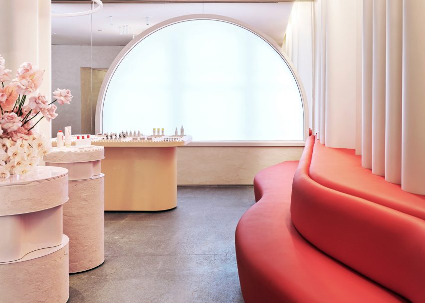
Windows that face the street are covered with thin white sheets known as Barrisol to diffuse light into the space, while the surrounding wall is covered in mirrors to make the room appear larger.
A spongey red sofa that looks like lips runs along one side, while the wall behind has a rippled effect.
"We used colour to highlight the brand experience, mirrors to provoke participation within the space, and millwork shapes that encouraged shared experience and community," said Gachot.
Products are displayed on cylindrical podiums huddled around columns. The tops are ribbed to match the lipsticks, mascaras, concealers and other products on show.
Customers are invited to try makeup and skincare in a separate Wet Bar, which features two sinks with products displayed in mirrored cubes behind.
These reflective shelves are "a subtle nod to the iconic Glossier packaging" according to the brand. One of the millennial-pink, boiler suit uniforms worn by staff is mounted in an illuminated frame behind.
Other details include a pair of pink paper pulp chairs designed by Thomas Barger tucked into a nook in the store.
There is also a pick-up counter for customers to collect orders packaged on the second floor, which are delivered directly to the station via a conveyer belt.
Glossier Flagship is one of the few permanent stores for the brand, which predominantly operates with pop-ups and online sales.
"For the first time, the diverse and devoted Glossier community has a space to gather in real life," PRO's Miriam Peterson told Dezeen.
A variety of online stores have created temporary spaces ahead of the holiday season. The Arrivals, Brandless and Floyd are among a host of brands that recently launched pop-ups in New York City.
Photography is by Jason Schmidt.

