"Calgary's New Central Library is an example of the best practices in modern monument making"
Why can't all public libraries be as warm and welcoming as Snøhetta and Dialog's New Central Library for Calgary, asks Aaron Betsky in this Opinion column.
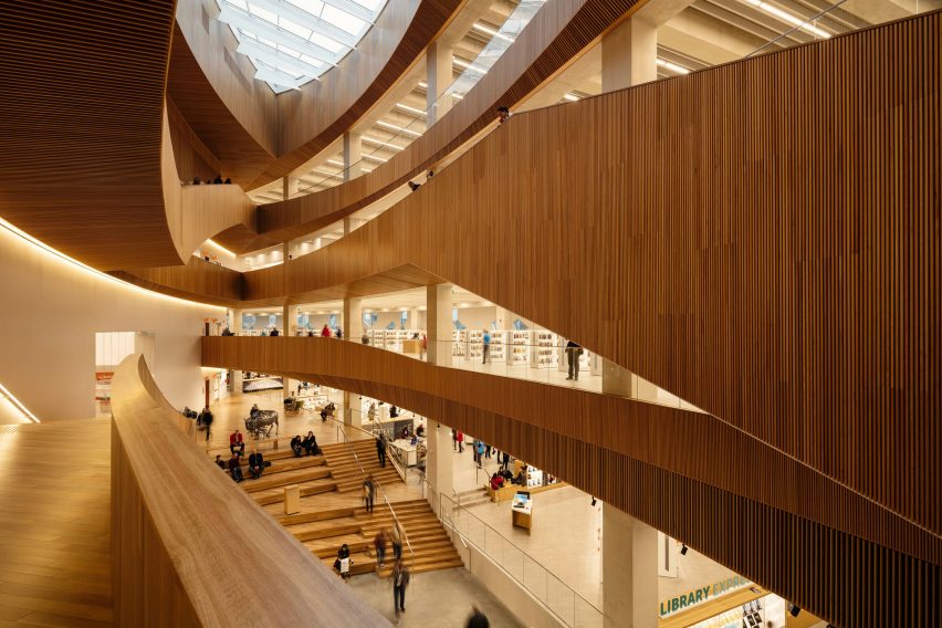
You walk in under a curving canopy of wood, slide into lozenge-shaped space where stacks and tables surrounded by reading people of all ages and sorts radiate away from you, and find yourself drawn up into the centre of vortex, an eye to the sky that leads you up along a grand stair, past level after level of more lounging and learning, peering at screens and napping, browsing and concentrating. This is the New Central Library (NCL) in downtown Calgary.
It is remarkable how, all around the world, libraries have become the main focus of civic activity. While they were always places that acted as access points to knowledge, they have in recent years turned into social centres, community halls, theatres, museums, and even a species of indoor park (this last function mainly of use to the homeless and socially disadvantaged), all rolled into one.

They have also become the most active and active structure in many communities, the one public building that defines and serves neighbourhoods or whole cities without charging you for a cup of coffee or waiting until you are sick.
Libraries, in other words, are what remains of the notion of a civic monument: a structure that embodies and fixes in place the aspirations of a community to be not just a collection of people, but a socially energised place that believes in bettering itself through its social, cultural and physical structures.
One of the most beautiful versions of these new community centres that I have seen in recent years
The NCL's design uses the elements that have become the standard building blocks for such "information access facilities" (the term "library" is really so last century) around the globe.
Combined with the quirks of its particular site to create one of the most beautiful versions of these new community centres that I have seen in recent years. What makes the design all the more remarkable is that it is not particularly innovative or different than that of other such structures.

The NCL is an example of what you might call "best practices" in modern monument making: put together well-tested elements, be sensitive to the site, and mould all of it together using the latest technology to create a beacon of culture that is imposing, awe-inspiring, all at the same time.
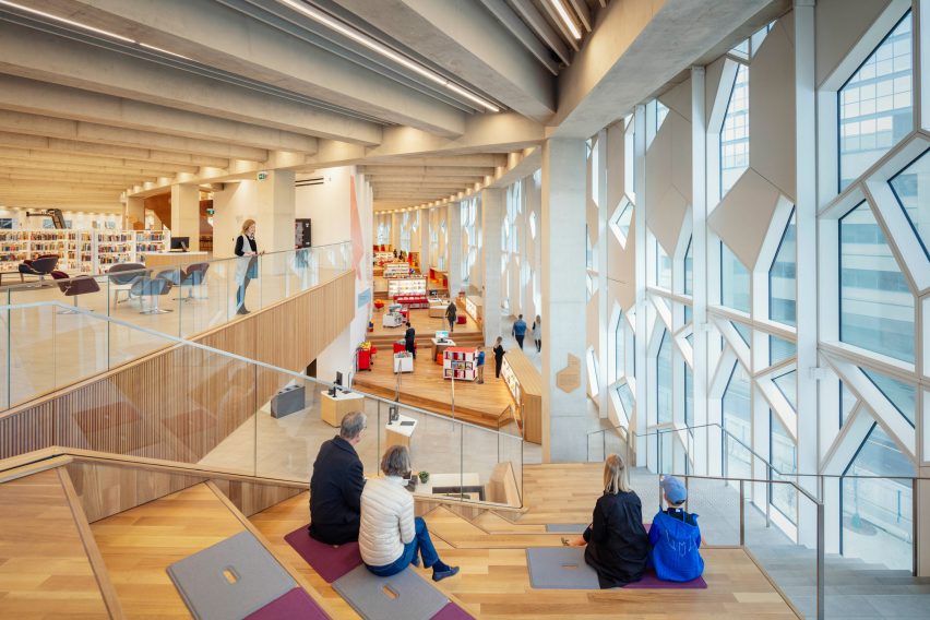
The standard elements the designers, Norwegian/American firm Snøhetta and local studio Dialog, use include a sharp and distinctive exterior; the soaring and sky-lighted atrium that is also a stair hall, from which you can see all the main levels; a broad and inviting set of steps and ramps under a sweeping canopy that invites you into the building; open stacks for at least the most often used books; cozy reading areas scattered around the space in such a way that you can either concentrate on your reading (whether digital or physical, as the whole library is also a point of access to those without connectivity) or on seeing and being seen; a formal reading room on the top level; and a stepped children's area filled with stage sets for informal readings and parent-toddler interaction.
The way the building comes to sharp edges at either end makes it all the more dramatic
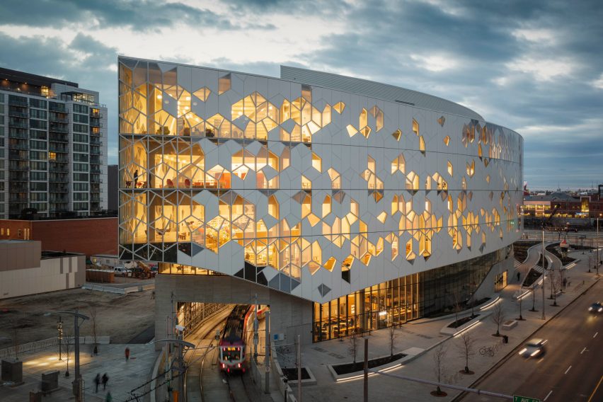
The particular situation the site offers is the result of the train tracks that run down the middle of Calgary's central business district. They emerge out of a tunnel that leads them in from the suburbs to the south of the city right at this site, and the curve they make as they turn into downtown defines the majority of the site's eastern edge – or at least in the manner Snøhetta have defined it.
They chose to pose the library over the tracks, leaving most of the remaining section open for future development that will help fund the institution's activities while merging the mainly civic core to the west with a newly developing residential neighbourhood to the east.
To resolve all of these forces into a coherent building, they then mirrored and reversed the building's curve for the western facade. The way the building comes to sharp edges at either end, one of them posed on concrete arches over the train tracks, makes it all the more dramatic.
Those facades, though elegant and inviting in their sweep, are also the design's weakest part, as Snøhetta decided to answer the limit to how many openings they could have (for environmental purposes in this very cold climate) by cladding them with an irregular polygonal pattern in which metal plates transform into glass panes towards the structure's northern edge.
It is the inside that really matters
While this let the designers make a skin that is more or less continuous, while also hiding the diagonal structure the bridging over the tracks makes necessary, the result is an object whose appearance has little to do with its immediate context. Any reference to snowflakes, the nearby Bow River's curves, or the distant mountains disappear when you see the harsh geometries of the endlessly repeated angles.
Luckily, those dynamic diagonals disappear at eye level, where Snøhetta sucked in the building's belly to create entrances covered with wood slats. From a distance, the structure also becomes more benign, its patterns melting into the site's welter of different buildings in brick, stone, concrete, and glass.

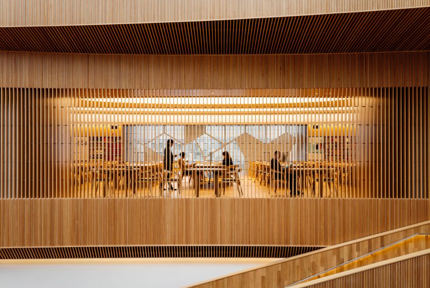
It is the inside that really matters. As much of Calgary's northern prairie life has to take place there for a majority of the year, that is as it should be. Filled with light and dominated by the curves, the library's accoutrements and details disappear into serviceable furniture and fixtures in a mode that is somewhere between Scandinavian Modern and an institutional version of Ikea.
The arrangements of elements, from the check-in desk to the sequence of stacks, is more or less standard, with necessary adjustments for the structure's geometry. This is a just a library, no more or less.
I wish this library was a prototype for the design of such structures all across the Americas
Yet the NCL is also a bubble, a sphere of civic comfort where almost everybody and everything is welcome. It is the perfect, well-behaved modern monument. It stands by itself, different than everything quotidian around it. It invites you in, while at the same time impressing you. It evokes your awe, and then lets you stay to make use of the services that every self-respective community should offer its citizens.
I wish this library was a prototype, in the manner of the Carnegie Libraries of yore, for the design of such structures all across the Americas. Perhaps some modern-day equivalent of that Robber Barron will endow those communities less socially minded and well-funded by natural resources (oil, in Calgary's case) to construct such community centres of elegance and subdued grandeur.
Photography is by Michael Grimm.