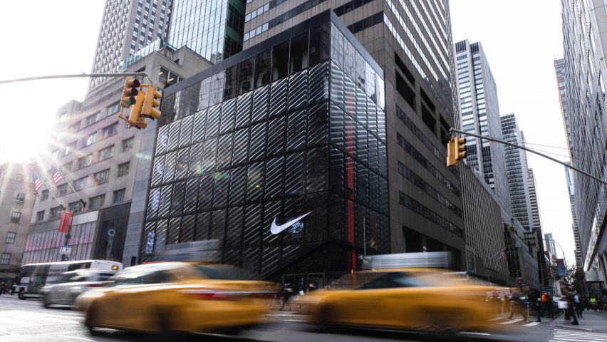
Nike's rippled glass New York flagship aims to disrupt "concrete canyon"
Nike's swoosh symbol and airbag technology informed the bubbly, slumped glass facade that encases the sports brand's new flagship store in New York City.
The design team at Nike transformed a 68,000-square-foot (6317-square-mere) building at 650 5th Avenue, on the corner of 52nd Street, into the store called Nike House of Innovation 000.

The American brand closed its main NikeTown outpost in Midtown to focus on the new store, for which it seized the chance to experiment with its architectural style, according to Andy Thaemert – senior creative director of global store design at Nike.
"We had the opportunity to do that at a scale that's rarely seen," Thaemert told Dezeen during a private tour of the flagship on 31 October 2018.
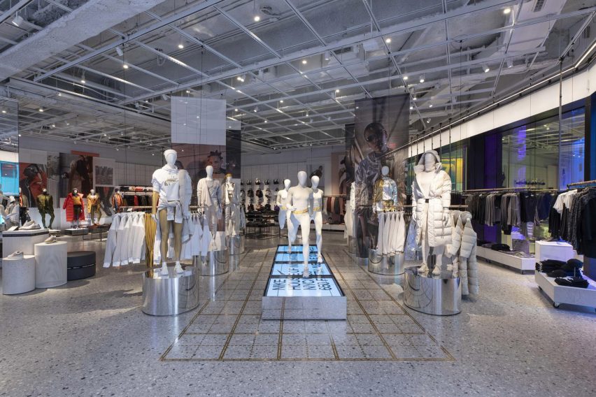
Thaemert, who led the Nike flagship project with the brand's chief design officer John Hoke, said that one of the main aims of the project was to distinguish it from the surrounding concrete structures in the busy shopping district.
"It's really a concrete canyon, it's really dense and heavy," said Thaemert. "The mission to disrupt, to distort, in a playful appropriate manner set the foundation of how we started to do the design."
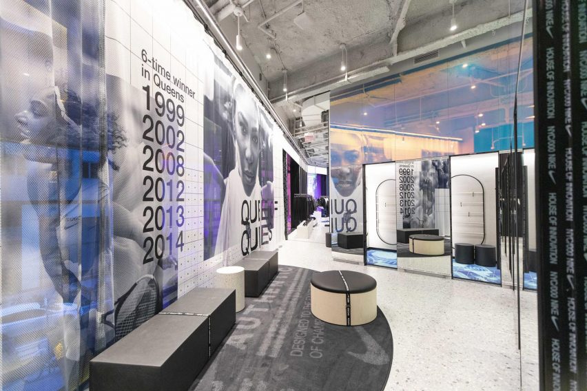
Blocks of slumped glass covering the building's exterior are traced with diagonal markings that follow the line of the brand's swoosh symbol, creating a rippled effect that blurs views inside.
"We looked into motion and architecture: the body in movement, being lighter and leaner," said Thaemert. "That idea around speed, blur and motion was the narrative idea that we had in our heads as we started to think about the building's skin."
The individual bubbles that appear across the facade are a "loose abstraction" of Nike's airbag cushions, used in the soles of sports shoes, according to Hoke.
He also likened a wedge sliced away from the corner of the building, creating the entrance, to the outline of an athlete's lifted heel before a sprint.
"It has a dynamism...it feels like an athlete," Hoke told Dezeen.
Inside, a staircase is positioned behind the glass facade, offering customers expansive views of the surroundings. Move up the six-level store, contrasting finishes are found on each level.
"Having as many floors like this, we wanted to what I call 'break the run-on sentence'... so we've transitioned from mood, feel, palette and tone," said Thaemert.
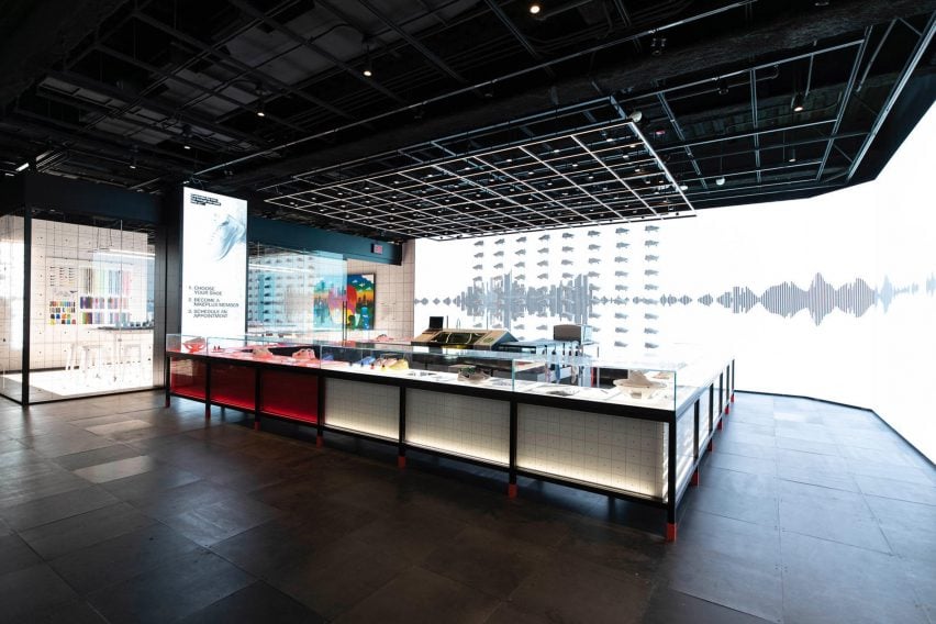
Chunky black existing beams puncture through the "dark and theatrical" Nike Arena on the ground floor, where the brand will showcase seasonal items and host temporary sculptural installations.
A service desk will allow Nike Plus members to book appointments with store employees, known as "athletes".
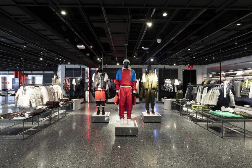
Above this level is the "light and airy" women's floor. This includes white walls and furnishings, and a pale terrazzo flooring called Nike Grind, which features colourful remnants of the brand's footwear.
Products are displayed and styled across sports disciplines in order to suit Nike's contemporary female shopper, which it has nicknamed "fenom".
"We served the 'fenom' as our muse – the young upstart who is going to be a ground breaker, game changer," Hoke said. "We shifted the 'ph' to an 'f' so it's a fenom."
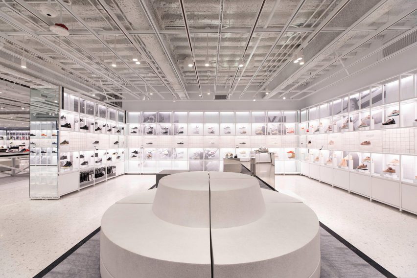
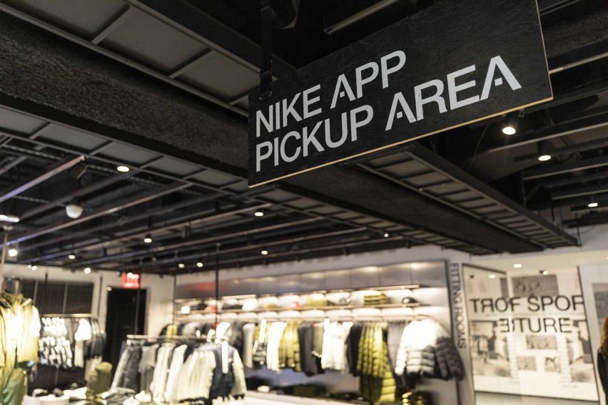
In the store, outfits dressing mannequins can easily be purchased through a "Shop the Look" feature. Merchandise is fitted with a QR code for Nike Plus members to scan with their app, either to buy immediately in their size or have the items sent to a changing room to try on.
Another updated digital aspects that Nike has included is the Nike Scan Pay, which allows app members to buy products on their phone and avoid long queues.
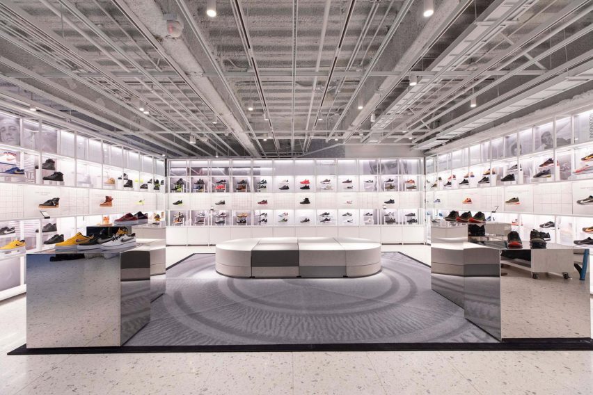
These tech-driven shopping features form part of the brand's wider ambition to disrupt the retail industry, also demonstrated at a temporary concept store that opened in Los Angeles earlier this year.
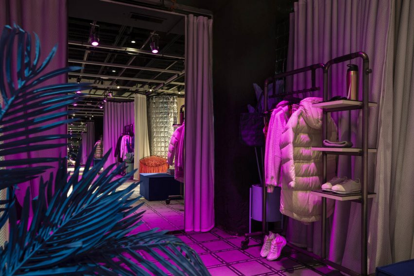
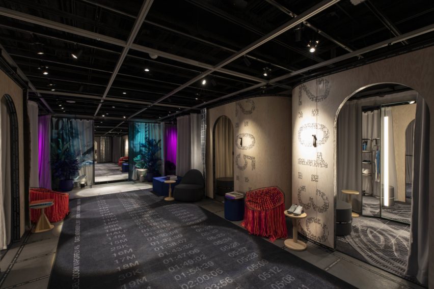
Fitting rooms on the women's floor have also been re-addressed as part of the project, including three custom light levels and a button to call an athlete. Colourful rugs are based on Nike's heat-matting process used to develop apparel.
The interiors transition to darker tones for the menswear floor and then back to bright on the third level, which hosts the Nike Sneaker Lab – billed as "world's best (and biggest) Nike footwear floor".
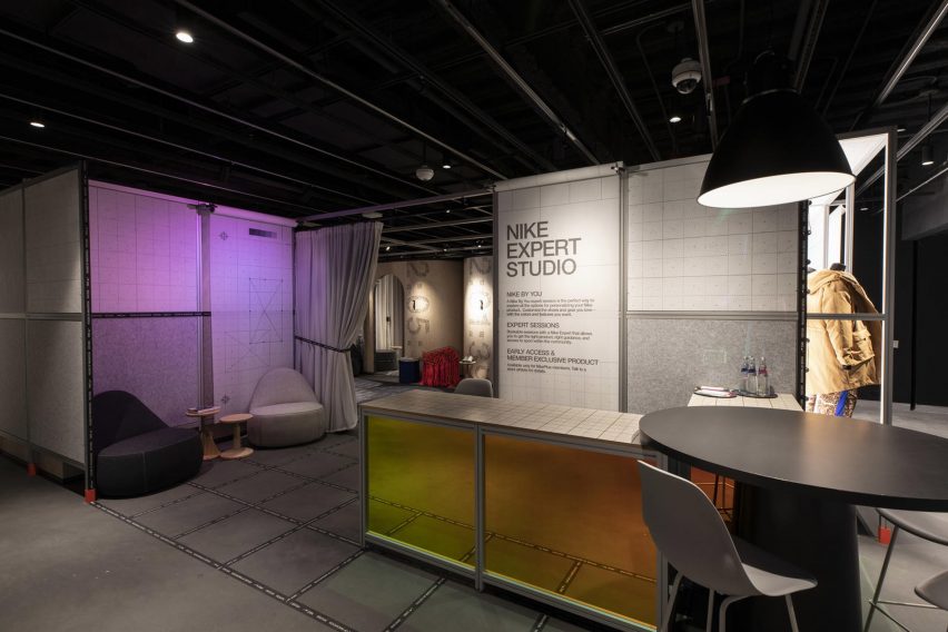
The final fourth level is modelled on a Nike design studio, and used for one-to-one sessions with Nike athletes to help customers to find suitable products.
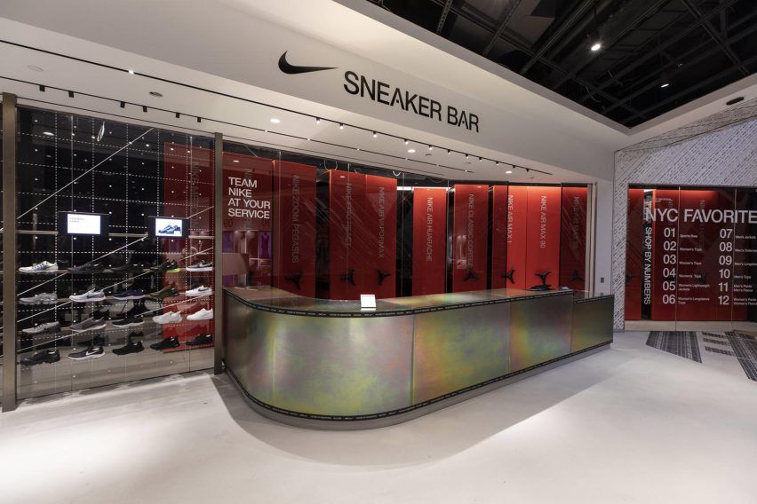
An elevator leads from here down to the basement, where the brand has created the Nike Speed shop, with many similarities to the Nike Live Melrose pop-up.
The Nike flagship forms part of the brand's new set of tailored physical retail experiences, which it plans to roll out internationally.
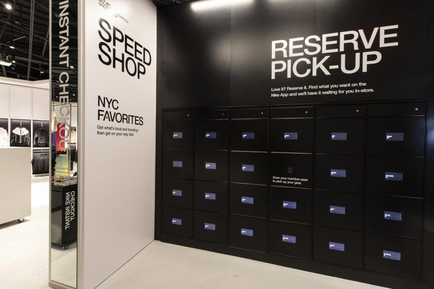
The New York outpost is its second house of innovation, following the Nike House of Innovation Shanghai 001, which opened last month, while a third is slated for Paris in 2019. The Tokyo team is also planning to open another Nike Live pop-up in spring 2019.
Vice president of Nike's global stores, Cathy Sparks, told Dezeen in an exclusive interview earlier this year that these updated retail spaces give the brand an edge over its competitors.
Photography is courtesy of Nike.