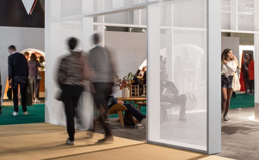
Rotterdam-based architects Studio Verter transformed the interior of the Kortrijk Expo centre for Biennale Interieur 2018, creating a "city" with a public square and meeting spaces.
Studio Verter created the scenography to mark the 50th anniversary of the biennale in Kortrijk, Belgium, the second oldest design fair in the world.
Its proposal for the biennale, which ran from 18 to 22 October 2018, brought together the halls of the exhibition centre by introducing the idea of an archetypal "city square".
This space spanned two of the exhibitions halls and was delineated by a white facade made from simple wooden frames and scaffolding netting painted white and punctured with regular openings.
"The facade is really the central element," Studio Verter co-founder Roxane van Hoof told Dezeen. "If you think about the city, this facade is the square and the other spaces are more like an active forum with different things going on and active elements that all have their own presence."
Inside the square, the studio invited other designers and artists to create landmarks that appeared alongside the design companies and galleries that were exhibiting.
These included a nine-metre-tall obelisk called Lumalisk by UK-based designer Adam Nathaniel Furman patterned with emojis and rainbow gradients. Furman described the obelisk as being "smashed through a kaleidoscopic blender of 21st century ornament until it becomes a kind of ancient-futuristic digital artefact".
Elsewhere a Design Kiosk by designers Chmara Rosinke invited visitors to sit and interact.
Artist Conrad Willems created a series of building-like sculptures, made from small blocks of stone in the shape of children's building blocks.
An installation of small concrete, mushroom-like stools called Brutiful were designed by architect Arno Brandlhuber for Belgian gallery Maniera.
Studio Verter's own contribution was a slim column made of galvanised steel tubes, on a podium made from oriented strand board (OSB) that was stained green using a garden furniture stain and then lacquered.
Other areas within the Expo centre were each given a different identity, including exhibition spaces partially enclosed with walls made from cardboard tubes and OSB, magazine towers made from MDF and a young designers showcase formed from concrete bricks.
"That's what we're always interested in, using these very cheap or almost disgusting materials, but making something beautiful," explained Van Hoof.
"The OSB of our podium is stained with this green stain and then one layer of lacquer and it looks like a totally different material. So we're using these very simple things."
Other spaces inside the 40,000 square metre Expo centre included a series of bars, each designed by a different studio as part of the biennale's awards program and featuring menus to complement the designs.
Cafe Gyproc by French designers Julien Renault and Paul Vaugoyeau featured a structure made from the construction material Gyproc, which was left exposed to show how the bar was created.
Geofood by Raams Studio recreated the arched, white forms of a Spanish cave house, while Bar Open by Matyas Molnar, Maos Smora and Christian Vajda used the idea of height, enclosing the space in tall black walls.
The Interieur Festival, a satellite event in the city centre that ran until 4 November, also included featuring predominantly new and upcoming designers, and this year saw designers take over spaces within a disused hospital.
Dezeen rounded up the five best up-and-coming Belgian designers at the Biennale, including Pierre-Emmanuel Vandeputte, Lauren Grusenmeyer and BedrossianServaes.

