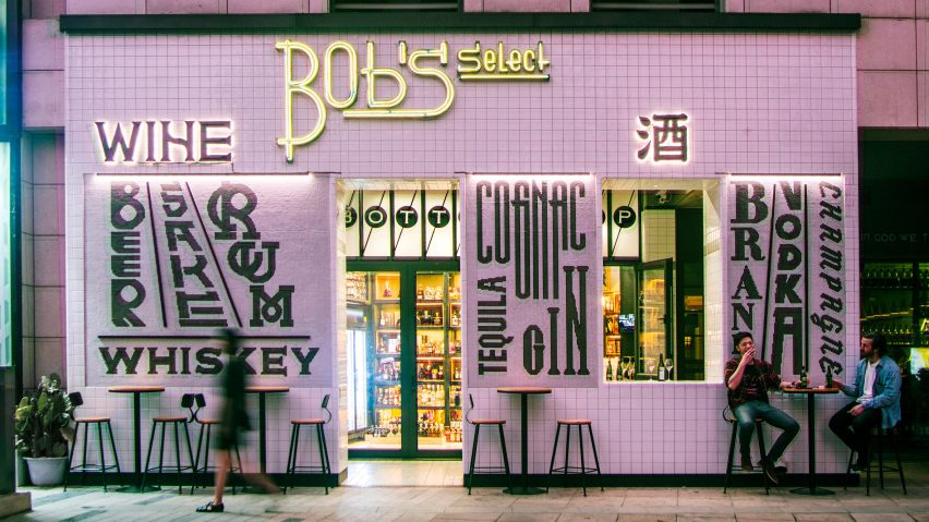
Bob's Select bar decorated with liquor lettering
Architectural studio Designreserve has created a liquor store-cum-bar in Sanlitum, Beijing with three rooms that display rare bottles in increasingly intimate settings.
The Bob's Select space is the flagship store for the affordable liquor retailer Bob's Wine, and is aimed at creating a community space in a busy shopping area.
Beijing-based Designreserve collaborated with graphic designer Zhizhi Liu to explore the traditions of communication in liquor culture and merchandise, by creating a facade covered with custom illustrated fonts.
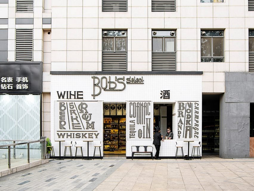
"Most shops on this street use random fonts for their signages, making the street front unappealing and boring," Designreserve co-founder Feng Yue told Dezeen.
"We wanted to create a strong visual identity. So we invited a graphic artist to design special fonts for each major alcohol type displayed on the facade. For us it is a kind of public art."
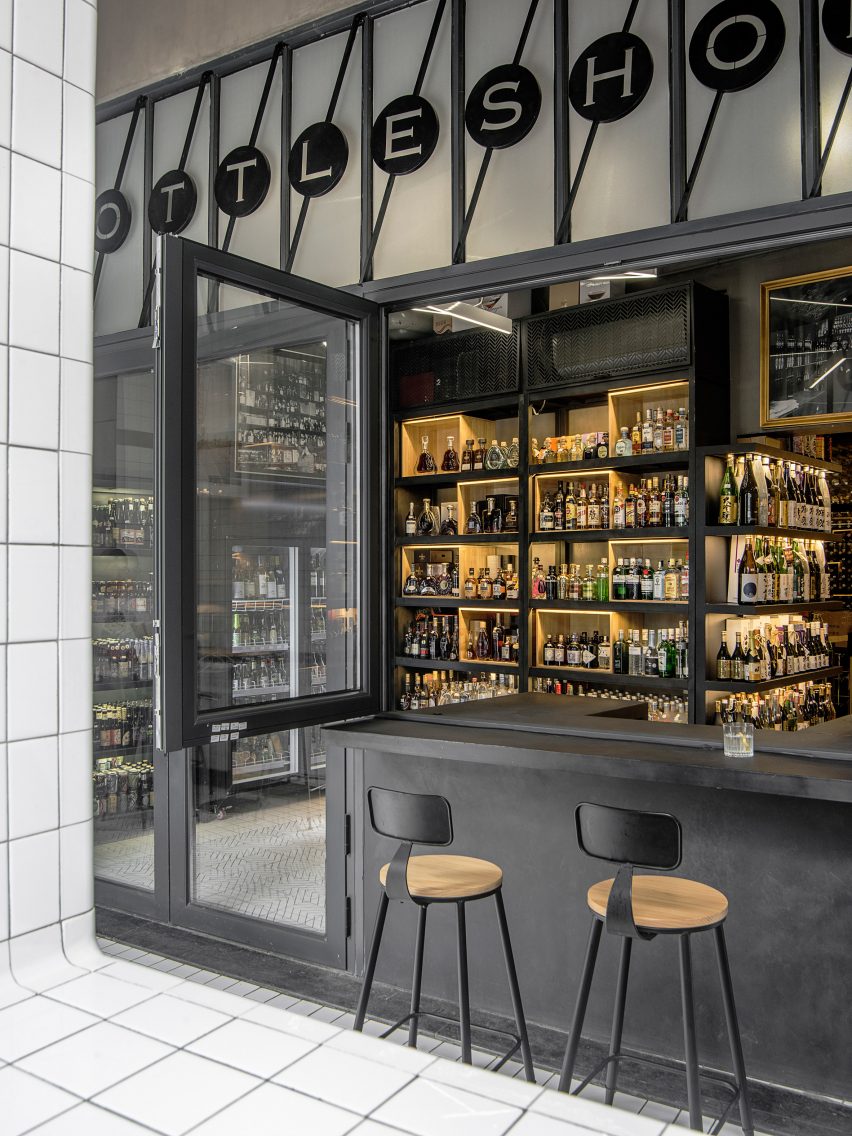
Bob's Select is the first store owned by Bob's Wine that integrates a bar into the retail experience. Although the store's footprint is small, Designreserve aimed to create a space that allows for easy bottle browsing as well as being comfortable enough to sit and have a drink.
"Previous shops of Bob's Wine are popular for their wide range of bottle selection as well as for their relaxing atmospheres, but the spaces were geared towards retail rather than bar," explained Yue.
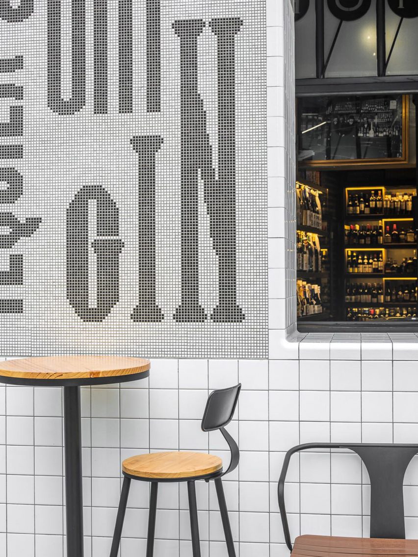
"For Bob's Select, we wanted to blur the boundary between liquor store and bar. We did this by rethinking the ways spaces are arranged, bottles are displayed, and even how the facade would be perceived by the passersby."
The sixty-square-metre space is divided into three rooms that transition visitors from the public domain to a more intimate "hideout".
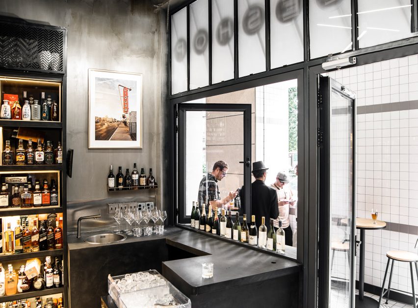
The first room acts as an entrance area and combines a covered inner corridor space with large openings and outdoor seating that link Bob's Select to the neighbouring shops and the plaza beyond.
Glossy white tiles wrap the countertops, inner and outer walls and the floor of this first space. These tiles reflect nature light around a once-dark and under-utilised corridor, transforming it into an inviting sociable space.
The second room is designed to simulate a neighbourhood corner store and popular beer and spirit stock are displayed in a mini bar on the inner facade.
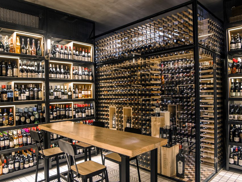
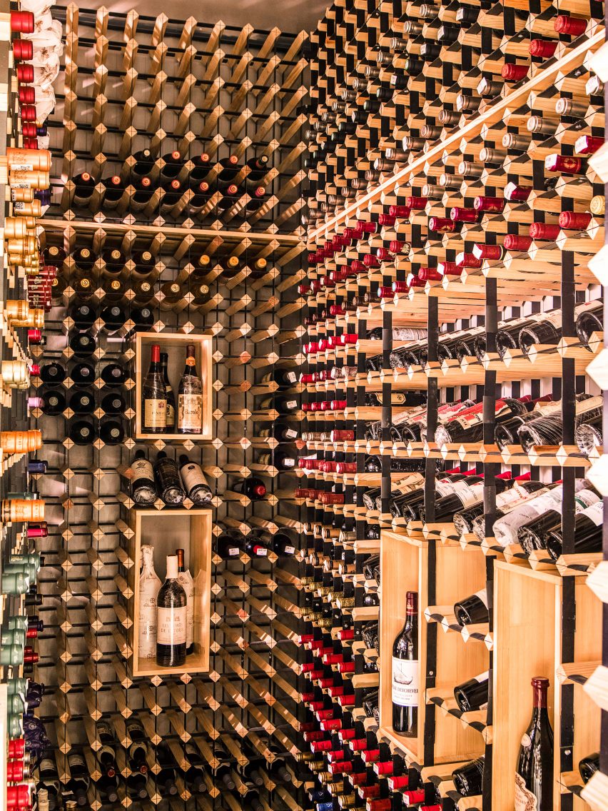
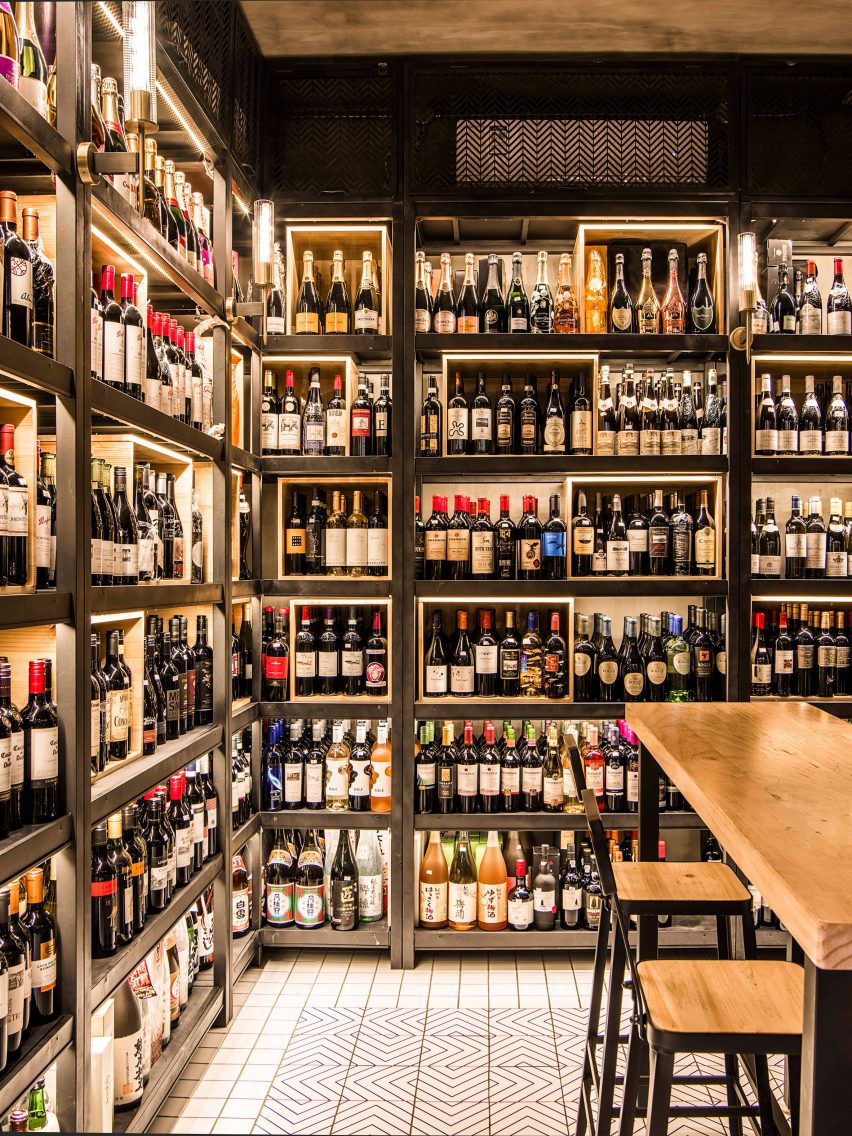
Rare bottles of wine and whisky are reserved for the final room, where dim lighting creates a salon-style atmosphere for slow browsing and more expensive drinking. A glass vault inside this third room contains the most exclusive vintages.
"Experience is the key determining factor for the success of retail spaces," said Yue. "Therefore, our job as designers is to create spaces where people feel inspired and hopeful that city life can still be fun."
On the wall of the final innermost room are a selection of historic photos that present a brief history of modern liquor merchandising. Designreserve chose these images to show that the culture of drinking is linked closely to bottle stores.
Designreserve was founded by Lydia Song and Feng Yue in Beijing, and also has a studio in Silicon Valley, California. The studio focuses on creating high quality spaces that promote urban culture.
The studio has previously worked with a local Beijing craft beer to create a tap room and is currently finishing a gin bar in a historical Hutong area.
Zhizhi Liu is one of the first Chinese graphic designers recognised by the Alliance Graphique Internationale (AGI) and Tokyo Art Director's Club. He has collaborated with Designreserve on previous projects.
At a tea-themed shop-cum-bar in central London, which serves hot drinks by day and alcohol-infused tipples at night, Russell Sage Studios looked to the crops of Bangladesh to inform the rich-hued interiors.