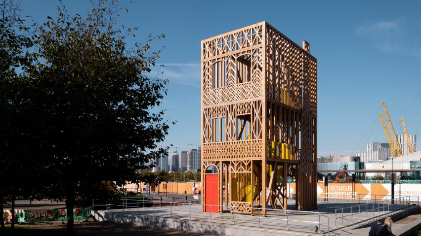
Studio Weave has unveiled a pavilion in the form of a "typical terraced house", offering views over the construction site of a new design district on the Greenwich Peninsula in London.
Named 33, the number of the house Studio Weave director Je Ahn used to live at, the three-storey pavilion is built in the shape of a terraced house, complete with a bright red door.
The design references the housing that covers much of London, and the structure also stands near a row of surviving Georgian worker terraces on River Way. But instead of typical brick walls, 33 comprises a decorative lattice of timber elements.
"The project was conceived under the theme of 'what home is'," explained Ahn, who is also a judge of the inaugural Dezeen Awards.
"It celebrates the evolution of the area as a creative community providing new homes, jobs and neighbourhoods near the River Thames," he told Dezeen.
The stripped structure of the single terraced house is built with Douglas fir from forests in the UK, joined together with timber pegs.
"Thirty-three echoes the proportions of a historical terrace dwelling, mimicking window, door and chimney segments yet introducing a contemporary twist in the form of intricately patterned stud-work," said Ahn.
"These patterns have a structural purpose whilst also suggesting broader cultural associations – in particular questioning the meaning of home in contemporary London, where terraced houses are still the dominating residential typology associated with the idea of home."
Within the timber terrace, a bright yellow steel staircase allows visitors to climb up inside the pavilion to get views of the a new housing development that is already under construction.
"Acting as the destination for visitors travelling down Phoenix Avenue, the pavilion is both a viewing platform for contemplating the construction of the neighbouring design district and an event space for a variety of activities," said Ahn.
Throughout the pavilion, graphics on the floor – coordinated by Hato and illustrated by Jay Cover – show typical items of furniture that would be normal in a home, such as tables and chairs, and a desk.
On the ground floor, these illustration extend out from the pavilion to form a "garden".
"With illustrations that evoke the personal occupation of the home, extending into a 2D drawn 'garden', visitors can discover and take delight in everyday domestic stuff that reveals how Londoners live today," added Ahn.
Studio Weave has completed several pavilions across London. The most recent, which is also near the River Thames, contains a raised garden within a water tank.
Photography is by Jim Stephenson.
Project credits:
Architect: Studio Weave
Client: Now Gallery & Greenwich Peninsula and Knight Dragon
Graphic design: Hato with Jay Cover
Structural engineer: Timberwright
Main contractor: Timberwright

