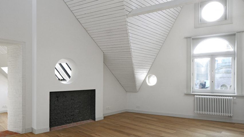
Antwerp-based studio Bovenbouw has combined three 19th-century buildings on the city's main shopping street, creating a new residential development boasting sculptural openings and coloured marble details.
Located at the far end of Meir, the busiest shopping street in Antwerp, the project brings together a trio of historic buildings that have shops at ground level.
Bovenbouw won a competition organised by the city to combine the buildings above shop level, creating eight new apartments across four storeys, while preserving the original facades.
"The buildings are from the late 19th-century and were in a very bad condition, to the point that roofs were leaking, which led to some wooden floors being unsafe to walk on," explained Bovenbouw founder Dirk Somers.
"We adored the facades and were intrigued by the diversity of figures and motives in the eclectic architecture," he told Dezeen.
"The interiors to the contrary were very disappointing in comparison, rather mediocre. We liked to think of a project that would bridge the gap between the decorative richness of the outside and the dull inside."
Each new apartment straddles half a floor of the central building and an entire floor of one of the buildings on either side, covering around 100 square metres.
The architects chose to retain some of the original internal structures like fireplaces and add new openings around them to complement the original facades. The result is a series of spaces that each have their own unique plan and appearance.
To guide their approach, the architects looked to 19th-century design ideas. They chose to develop each apartment through a method of association and improvisation, rather than try to make them all consistent. Somers described their approach as "unity in diversity".
"We approached every room with an open mind and looked for the opportunities that were there. Sometimes nice ceilings of chimneypieces could be retained, elsewhere we changed the configuration more thoroughly," he said.
"The connection to outdoor spaces steered the way living spaces were organised (lateral versus perpendicular). Formally we developed an array of strategies and motives that were used selectively."
Each apartment shares the same wooden floors and gypsum surfaces, with herringbone flooring used in the main spaces and encaustic tiles in the hallways.
But a series of different motifs were deployed to introduce a different character into each space, including interior windows, variations of the treatment of the original chimneys, enfilades (a series of rooms with aligned doorways) and coloured details on the ceilings.
"We embraced the conflict between the idea of an open connection between rooms and the chimney being an obstacle in doing this," said Somers.
"By cutting in the chimneys, or just next to them, more transparency was made but without losing their decorative role. Some new openings correspond to the facade composition, repeating round openings, or bringing the scale of a bay inward."
In some apartments, small circular openings are punched into the walls to create a sense of connection between different spaces. Existing marble details are combined with newly added pieces in different colours to emphasise some openings and surface transitions in different spaces.
One bathroom on the second floor features coloured tiles, as well as folding screens and storage made from brightly tinted wood.
On the fifth floor, the angular, slatted wooden roof juts down into the living spaces, while the shower room of one apartment is nestled into a turret.
"The difference in character responds to the difference in the elevations and the section," said Somers. "We gave the attic a different regime, more lofty and a bit more elementary, in respect for what an attic always was."
The buildings are owned by AG Vespa, a public company set up to help the city manage its real estate and major projects, and the project is the first rental development of its kind for the organisation.
"AG Vespa can charge very high rent for the commercial ground floors, while the upper floors have far less value. Like in so many buildings on the main shopping street, the upper floors are left empty," explained Somers.
He said that, as a result of the project, the amount of inhabitants on the Meir increased, "which is quite unusual".
The Leystraat project completed in 2017, and was named as one of the nominees for the EU Mies Award earlier this month. Named after architect Mies van der Rohe, the prize is granted to the best new contemporary architecture project and to an emerging architect every two years.
Elsewhere in Antwerp, Belgian architecture practice DMVA recently turned a three-storey 17th century house into a hotel just 2.4 metres wide.
Photography is by Filip Dujardin.

