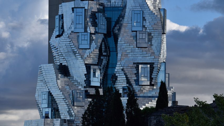
In this week's comments update, readers are critical of a reflective tower in France designed by Frank Gehry and a pixelated skyscraper in Bangkok by Büro Ole Scheeren.
Faulty towers: images have been released of the Luma Arles complex in the south of France designed by Frank Gehry, which is scheduled to be complete in 2020, and readers are less than complimentary.
"Dear Lord, what have the poor people of Arles done to deserve such a dreadful thing? Visual hell," commented Andrew.
Marc Sicard was equally dismayed: "I had some hopes when I saw the first images some years ago, but alas. Such a waste of money, resources, space, such a poor understanding of the place."
"Looks like a haunted house on the front, and a boring building on the back," added Marco Sosa.
Thenicolas agreed: "It's like a render stuck halfway."
One reader could see the positive side though:
What do you think of the tower? Join the discussion ›
Sin city: Danish bicycle brand Biomega has designed its SIN electric car to be an affordable and sustainable mode of urban transport. But commenters aren't convinced.
"Obviously the creator has never drove a car. Dead angles everywhere," observed Traian Musatescu.
Mark shared the sentiment: "Those seats look mightily uncomfortable. A square steering wheel? That's so Austin Allegro circa 1977."
"It's a sin they pretend people will pay to be uncomfortable, exposed and cold," replied Jean Claude.
Frank Mobley disagreed though, exclaiming: "Love it. Everything the new Land Rover isn't and bravo for it."
This reader had a different brand in mind:
Do you think the SIN electric car is desirable ? Join the discussion ›
Out of focus: Büro Ole Scheeren's 77-storey MahaNakhon skyscraper in Bangkok has completed, but it seems commenters are growing bored of pixelated buildings.
"I'm as bored as everyone else with this geometric/pixelated conceit as an excuse for a design concept," said HeywoodFloyd.
Simon Gauthier agreed: "I personally find it boring. Looks more like death than life to me, with its cold glass and steel cladding."
"Too many buildings try to look like pixels. Are they trying to stay smartphone relevant?" asked BumpOfChicken.
"Not sure if this makes it good architecture, but I think this is an excellent, if not the best, example of pixel-architecture," replied Rd.
This reader made a poignant point:
Are you bored of pixelated buildings? Join the discussion ›
50 shades of grey: readers feel melancholy having seen images of Crematorium Siesegem in Belgium, which Kaan Architecten has recently finished with grey marble and concrete.
"Very bleak and depressing," said Sarah.
Reich Beich elaborated: "Definitely austere."
"It does the opposite of what it's trying to do the opposite of," added Alex.
"Needs a few funeral clowns," joked Jb.
This reader was more focused on logistics though:
How do you feel about Crematorium Siesegem? Join the discussion ›

