Snøhetta updates proposal for Philip Johnson's AT&T Building
Snøhetta has revealed an updated proposal for the overhaul of Philip Johnson's AT&T Building, after a major backlash against its initial scheme resulted in the postmodern tower gaining landmark status.
Johnson's postmodern AT&T Building was awarded landmark status earlier this year, sending Snøhetta's controversial renovation plans for the Midtown Manhattan skyscraper back to the drawing board.
Since the landmarking, the architecture firm has worked on revising the scheme to meet approval from New York's Landmarks Preservation Commission (LPC).
Revealed 4 December 2018, the updated design scraps the original proposal to replace part of the masonry building with large expanses of glass, which triggered the outcry in the architecture industry, and instead aims to "preserve and revitalise" Johnson's existing design.

"We're leaving the bulk of the building alone," Snøhetta co-founder Craig Dykers told a group of journalists during a presentation of the design on 29 November 2018. "We're not changing the iconic identity, and the pediment that everyone is familiar with will stay the same."
"We think it will be transformative without stepping on the toes of the people who think there are important components we need to respect," he added.
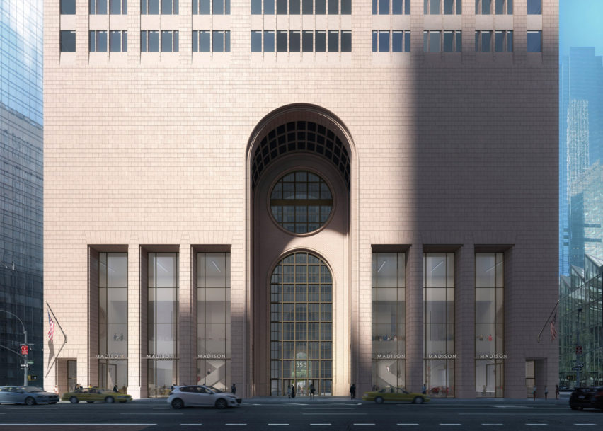
Snøhetta has now proposed restoring and sprucing up the existing brickwork, and offered a more subtle approach towards the masonry Madison Avenue facade, and the gridded glasswork that fills the main arched opening at the centre of the building.
The six 60-foot-high (18-metre-high) openings running along the front will be stripped of the black-painted glass, which has filled the openings since Gwathmey Siegel Kaufman made updates to the building in the 1990s.

As Johnson originally designed these to be open, Snøhetta would fill the openings with slender mullions to make them as transparent as possible. Other amends to the ground-level areas, which will be occupied by shops, include pushing out the external wall that runs down the shorter sides to meet street level.
Snøhetta's project involves updating the empty retail level and the office spaces in the 647-foot (197-metre) tower – also previously known as the Sony Tower, but now named 550 Madison.
In order to accommodate the growth of occupation – expected to rise from 800 to 3,000 – existing elevators in the multi-tenant building would be replaced with larger ones. These would be rotated to create a window to the patio at the rear of the building, so that it can be viewed from the street.
This intervention forms part of Snøhetta's plans to turn this glazed atrium into a large new garden, which it bills as the "biggest outdoor space in Midtown" that would be free for the public, complementing the nearby small Paley Park.
"We really pushed hard to make a public space that is unlike any other space in the city," said Dykers, who hopes the new feature will help swing opinion during the LPC review.
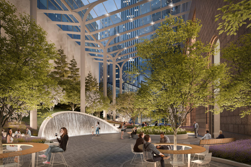
To achieve this move, the firm plans to rip out the curved glass shell currently covering the space and annex buildings to create more room. A new white steel cover would be added in, featuring an "airplane wing-link shape" that parts in two just off-centre.
A series of areas would be located across the patio, marked by patterns on the flooring, which Snøhetta designed to draw on the circle motif often found in Johnson's designs.
Among these different areas are a hearth, which will be heated in the winter, a "living room", and a "water wall" to control the acoustics in the space. Seating would also vary, with some fixed and others movable.
Vegetation, including 42 new trees, would fill the space covering over the car park entrance and truck dock, to form a buffer along the rear wall. It is hoped that this will form a welcome habitat for wildlife living in and around the nearby Central Park.
Other updates to the 34-storey tower would include bolstering its environmental factors to meet LEED certification.
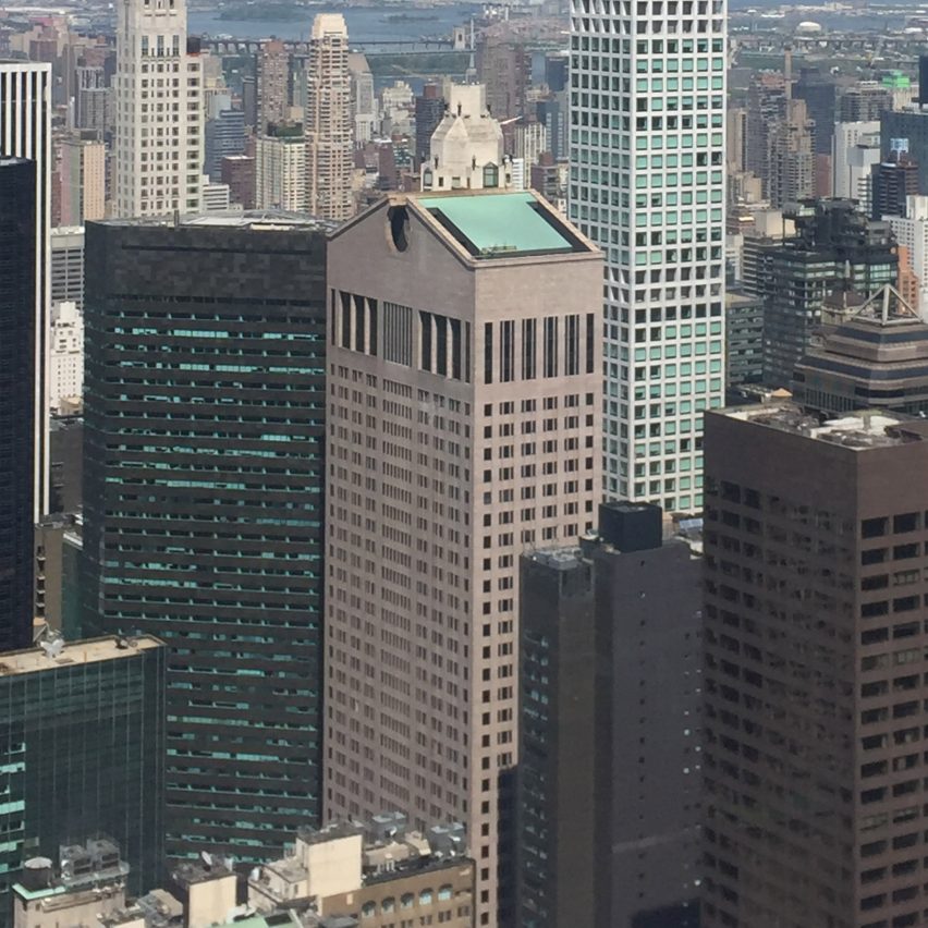
Johnson and partner John Burgee completed 550 Madison in 1984 for American communications giant AT&T, and the building is recognisable for its reddish brickwork and "Chippendale" roof line. It is regarded as the first skyscraper in the controversial postmodern style, which emerged in the late 1970s as an ideological reaction against the utopian ideals of modernism, and often splits opinion.
Dykers admits that he wasn't surprised by the major backlash Snøhetta faced following the unveiling of the first proposal last year. The outcry included protests and the move to landmark the building, which was publicly backed by architects Norman Foster and Robert A M Stern, and critics including Olly Wainwright, Alice Rawsthorn, Alan G Brake and Alexandra Lange.
"It's a volatile design," said Dykers. "Philip Johnson's work was always volatile."
"We knew that was going to happen," he added. "We weren't afraid of that."
Speaking to Dezeen last year, Foster said said although he didn't particularly like "cartoonish" postmodernism, some of its buildings are worth saving – a sentiment that Dykers agrees with.
"I always say just because you have an aesthetic direction, that doesn't mean you shouldn't just tear down the building," he said. "In this time, architects need to respect things even if they don't always agree with them aesthetically."
"You shouldn't just be tearing down buildings because it's not the style now, so find the best way to improve it."
Featured image is courtesy of LMNB and Snøhetta.