10 art galleries and museums by Kulapat Yantrasast
Kulapat Yantrasast has become the go-to architect for contemporary art galleries and museums in the US. Here are 10 of his major projects that differ from typical white-box exhibition spaces, with warm materials, unusual layouts and custom furniture.
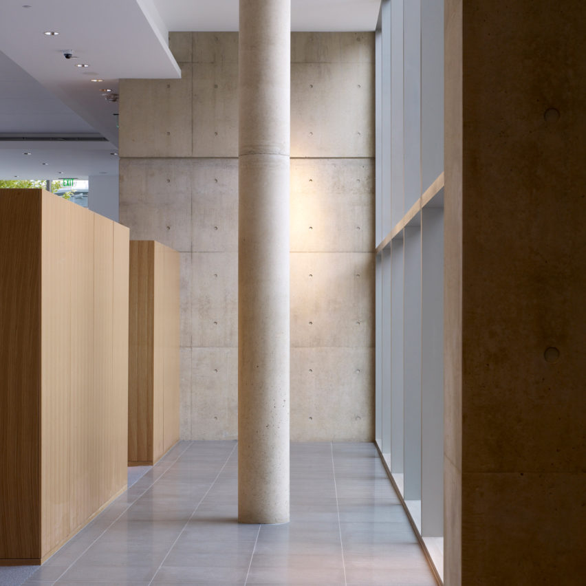
Grand Rapids Art Museum, Michigan, 2006
The first major commission awarded to Yantrasast's Los Angeles-based firm wHY, the Grand Rapids Art Museum integrates ancillary functions – such as the cafe, store, classrooms, library and auditorium, as well as outdoor spaces – to bring activity into the galleries.
Among these is the Rosa Parks Circle plaza designed by architect Maya Lin, with the museum's large glazed walls offering views and plenty of natural light.
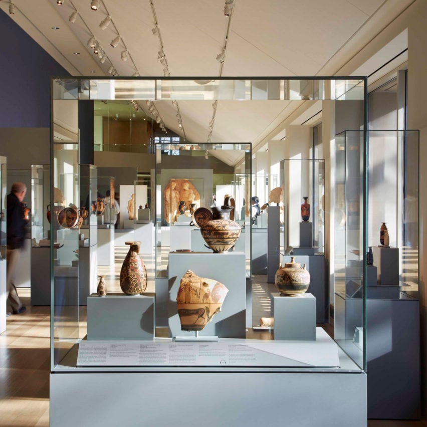
Ancient galleries at Art Institute of Chicago, Illinois, 2012
A dark 1970s interior at the Art Institute of Chicago was turned into bright and minimal spaces for the museum's ancient galleries in this renovation project, which wHY completed alongside a Renzo Piano-designed expansion.
The collections of Greek, Roman, and Byzantine Art are grouped together in glass cases, which are then arranged into "island configurations" that signal the relationships between the different art groups.
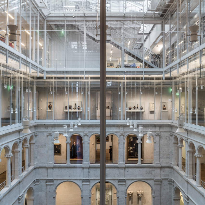
Harvard Art Museums, Cambridge, Massachusetts, 2014
Tasked to reconfigure Harvard University's "overstuffed" galleries, as part of its redesign by Piano and local firm Payette, Yantrasast stripped back and simplified the spaces, using a "kit of parts" arrangement and subtle lighting.
The institution's extensive collection – which comprises 250,000 objects dating back to ancient times – is now staggered along spaces that wrap a central atrium where long pendant lights hang.
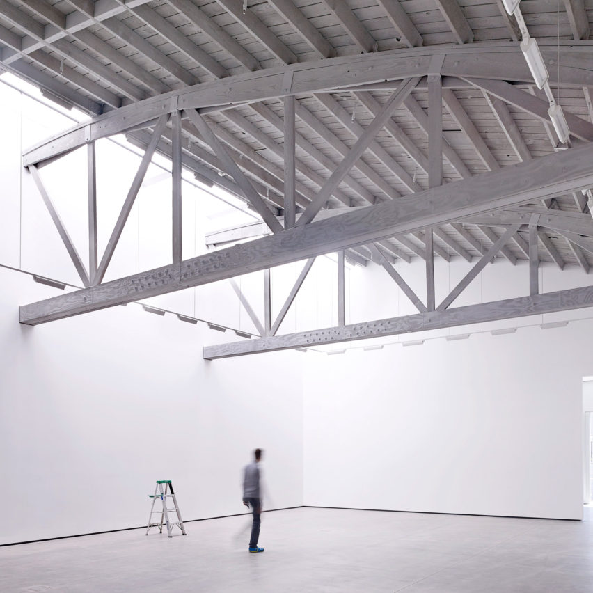
David Kordansky Gallery, Los Angeles, California, 2014
Exposed bow-truss wooden ceilings soar above the exhibition spaces at David Kordansky Gallery, located in a building the La Brea corridor of Los Angeles that was previously a martial arts training centre, a speciality foods store, and a car repair shop. Kordansky enlisted Yantrasast to design the space to drive conversations between different artists and artworks.
"David's programme is very strong, the building really supported the programme, so [there is] a good synergetic relationship to the architecture and the art programme there," the architect told Dezeen. "That has stood out for most people."
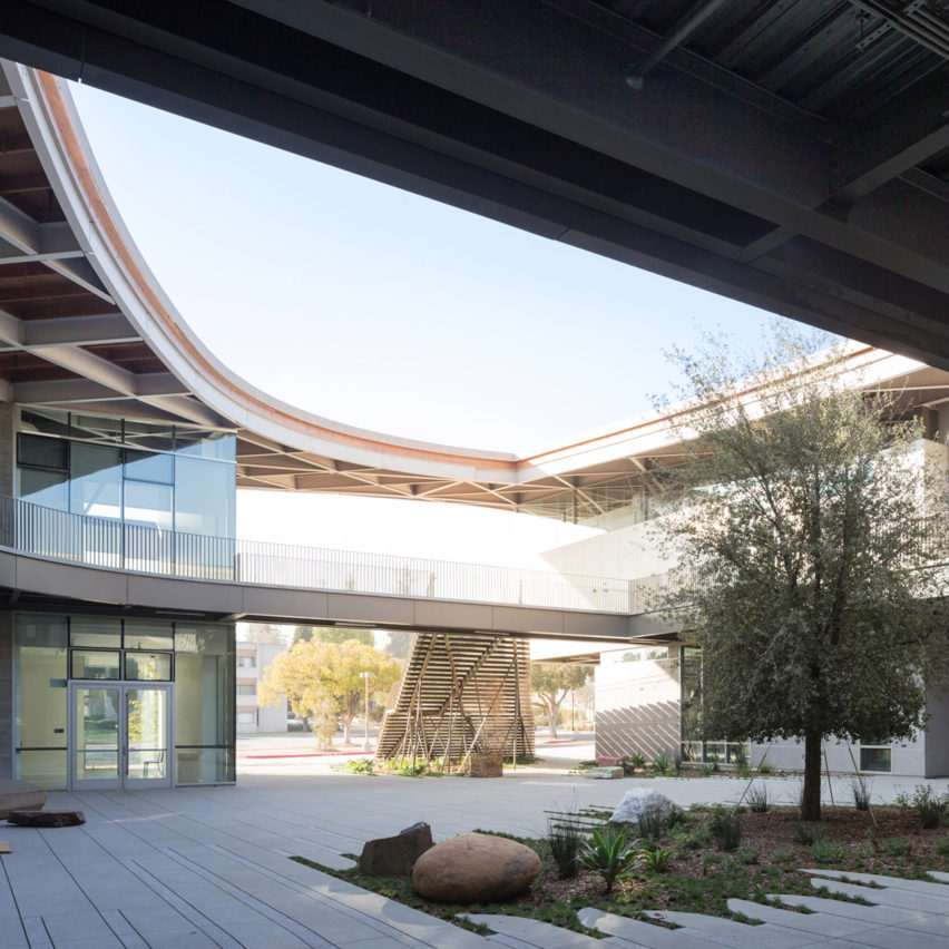
Pomona College Studio Art Hall, Claremont, California, 2014
A huge hole punctures the roof of liberal arts school Pomona College's Studio Art Hall to open a central courtyard to the sky.
The wood and steel structure underneath the wavy canopy is left exposed to create continuity across the several studios and "grey spaces" – areas designed to encourage collaborations between students – that make up the centre.
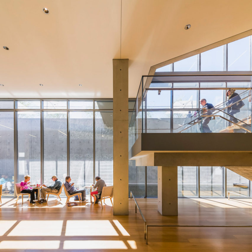
Clark Art Institute, Williamstown, Massachusetts, 2014
Yantrasast teamed up with mentor Tadao Ando to design public areas at the Clark Art Institute during its expansion.
The cafe has become an open and airy lobby, where visitors are invited to relax on chairs and tables with views outside, while the gallery-style shop is finished with wooden bookshelves and plinths.
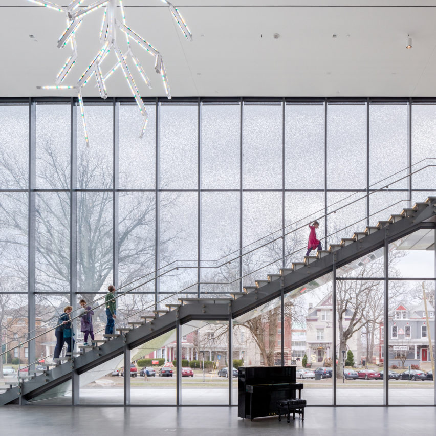
Speed Art Museum, Louisville, Kentucky, 2016
Fritted glass and corrugated metal panels front the extension that wHY designed for the Speed Art Museum in Louisville, Kentucky. The scheme involved adding two new structures, and renovating the existing 1927 Beaux Arts building to simplify circulation and improve the visitor experience.
"Rather than create a stand-alone expansion we wanted to activate the original building from multiple points in order to heal the whole," Yantrasast told Dezeen in an interview in 2016. "We called it 'acupuncture architecture'."
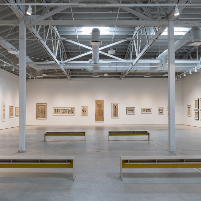
Institute of Contemporary Art Los Angeles, California, 2017
The Institute of Contemporary Art Los Angeles is arranged so that visitors enter through its offices and classrooms, to make it feel more like visiting an artists studio.
Located in an industrial-style, 13000-square-foot (1200-square-metre) building in the city's downtown arts district, it comprises three different size galleries to suit a variety of shows. All the furniture was also custom-made to be multi-functional.
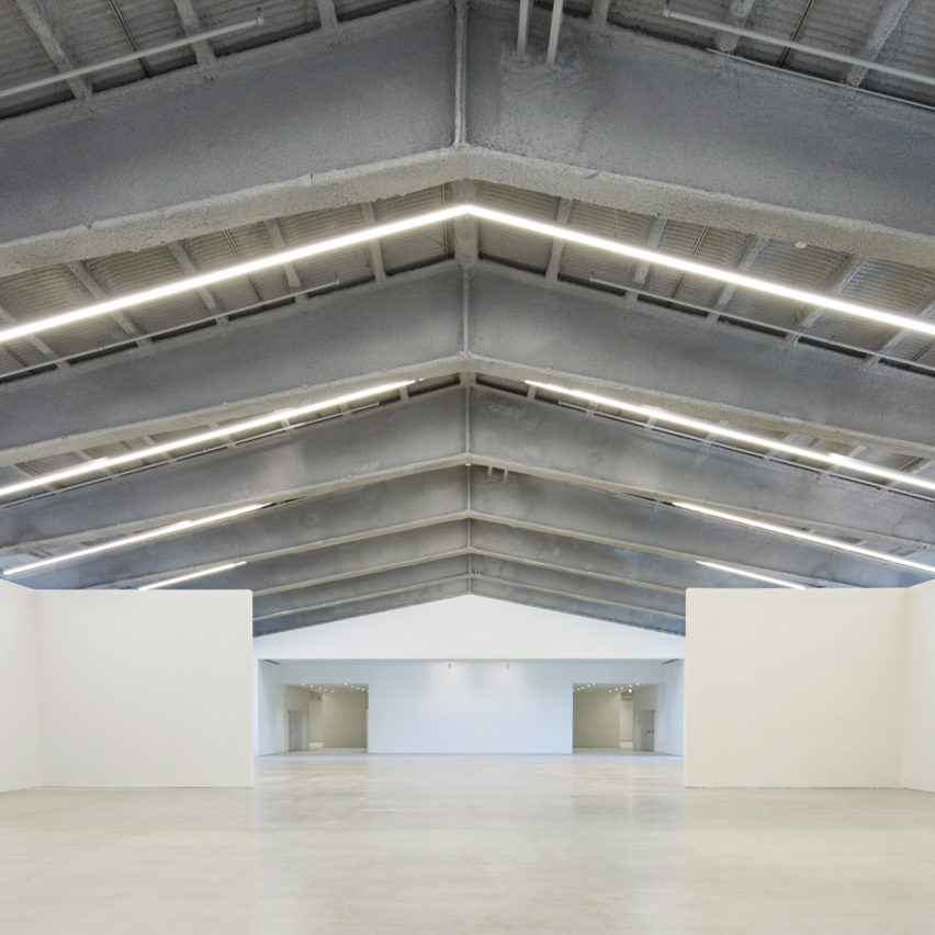
Marciano Art Foundation, Los Angeles, California, 2017
An empty temple on LA's Wilshire Boulevard was transformed into this contemporary art gallery to display the collections of Maurice and Paul Marciano, who co-founded Guess jeans.
Along with restoring the original details of the historic building, like the white marble and travertine exterior, the team added new walls, ceilings and lighting to suit the showcase of art.
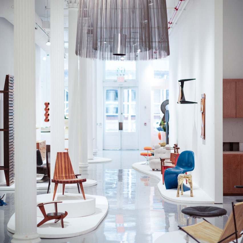
R & Company, New York City, New York, 2018
R & Company's overhauled 1869 cast iron store was conceived by wHY to provide "a new model for galleries" in New York's Tribeca neighbourhood.
Bright white 16-foot-high (five-metre) columns run through the ground-floor gallery, with movable walls for dividing up the space when necessary. At the back of the space is a 40-foot-high (12.1-metre) atrium, which floods additional galleries, offices and research facilities with natural light.
"It's definitely not a white box, it's more like a museum," said Yantrasast.