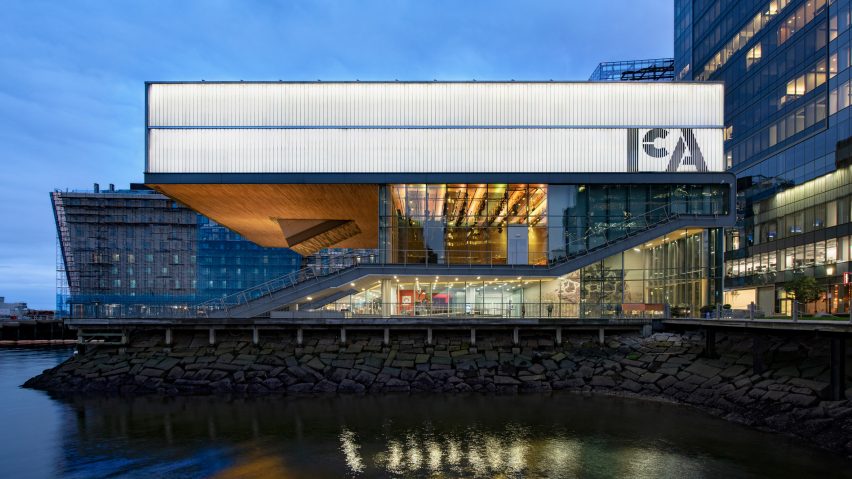
A logo resembling "stencil letterforms" is printed on the exterior of the Diller Scofidio + Renfro-designed art gallery on Boston's waterfront, as part of a major branding overhaul by graphic design studio Pentagram.
Pentagram's Abbott Miller led the studio's New York team on the rebranding of the ICA Boston, which architecture firm Diller Scofidio + Renfro completed in the South Boston Seaport District in 2006.
Celebrated as one of America's earliest institutions dedicated to contemporary art, the museum was originally founded in 1939 as a spin-off of New York's MoMA, and called Boston Museum of Modern Art. It was later renamed the Institute of Modern Art, and then the Institute of Contemporary Art to better reflect its programme, making it the first institution to use "contemporary" in its moniker.
Emphasising this history, Miller's redesigned simplifies the title into the three initials, arranged with a lower-case "c" wedged in between a capitalised "I" and "A".
"In the new identity, 'Institute' and 'Art' (as 'I' and 'A') act as formal bookends around a small 'c', highlighting the idea that 'contemporary' is at the core of the museum's mission and always in flux," said Pentagram in a project statement.
The logotype is bold and black, and broken up by slender lines to resemble letters printed with a stencil. This references the 20th-century warehouses in the surrounding area, according to Pentagram.
"Set in stencil letterforms, the identity evokes openness and activity, as well as the industrial heritage of the harbour," said the graphic design agency, which is one of the world's most prolific.
Large versions of the new logo, which were added in several places across the cantilevered top of the building, are also segmented with vertical lines created by the cladding.
Another supergraphic is imprinted on the translucent ICA Watershed – a small outpost in the East Boston Shipyard across the harbour from the main institution, which opened earlier this year to host programmes during the summer months.
Pentagram designed the logo to be scaled to suit various marketing materials, which the studio also overhauled as part of the rebranding. These include animations, the website, signage and environmental graphics.
On these items, the institution's full name, Institute of Contemporary Art / Boston, is set in a smaller font in various arrangements around the logo.
A pairing of blue and black provide the principle palette, taking cues from the waterfront, with undulating line details resembling waves. There are also materials that come in contrasting brighter hues of purple, red and yellow.
Diller Scofidio + Renfro completed ICA Boston 12 years ago, conceiving a design that integrated the contemporary art gallery with spaces for public programmes. A defining feature of the building is the exterior steps that lead onto the Harbourwalk.
The building is among a series of projects intended to reinvigorate the area into the "city's most vibrant district". Future projects in the new neighbourhood include a European-style piazza and a pedestrian loop.
Since completing ICA Boston, Diller Scofidio + Renfro has worked on a number of major cultural institutions in the US, like the Broad Museum in Los Angeles and a major overhaul of the MoMA in New York.
Pentagram, which was established in 1972, has also become the go-to studio for branding arts buildings across the nation. Its recent projects include updating the visual identity for America's Library of Congress in Washington DC to look like bookends, and rebranding a Nashville art museum with a 1930s-influenced logo.

