Dezeen's top 10 shops of 2018
Furry changing rooms, library-style display shelves and blue marble walls feature among our top 10 shops of 2018, picked out by interiors reporter Natasha Levy for our review of the year.
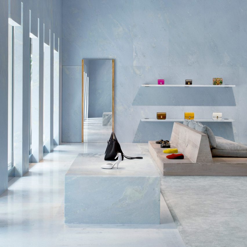
Celine, US, by Valerio Olgiati
Marble, one of 2018's most popular materials, provided the striking interior of Celine's Miami store. The space which features sky-blue slabs of the natural stone across its ceiling and walls, as well as a pyramid-shaped stairway.
Textural interest was added with grey, suede-like cushion seats and peaked concrete columns.
Find out more about Celine's Miami store ›
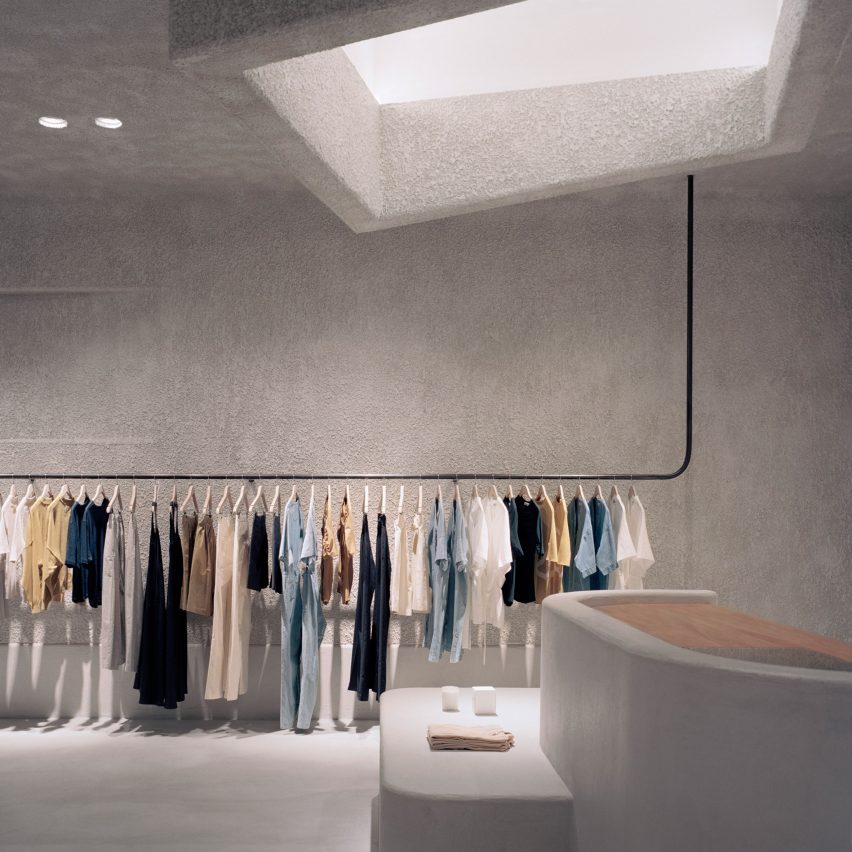
Kloke, Australia, by Studio Goss
Rough concrete surfaces and blocky fixtures emulate the appearance of brutalist architecture inside this Melbourne boutique, which Studio Goss designed for pared-back clothing brand Kloke.
An asymmetric cubic volume distends from the centre of the store's ceiling to form a faux skylight, complemented by angular recesses in the walls.
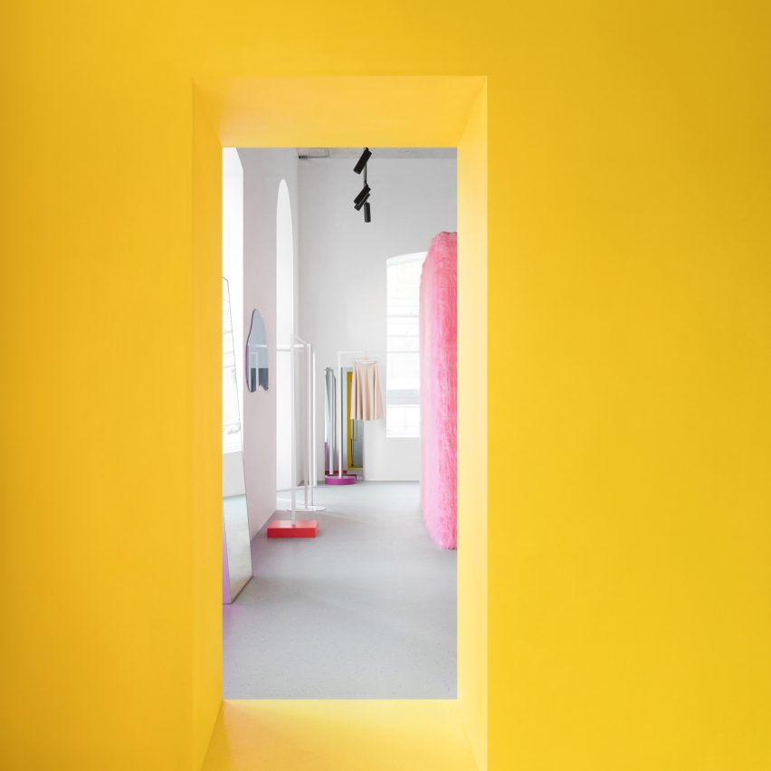
Like Shop, Russia, by Eduard Eremchuk
Colourful installations by the American artist James Turrell informed the interiors of this fashion concept store in Moscow, which has an all-yellow entryway.
Bubblegum-pink fluffy fabric covers the changing room booths, while terrazzo-style vinyl with purple and orange flecks provides the flooring.
Find out more about Like Shop ›
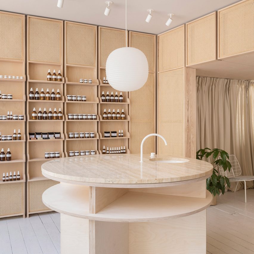
RÖ Skin, UK, by O'Sullivan Skoufoglou
Cane mesh cabinetry lines the edges of this skincare store in Lincolnshire, which O'Sullivan Skoufoglou designed to encourage "transparency, light and visual connection".
The space's warm tones are enhanced by a peachy marble sink counter and sand-coloured linen curtains, which provide privacy to treatment rooms.
Knoll, USA, by Johnston Marklee
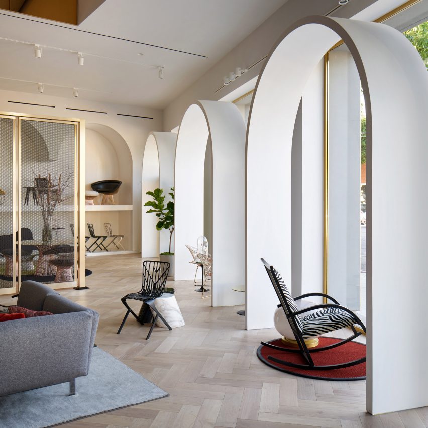
A sequence of grand white archways sit behind the front display window of Knoll's Los Angeles store, which architecture firm Johnston Marklee designed in reference to a 16th-century Moroccan castle.
Further touches of opulence are provided by gold-tone mirrors and the canopy-style ceiling draped with panels of grey felt.
Find out more about Knoll's LA store ›
The Daily Edited, Australia, by Pattern Studio
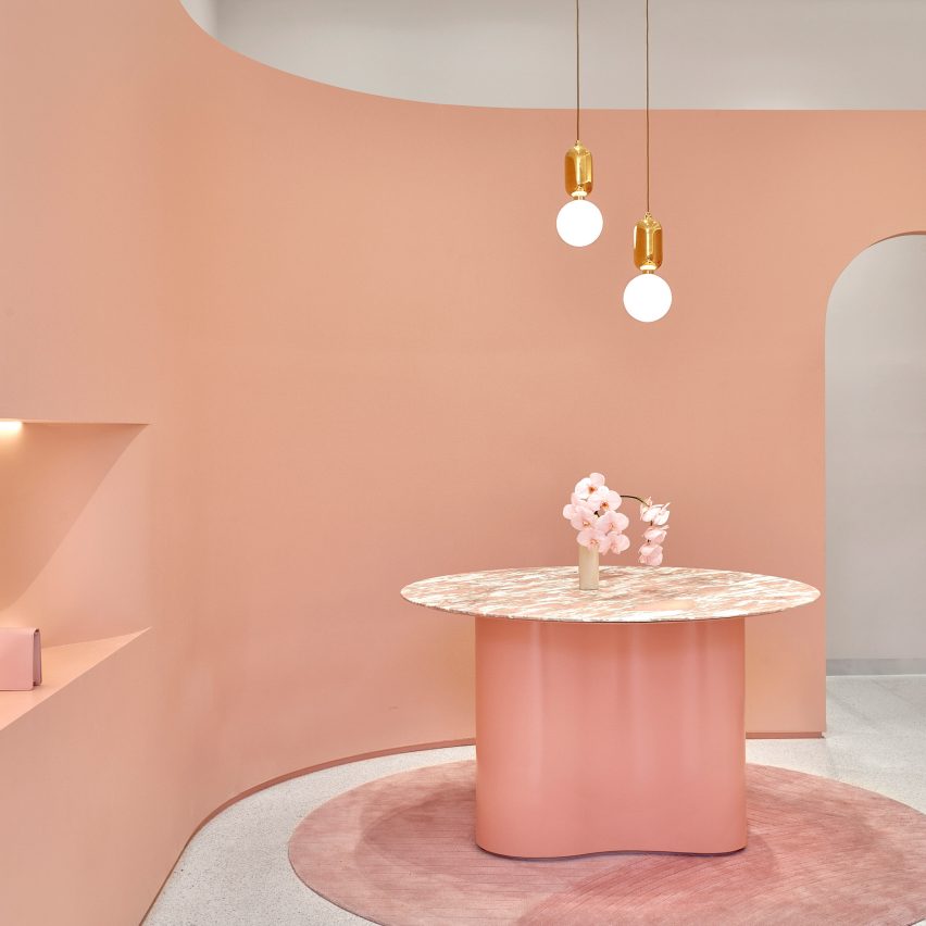
Pattern Studio aimed to suggest a "new kind of femininity" inside this Melbourne accessories shop, which continues the pink trend with blush-tone surfaces and rosy marble counters.
LED strip lighting installed above the shop's display nooks and behind its curved partition wall also lends the space a futuristic feel.
Find out more about The Daily Edited ›
Forte Forte, Italy, by Robert Vattilana
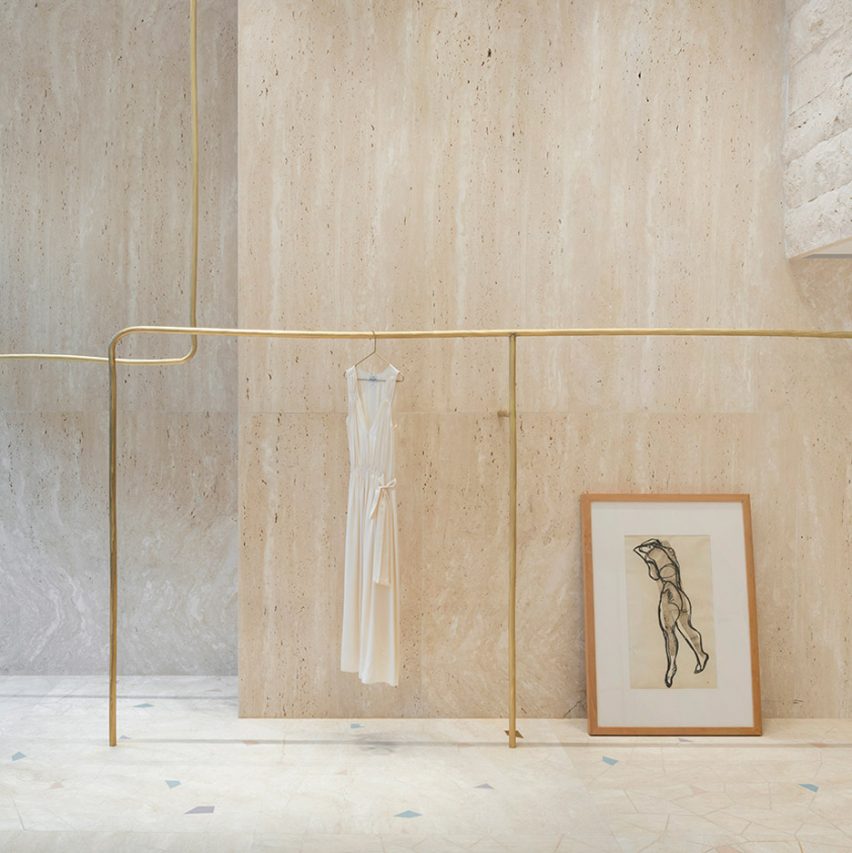
A nude sketch, spindles of yarn, and a bust of the Roman goddess Venus are among the array of curious ornaments that art director Robert Vattilana used to create a "dreamy" mood inside this Milanese fashion boutique.
The objects are set against expanses of grooved marble, white gauzy curtains, and jade green partition walls.
Find out more about Forte Forte ›
Ssense, Canada, by David Chipperfield Architects
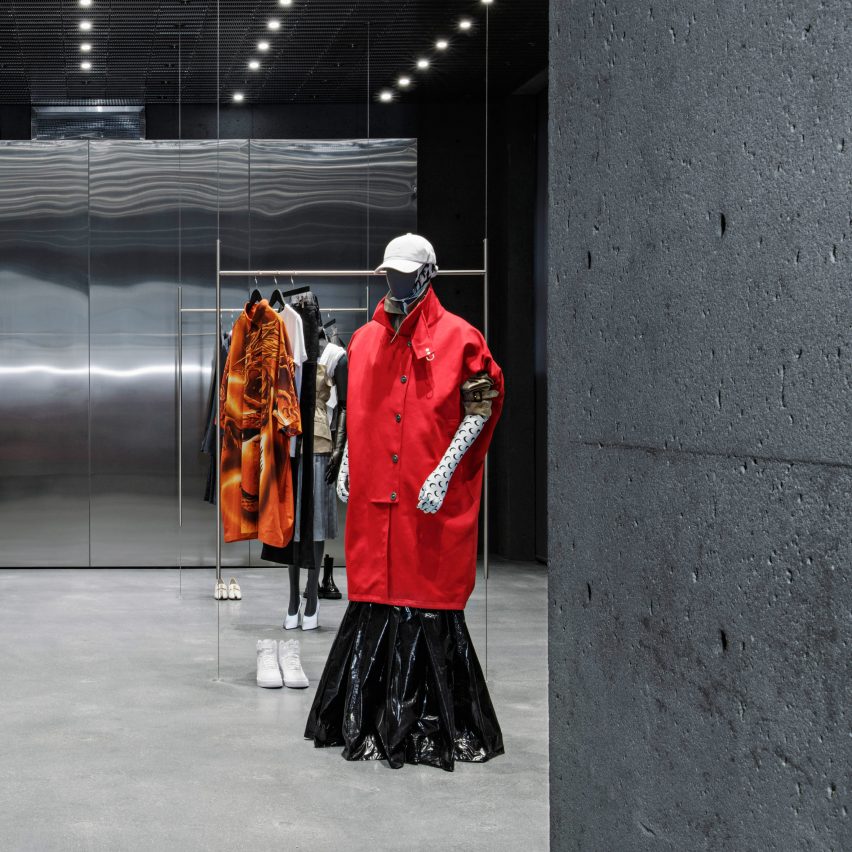
This year saw David Chipperfield Architects complete its first project in Canada, a brick-and-mortar store for online fashion label Ssense.
The austere retail space is set inside a 19th-century building. It exclusively features concrete and mirrored surfaces, which the practice kept as bare as possible by concealing wiring systems.
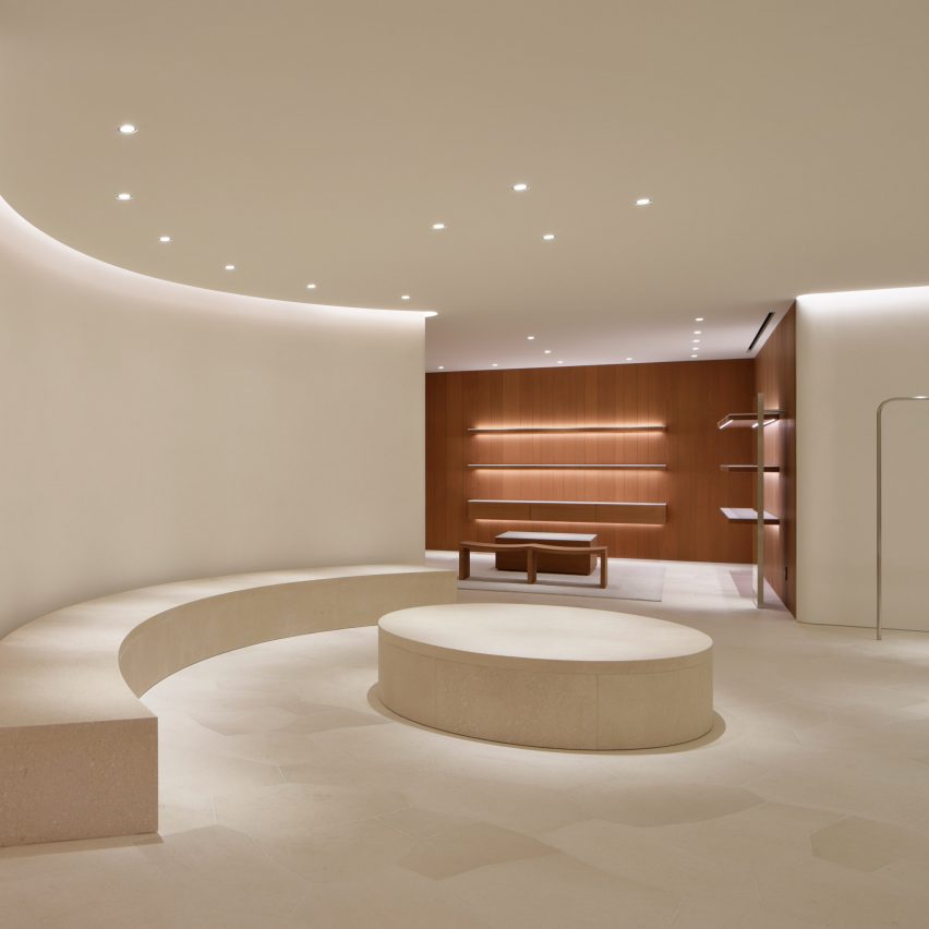
Jil Sander, Japan, by John Pawson
A limited material palette of limestone and cherry wood helped John Pawson achieve a minimalist aesthetic inside the Tokyo flagship of fashion label Jil Sander.
While the space is sparsely finished, interest is added by a tall banyan tree in the store's basement that grows up through the stairwell.
Find out more about Jil Sander's Tokyo store ›
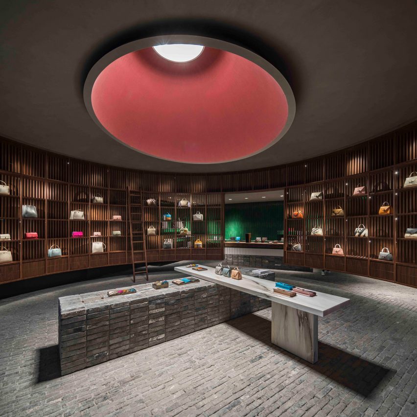
Neri&Hu looked to the layout of libraries when designing the interiors of this Chengdu accessories store, where handbags are displayed high on walnut shelves and accessed via step ladders.
While most of the store is illuminated by artificial spotlighting, a deep conical light funnel has also been carved out of the ceiling – a feature inspired by the oculus of Rome's Pantheon.
Find out more about Valextra ›