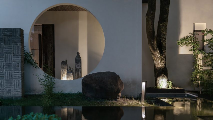
Interior design firm Yiduan Shanghai has transformed a 1960s building in Shanghai into a "zen-like" HQ for Hemu, a local clothing brand.
Located in the Jiading District of Shanghai, the original 1960s building was built as an annexe of Huilongtan Park – a picturesque park with a 400-year history. Made from timber, grey bricks and moss-covered tiles, the two-storey structure features multiple archways that frame views.
The building has a back and front yard – a tranquil paved yard at the front of the property is surrounded by century-old trees. The space at the back of the showroom doubles as an outdoor runway at night for shows accompanied by music.
Inside the 1,500-square-metre property, the headquarter's interior has an austere, minimalist aesthetic that features plenty of natural materials and unfinished surfaces in accordance with Hemu's existing retail stores and brand image.
"Based on oriental elements and humanism, the overall design adheres to originality, respects nature, conveys Zen serenity and embodies traditional oriental culture," said the firm, which is led by founder Xu Xujun.
"The whole space shows harmonious integration between the brand and nature."
The brand's display area and the front desk are on the ground floor, while the working space and reception area are on the first floor.
Combining garments, tea, incense, homewares and books, the brand wanted to create a space where customers could come to experience a total lifestyle. The space allows visitors to not only view the clothing, but also enjoy a hot drink and read books at the same time.
"Simplicity is the ultimate form of sophistication, so we utilised a minimalist approach and natural materials to design the space," said the designers.
"We were hoping to realise harmonious coexistence among clothing, people and nature as well as encourage people to keep a kind heart and discover beauty in spite of the vicissitudes of life," said the designers.
The firm added a large modern windows to the building's facades to form a contrast with the classical Chinese architecture.
At the rear of the building, where the clothing showroom is located, a wall of floor-to-ceiling windows wrap the back yard providing a clear view of the runway.
At the front of the building, by the entrance area, a still water pond is surrounded by what the firm describe as "Chinese-style partition walls" that are cut with large circular openings.
These walls form an entrance corridor that circulate visitors to the front door and provide a smooth transition from the exterior landscaping to the interior architecture.
Stepping into the foyer, a long front desk made out of rough hewn timber comes into view, while above, a concrete beam is flanked by two strips of cloth that are suspended from the ceiling. The composition is intended to "overturn the traditional setting of a front desk," said the designers.
Entered though a circular doorway, the clothing display area is an altogether brighter space that benefits from floor-to-ceiling windows and doors that look out across the back yard.
On the second floor, reclaimed timber flooring is paired with neat cement slurry walls to create a tranquil yet austere space.
Strips of white gravel are used alongside the granite and timber board flooring to outline walkways and display areas. The feature was designed to add a "Zen atmosphere" to the space, according to Yiduan Shanghai Interior Design.
Relaxed seating areas with low tables and cushions can also be found across the HQ in both the display and office areas.
"In a word, Hemu headquarters is a pioneering project of Yiduan for combining Zen spirit, Chinese classical elements and modern style in the design," concluded the firm.
When Lukstudio fitted out this multifunctional building in the Tianhe District of Guangzhou China, they developed a concept that involved containing different areas within a series of voids. The space is home to both a coffee shop and a co-working space each housed in different white boxes.

