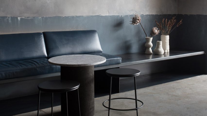
Patchy grey surfaces and concrete fixtures appear inside this bar in New South Wales, which Australian studio Pattern has designed to reflect the "raw beauty" of late-night eateries in Mexico.
The space formally played host to a popular nightlife spot, but has been given an understated makeover by local studio Pattern to feature grey-tone surfaces and just a handful of furnishings.
Named Locura the eatery is situated in the beachside town of Byron Bay, serving South America-inspired small plates and cocktails.
Intended to "discreetly reference the humble character and raw beauty" of late-night venues in Mexico City, the studio wanted the restaurant's aesthetic to veer away from "simplistic or culturally appropriated" imagery typically associated with South American cuisine like sombreros and cacti.
They also wanted to avoid the look of the typically overdone look of other eateries in the area.
"We wanted to respond more sensitively to the bar's context, and thought it fitting that aesthetically it reflect and celebrate the region's natural beauty and imperfect charm," Pattern told Dezeen.
"We don't feel it is necessary to use design or decoration to constantly remind people they are in a world-famous beach-side location, so there are no paintings or framed photos of the local surf breaks adorning the walls."
Walls in the main bar room have been completed in two different colours – while the lower half is gunmetal-blue, the upper section has been patchily-painted grey to create a cloudy effect. One wall has also been covered with a heavy, burnt-orange curtain.
Grey stone bricks form the main bar island, which is topped by a concrete counter.
More vivid shades are introduced in the rear customer bathrooms where partitions between each of the toilet stalls are fitted with LEDs. They bathe the surrounding space in pink, yellow, or cobalt-blue light, intended as a nod to the colour palette used by Mexican architect Luis Barragán.
"This gesture comes as an unexpected surprise as patrons travel from the moodily-lit but relatively unadorned bar space into the richly coloured bathrooms," explained the studio, who also referenced immersive light installations by American artist James Turrell.
Significant changes to the bar have otherwise been kept to a minimum due to a restricted budget. Previous booth-style seating has been traded for long banquettes with leather seat cushions that run along the peripheral walls, freeing up central floor space.
The entrance has been expanded to improve circulation between the bar and an outdoor seating area, which is lined with tropical plants and timber decking.
"The physical setting of the bar doesn't compete to command the attention of visitors, but happily dissolves into the background; supporting and facilitating an experience that feels laid back but special, and a little different to other venues in the area," said the studio.
Locura's dark interiors are a far cry from Pattern's previous project, an all-pink accessories boutique in Melbourne, which features blush-tone surfaces and rosy marble fixtures.
Photography is by Ben Hosking.

