Lukstudio creates monochrome interior for LePur yoghurt cafe in Beijing
A monochromatic palette and limited selection of materials create a minimal interior for the LePur yoghurt cafe in Beijing, while mirrors exaggerate light in the space.
The interior is designed to translate the LePur brand name, which suggests purity in Mandarin, through a "no-frills design approach". It creates a calm space where customers can escape Beijing's hyper-stimulating Sanlitun area.
"In my opinion, a calm space does not have a catchy theme, too many decorations or too much noise," said Lukstudio founder Christina Luk. "So we try to create the design with clean lines and subtle details, provide a backdrop rather than spectacles."
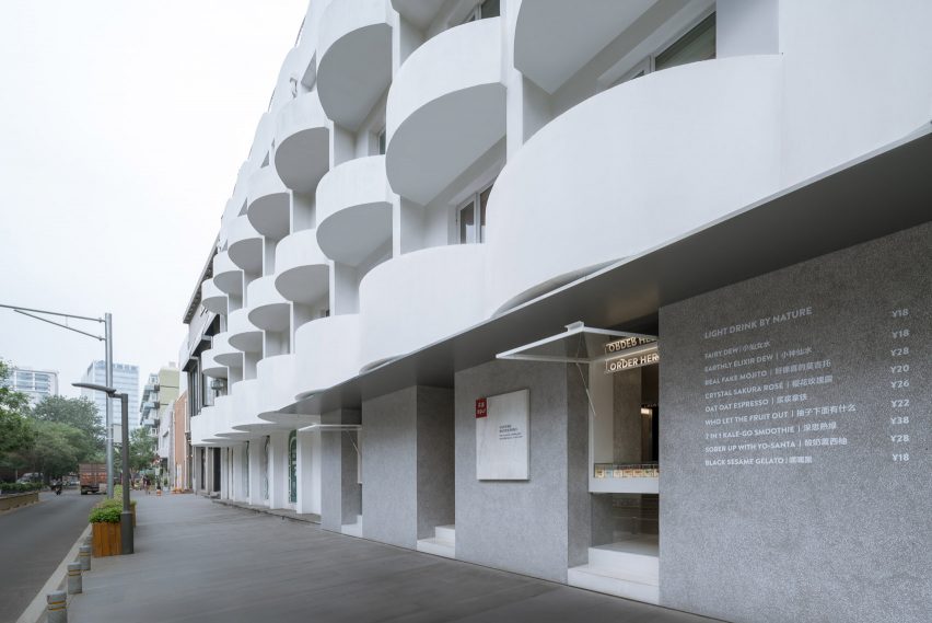
The cafe is located at ground level, on the corner of a white mid-rise building. The street-facing facade forms a pattern of open and closed blocks that limit the amount of natural light that can enter the interior.
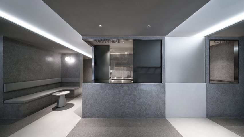
The design themes were inspired by the pattern of light and shadow that is created by the openings in the wall, which shine bright white light against an otherwise grey interior. The paths of movement for customers to navigate through the cafe follow these paths of light through the space.
Grey terrazzo forms the interior and exterior facades, as well as the counter spaces and service booths where orders are placed.
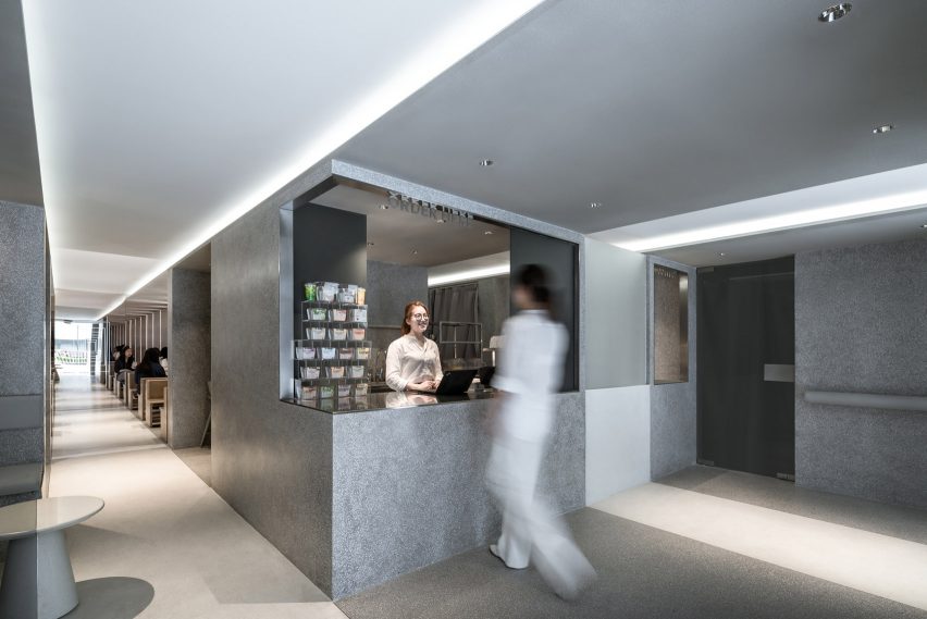
White terrazzo runs along the floor, marking the corridors of light and extending to the table edges and chairs that sit along these corridors.
Besides the white and grey, small amounts of wood have been introduced in the furniture, predominantly on the benches and chair legs.
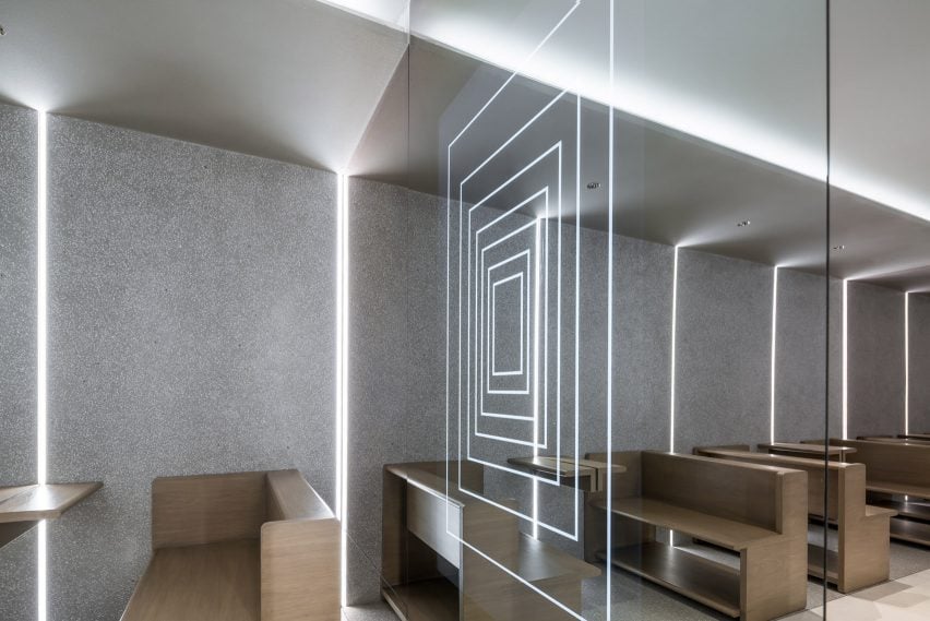
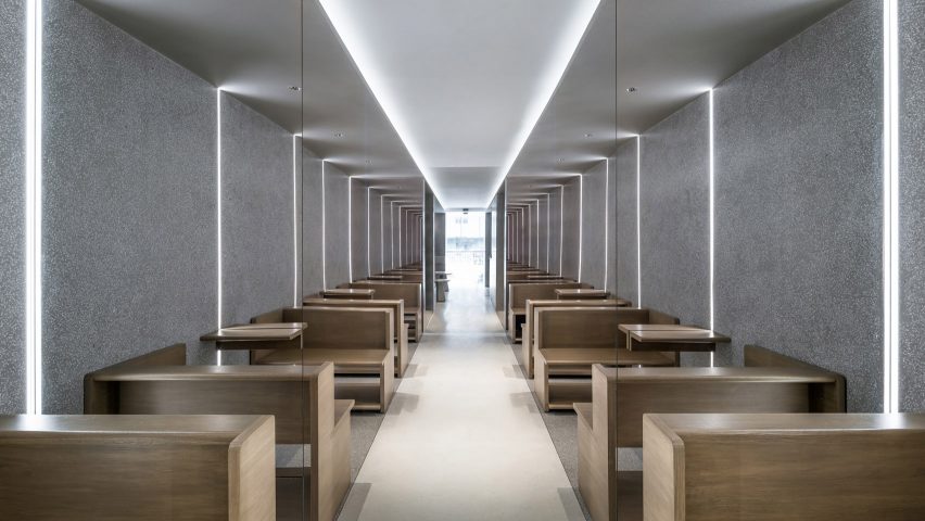
The designers maximised the small footprint and low ceilings of the cafe by adding mirrors that appear to extend the tight spaces.
These mirrors also reflect the colours and materiality of customers' clothing, adding an interesting visual effect without deviating from the white and grey scheme.
Towards the back of the cafe, tables furnished with wooden pews sit within double mirrored walls so that a customer sitting by themselves can see their own image reflected into infinity.
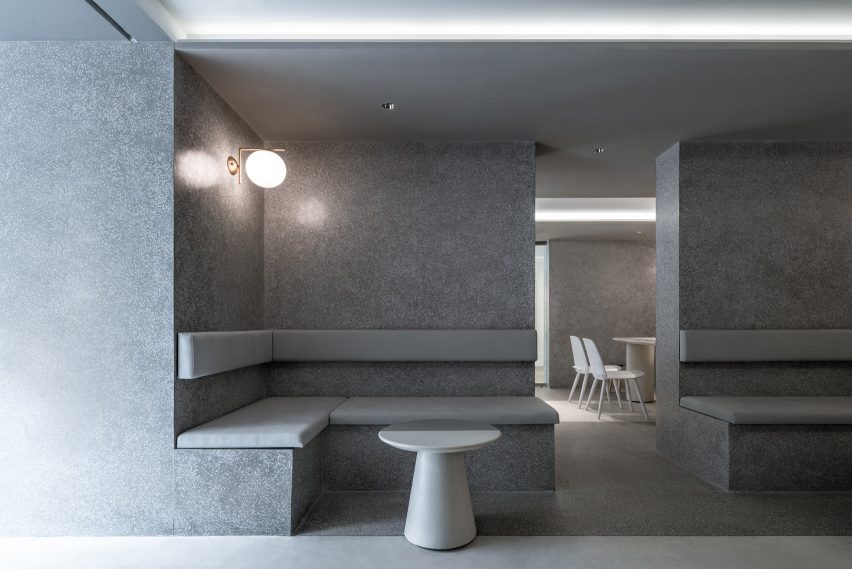
Most tables are arranged for single users or pairs, although larger tables for groups can also be found towards the rear of the cafe.
A light screen is incorporated into the largest mirrored wall and videos and messages can be used to change the ambience.
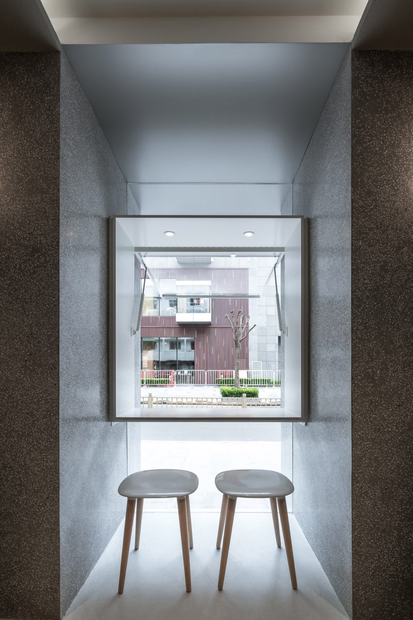
"When the cafe is not too busy, this innermost space is perfect for someone who wants a moment to him or herself," said Luk. "The design is very serene. If the space can let visitors enjoy being present with themselves, their thoughts, their food or drink, then we have done our job."
Lukstudio recently completed a shop and cafe for fashion platform Dear So Cute in Haining, east China, with theatrical flourishes to engage with young shoppers.
Photography is by CreatAR Images.