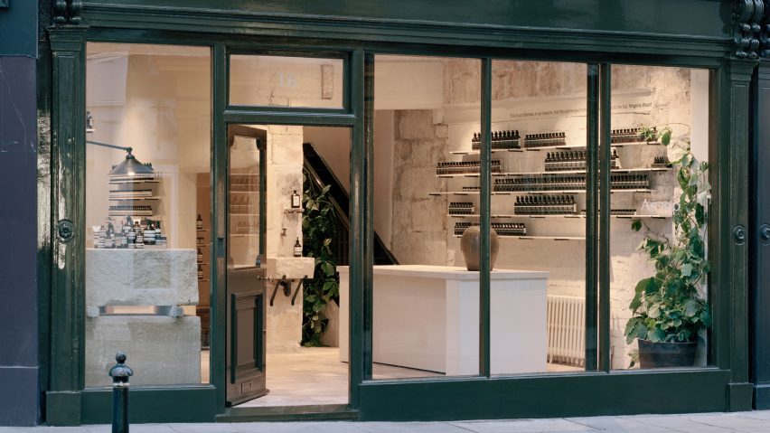
Local architecture informs stone interiors of Aesop store in Bath
Stone house facades, rubble-filled basements, and stories by Roald Dahl are just some of the things design studio JamesPlumb referenced to create the Aesop store in Bath, England, which even includes a library.
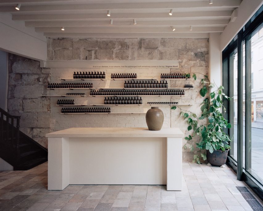
The store on Bath's New Bond Street has been designed by JamesPlumb to honour the materiality and architectural landscape of the English city, which is defined by its abundance of warm, honey-coloured buildings crafted from Bath stone.
"Aesop's main brief is always to create a store that responds to and is sympathetic to its location… however, we didn't want our design to feel like a history lesson. Our aim was to create a quiet, contemporary distillation of the city," James Russell and Hannah Plumb, founders of the studio, told Dezeen.
"We were drawn to the basements and lower floors of buildings where a simple but functional aesthetic prevails, but with wonderful details and honest materiality."
After traversing the city's residences, roads, museums, and quarries for research, the studio decided to subtly reflect the imagery they'd seen within the shop's interiors.
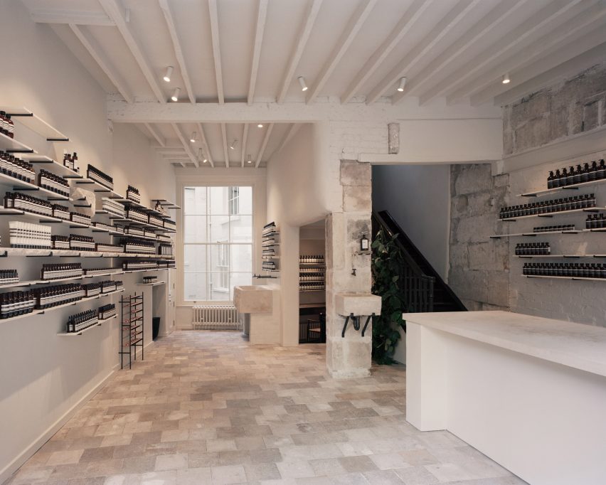
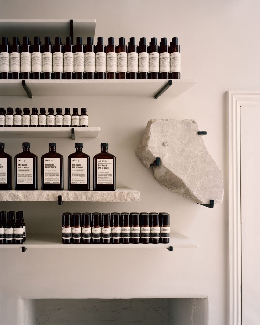
Pale tiles reclaimed from a nearby chapel are laid across the floors, complemented by white-painted walls and service counter. Rough fragments of Bath stone found in the building's lower level have been placed on steel pegs and displayed artefact-style between the shelves.
The same stone has been used to make chunky basins where customers can stand and test various products. Each has been punctuated with five small drainage holes to mimic the appearance of a scullery sink the studio saw in one of the terraced houses that form Bath's renowned Royal Crescent.
Colour only appears on the shop's facade, which has been updated with a glossy coat of forest green paint.
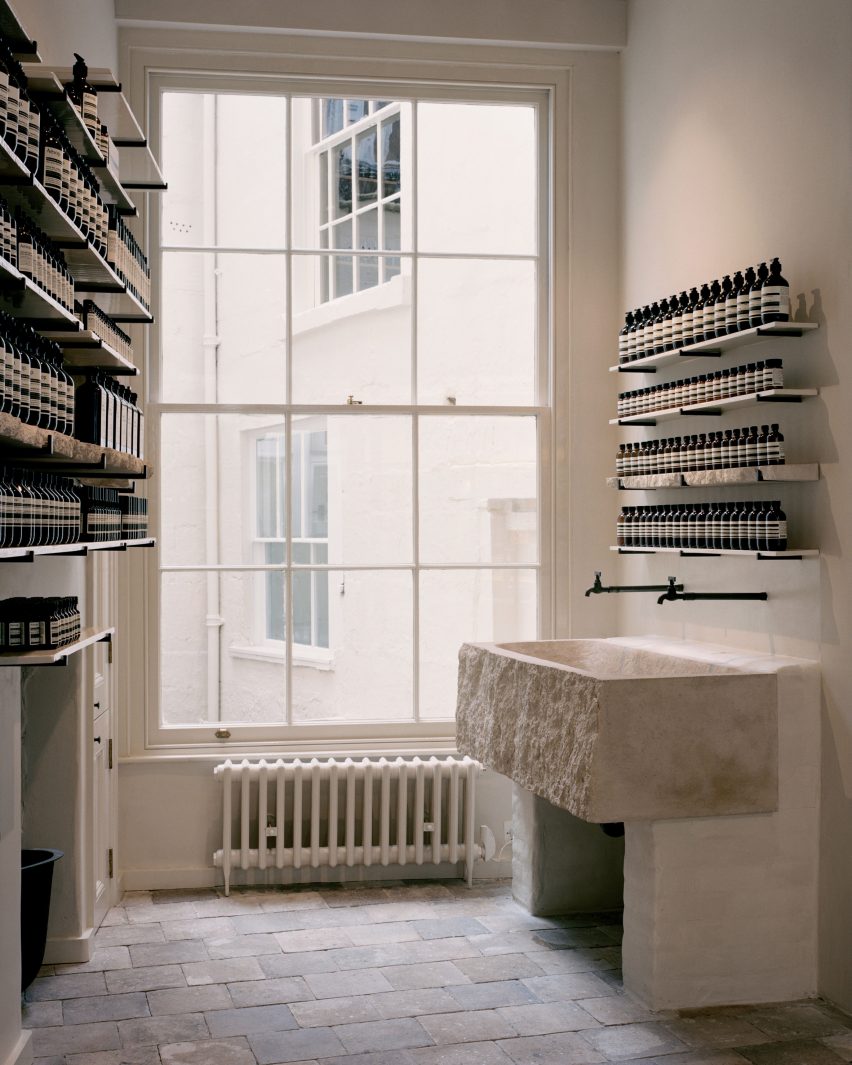
Prior to JamesPlumb's redesign the building had largely been in a state of disrepair, filled with unsightly fixtures from previous shop fit-outs. This left the studio to also carry out a number of changes to the store's internal structure. Three existing windows and a previously boarded-up staircase have been unblocked to return the space to its original Georgian proportions.
"This was an important step to reconnect the flow and human footfall of the whole building," added Russell and Plumb.
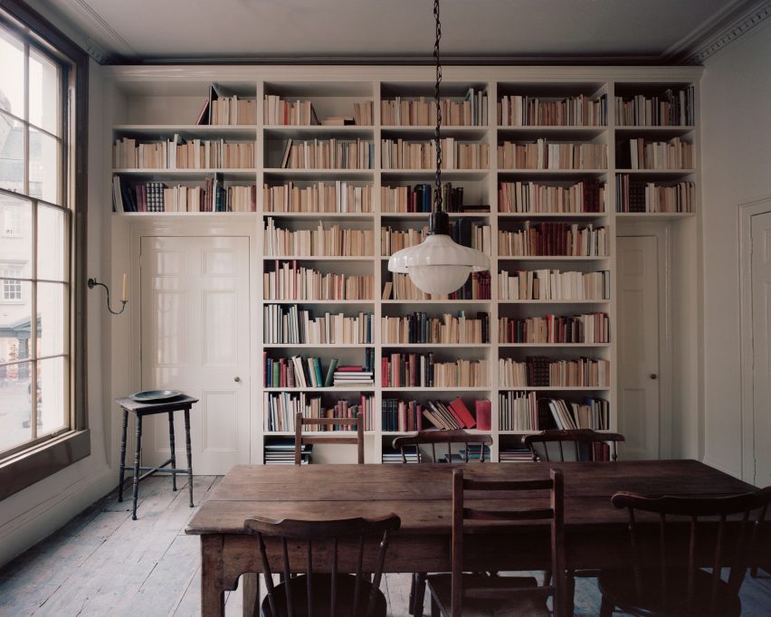
Upstairs, a library centred by a worn timber table has been preserved, forming a "hidden layer of domesticity". JamesPlumb's decision to have a designated area for reading within the retail space was also encouraged by Aesop's project brief, in which they asked the studio to consider author Roald Dahl's The Landlady – a short story that sees a teenage boy travel alone from London to Bath.
This is not the first time that JamesPlumb has fashioned the interiors of an Aesop store. Back in 2015 the south London-based studio completed a branch in Bloomsbury, where water runs between shelves mounted on the walls.
Photos courtesy of Aesop.