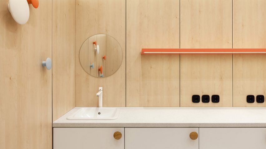
Bright colours and simple geometric forms feature in this children's outpatient clinic in Kyiv by local practice Ater Architects.
Called Doctor U, the two-room 38 square metre facility is located in a new residential complex in the city.
Ater Architects set out to create a friendly environment for young visitors that would turn a trip to the doctor into a positive experience.
"Our main task was to create an atypical atmosphere for the medical institution, which does not leave negative memories in children and therefore does not program them for further fear of visiting a doctor," explained the studio, which is headed up by Alexander Ivasiv and Yuliya Tkachenko.
Divided into a waiting area, two pediatric rooms and a restroom, the clinic features brightly coloured surfaces in blue, coral, and white teamed with terrazzo and natural wood.
The layout was designed so that there are clear pathways through the space making the admission process as quick and easy as possible.
"A small area of 38 square metres required a planning solution to ensure complete privacy, an individual approach to the management of each patient, the absence of queues and feeling of calm and comfort," explained Ater Architects.
The waiting area is designed to accommodate a maximum of two patients at a time and is fitted out with a reception and a small wardrobe.
The two pediatric rooms are equipped with all the necessary medical devices and apparatus which are mostly concealed in built-in storage areas in order to create a more relaxed, "non-medical" atmosphere and reduce patient stress in the process.
Each room is equipped with a counter and sink with a terrazzo splashback, an examination area with a therapy couch, and a desk where doctors are able to make notes and talk with patients.
In addition, the rooms also feature built-in refrigerators for drugs and vaccines, televisions with internet access and non-standard exam tables made of solid beech wood with soft, but durable, eco-leather upholstery.
The walls of the rooms are lined with wood panels that don't extend all the way to the ceiling. The architects explained that wood was chosen for its warmth while shorter panel height were used to create a space with a more intimate scale suitable for younger patients.
Glazed walls between rooms allow daylight to flow through the space while durable vinyl floors were selected for safety and hygiene reasons.
The restroom was designed with children of all ages in mind and includes a babycare mat, a counter and sink with two mirrors – a lower smaller mirror for younger children and a larger higher mirror for older children.
A storage area for a potty, seat pads, nappies, and other personal hygiene items is located in a built-in closet behind the toilet.
In Sheffield, UK, British designer Morag Myerscough decorated the wards of a Sheffield Children's Hospital with brightly coloured harlequin prints chevrons and stripes.
Photography is by Alexey Yanchenkov.

