Australian designers suggest Bleached Coral to follow Pantone's "tone deaf" colour of the year
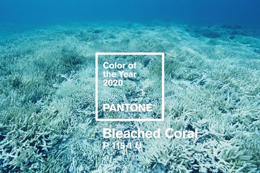
Australian design studio Jack and Huei has proposed Bleached Coral as the colour of the year for 2020, claiming that Pantone's shade for this year Living Coral fails to highlight the ongoing destruction of coral reefs.
Art director Huei Yin Wong and copywriter Jack Railton-Woodcock, who together run the Melbourne-based studio, described Pantone's 2019 colour of the year as "tone-deaf, and downright irresponsible".
The duo's response was to hijack the colour company's branding to create their own proposal for the colour of the year in 2020, to show people that coral reefs around their native Australia are under threat of extinction as a result of climate change.
"Pantone was in the best position to draw attention to this issue, and they didn't – which is one of the points we're trying to make," explained Yin Wong and Railton-Woodcock.
"It's the responsibility of all of us, creative or otherwise, to find creative solutions to big problems, and right now there aren’t many problems facing humanity that are bigger than climate change."
Bleached Coral matches coral ravaged by climate change
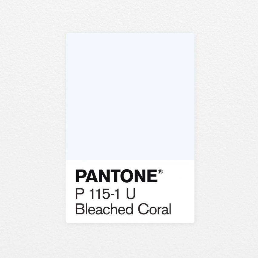
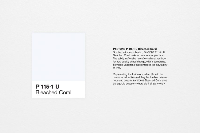
The designers went through Pantone's swatch library and pulled out the shade P 115-1 U, which matched the shade they recognised from images of dying coral in the Australian press. They gave it the name Bleached Coral.
P 115-1 U is a very pale blue shade, matching the coral that loses its colour because of the effects of climate change.
When water temperature rises, the colourful zooxanthellae algae that live in the coral tissues die and are expelled. It is these algae that give the coral its bright colour and 90 per cent of its energy.
Without the algae the coral tissue becomes transparent, revealing the white coral skeleton beneath it – a process known as bleaching. If the warm conditions persist, the coral eventually dies.

The Great Barrier Reef has lost half of its living coral since 2016 as a result of climate change.
The designers described it as an "unprecedented mass coral bleaching in the Great Barrier Reef, the largest living organism in the world".
The design duo point out that the colour of coral in the oceans is a key indicator of the health of a marine ecosystem.
"It really says something about humans that even when the largest living organism on the planet displays tangible, visible suffering, we’re still slow to act on climate change," they said.
Pantone should take responsibility say duo
Yin Wong and Railton-Woodcock suggest that the Pantone colour of the year should act as a reflection of society's concerns.
"The colour is meant to guide, inspire and shape the world of design (and beyond), while reflecting the state of the world as we know it – the rich tapestry of an entire year, distilled into a single colour," said the pair.

The studio feels strongly that the creative industries have a responsibility to put coral bleaching at the forefront of people's minds through the work that they create.
"It’s a sad reality that this precious connection to nature might be lost within a generation or two," they told Dezeen.
They point out that 85 per cent of the Australian population live within 30 miles of the ocean, but are keen to stress that it is a global issue rather than an Australian one.
"This is an issue we care about deeply and we think the creative industry has an opportunity to bring this global issue from the depths of the ocean to the surface of our screens," they explained.
If Pantone chose Bleached Coral as the 2020 Colour of the Year, they suggest, it would influence the clothes we wear, the products we buy, and the media we consume.
"As the walls between creative industries bleed together, the colours we use in fashion, industrial design, advertising, even music, creep into our everyday lives," they explained.
"We're already seeing Living Coral pop up all over the place."
Pantone described Living Coral as life-affirming
Trend forecasting experts at the Pantone Colour Institute looks to "what is taking place in our global culture at a moment in time" when deciding on the colour for that year.
When announcing Living Coral as the 2019 colour of the year, the colour institute referenced the "sustenance and shelter to sea life" that coral offers, as well as the "devastating" effect of today's society on the environment.
However the announcement fell flat with many in the design community and further afield, with Michelle Ogundehin writing for Dezeen that "while Pantone claim its choice of colour harks of optimism, naivety might seem more appropriate".
Pantone describes the peachy orange Living Coral tone as an "animating and life-affirming coral hue with a golden undertone that energises and enlivens with a softer edge".