
Schemata Architects completes industrial-style pop-up store for Hay
Scaffold-like partition walls and timber display units appear inside this pop-up store that Schemata Architects has designed for Danish homeware brand Hay.
The temporary store is set within a basement in Tokyo's bustling Omotesando shopping district, and has been designed by Schemata Architects to feature a series of easily-demountable display fixtures.
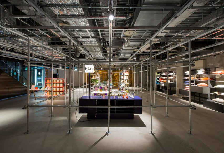
"The space consists of what we call 'interfaces' or moveable furniture systems that instigate people's activities," explained the studio.
"These 'interfaces' are something between architecture and furniture."

Perforated metal tracks have been installed just beneath the exposed pipework in the ceiling, where vertical poles can be screwed in to form gridded partitions.
Behind these sit a number of shelves which present smaller pieces of Hay's homeware range, such as plant pots or vases.

Throughout the rest of the space – which is punctuated by just a few concrete columns – sitting room-style display areas have been arranged, showing off the brand's selection of sofas, rugs, and coffee tables. These are backed by colourful wall panels that are also affixed to the ceiling's metal framework.
Leafy plants have also been used to dress the space.
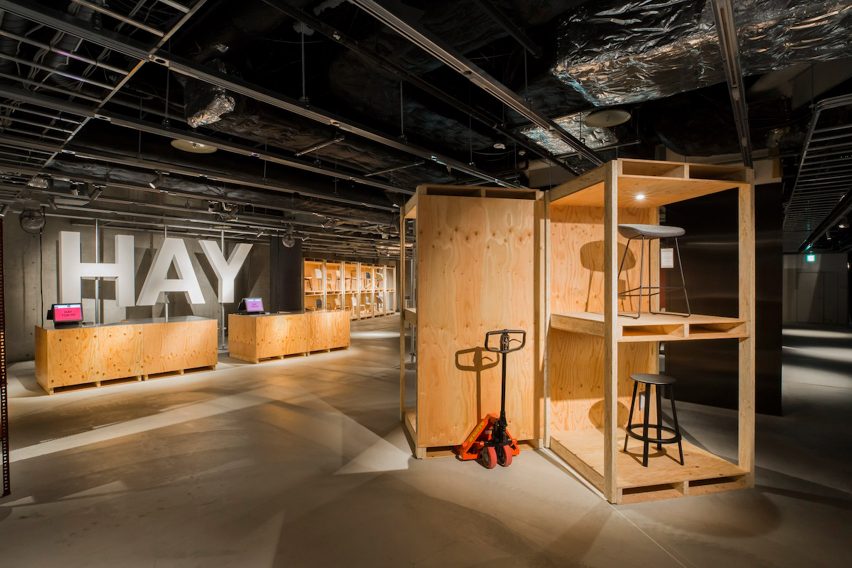
Timber has been used to construct the store's cash register counters and tall storage units that accommodate the brand's different chair models, all of which can be moved around with pallet trolleys.
The studio hopes that this will not only allow staff to easily create different display set-ups for new product collections, but also to reconfigure the space for in-store events.
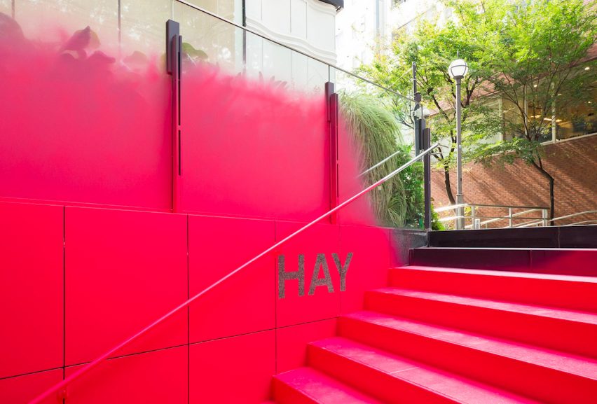
To enter the store, customers must descend down a formerly nondescript staircase that has been painted hot pink.
"Instead of using signs to guide people in Omotesando – a district already overloaded with signs – we decided to draw people's attention by doing something we are not supposed to do in this city: to vividly spray-paint an entire stairway and its existing walls," explained the studio.
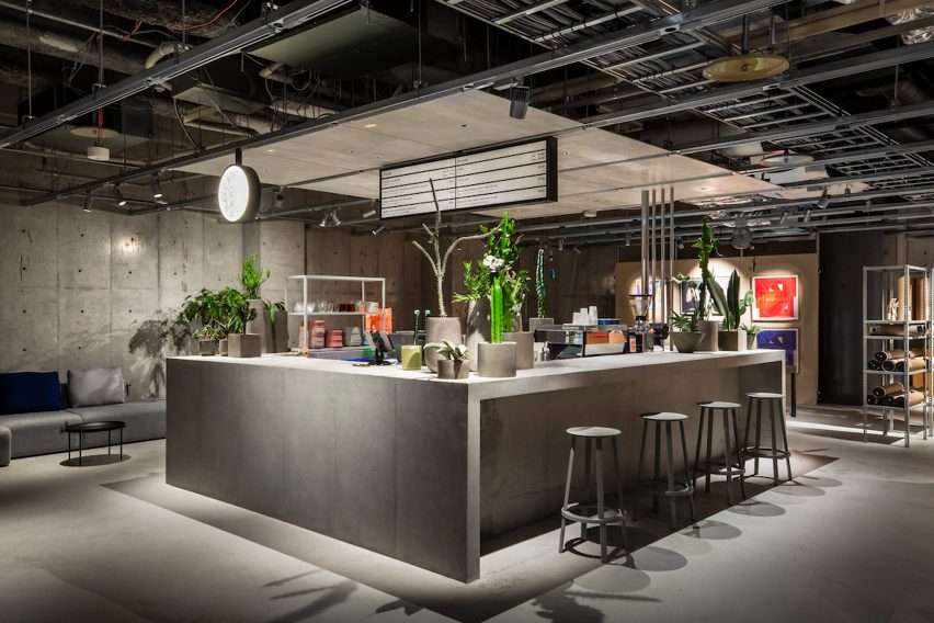
Concrete has also been used to form a small cafe where customers can grab a coffee or snack, which has matching slate-grey stool seats.
At the end of last year, Hay opened their first brick-and-mortar retail space in the US. Situated in Oregon's Pearl District, the store has raw brick walls and wooden ceiling beams that the brand hopes will foster a homey-atmosphere.
Hay's Tokyo branch will remain open until autumn 2019.
Photography is by Masataka Nishi.
Project credits:
Architects: Jo Nagasaka/Schemata Architects
Project team: Toshihisa Aida
Structure: SRC