Studio In2 plays with proportions inside Nancy's Big Apartment in Taipei
Full-height partition walls and tall furnishings exaggerate a sense of space in this apartment in Taipei, which has been revamped by Studio In2.
Nancy's Big Apartment – which is named after its owner – formerly played host to a series of claustrophobic rooms, but now has fixtures and furnishings that help "disrupt the visual proportions and challenge the original sense of space".
Studio In2 were loosely inspired to experiment with dimensions and space distribution inside the apartment after watching Honey, I Shrunk the Kids – a 1989 American comedy film that tells the story of an inventor that accidentally shrinks his family down to the size of a quarter of an inch.
"[The movie] led us to think if we can't make the space bigger, can we make ourselves smaller? If we were shrunk, the same place would feel much bigger. So instead of making everything oversized and crowded, we experimented with the use of large frames," the studio explained to Dezeen.
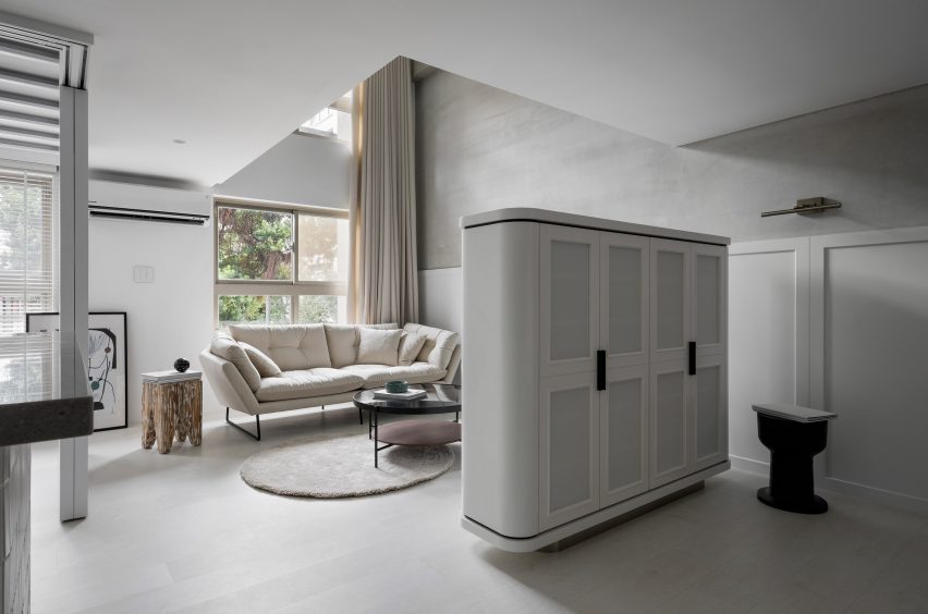
The studio knocked through several non-load bearing walls to open up the apartment's floor plan. Different living zones are instead delineated by slightly oversized elements – a large, curved storage unit divides the entryway from the sitting room.
This area has been completed with an oatmeal-coloured sofa and rug.
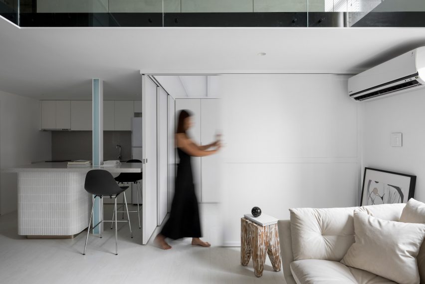
Tall sliding doors have then been installed to obscure a ground floor guest room. They can be slid back to reveal a window, flooding the kitchen and dining area with extra natural light.
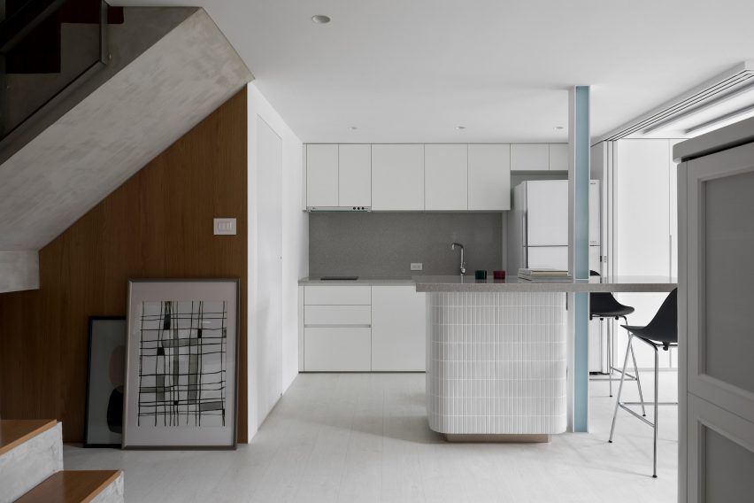
The space can also be illuminated by a structural beam that's fitted with LED lights, which runs through the middle of the breakfast island.
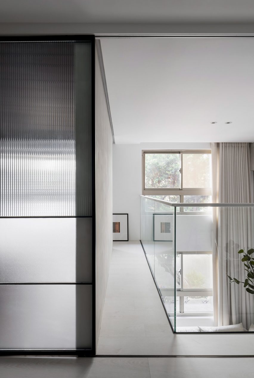
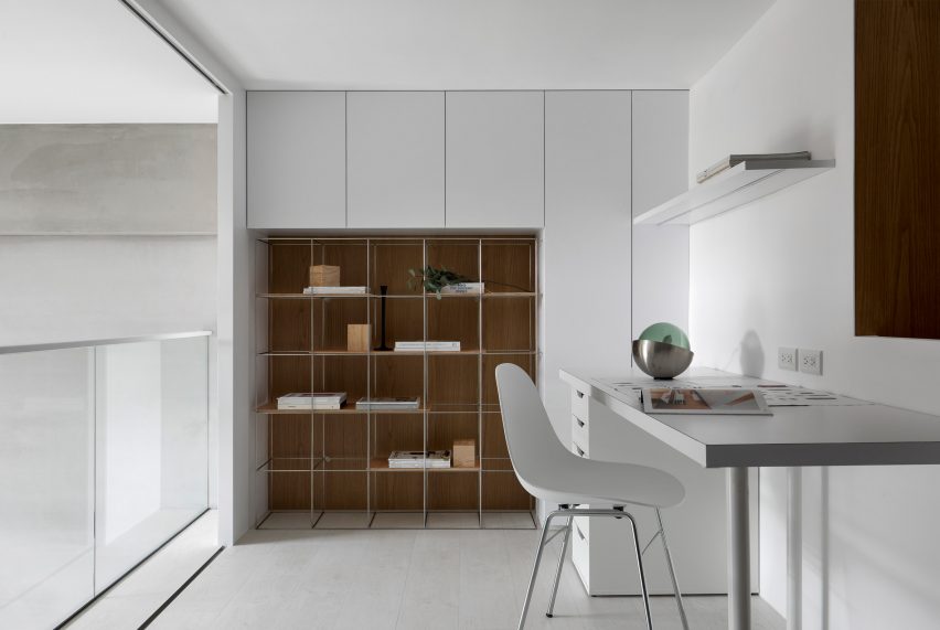
Upstairs on the mezzanine level, a small room has been removed to allow for a short walkway that links the master bedroom to a reading room. Its fronted by a glass balustrade, creating clear sightlines up to the apartment's ceiling.
"The height of the space does not evoke a sense of pressure, but rather creates a comfortable and open spatial experience," said the studio.
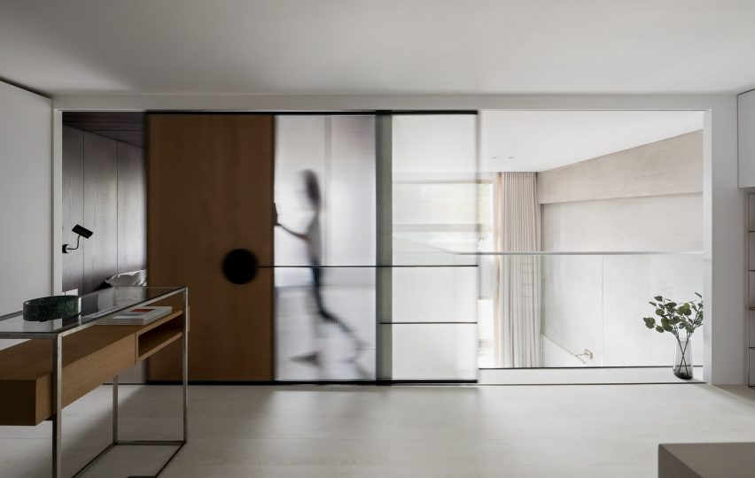
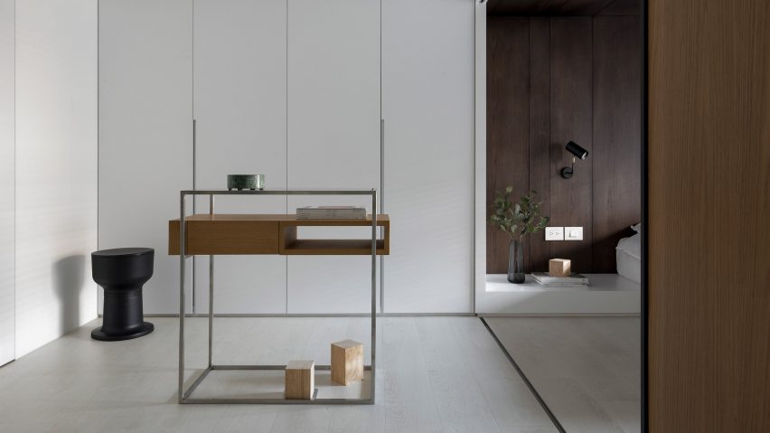
While Studio In2 has tried to brighten the rest of the apartment by painting surfaces white, the ceiling and rear wall of the bedroom have been lined in dark wood to give a cosier feel. A panel of fluted glass can also be moved across to close off the bedroom from an adjacent dressing area.
"The design idea of using one big sliding door for the limited ceiling height of the mezzanine space is also inspired by 16:9 movie format – the width creates a big, dreamy view, just like watching a film," added the studio.
This isn't the only Taipei apartment that plays with proportion – A Little Design recently converted a 17.6 square-metre piano studio in the city into a micro flat, complete with space-saving furniture.
Photography is by Jackal Liu.