Old stone contrasts with polished brass inside En skincare store in Paris by Archiee
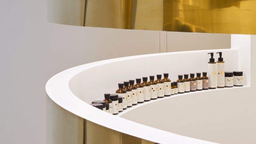
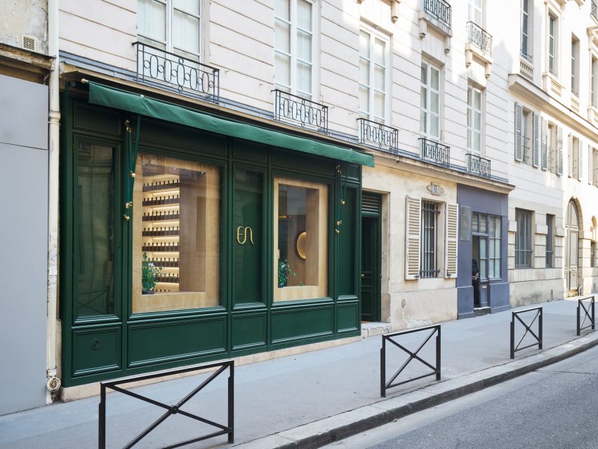
Curving brass partitions and vaulted stone ceilings both feature inside this Japanese beauty store in Paris, designed by local architecture firm Archiee.
Designed for new Japanese cosmetics brand En, the 150-square-metre store occupies the ground floor and basement of an 18th-century building in the centre of the French capital. It is the brand's first physical shop.
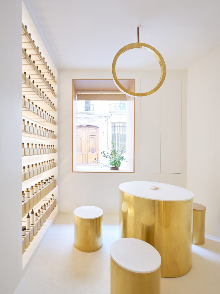
En's unique selling point is that customers are able to create customised skincare products by mixing their choice of the brand's some 100 "essences", which include organic plant extracts, rock salts and tea-leaf powders.
The name "En" translates as "beauty" in Japanese, but can also mean "circle" and "connection". These three translations all inspired the design of the store.
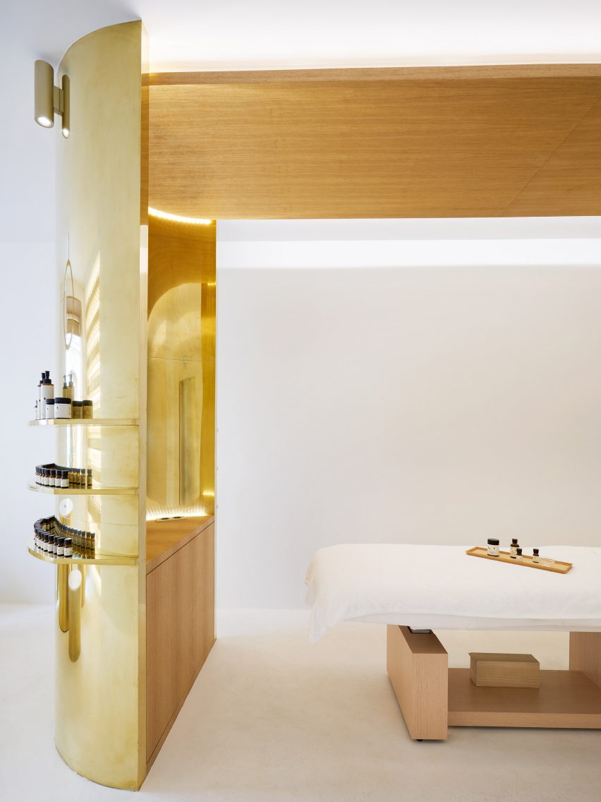
The store is divided into four main rooms. On the ground floor are two bright minimal spaces, furnished with curving brass partitions and furniture. Meanwhile the basement reveals the building's history, with exposed stone walls and a vaulted ceiling.
Archiee – a studio led by Japanese architects Yusuke Kinoshita and Daisuke Sekine – has added brass elements in different ways in each of the four spaces. Upstairs, they form curved partitions that frame semi-circular spaces, while downstairs they create details for lighting and furniture.
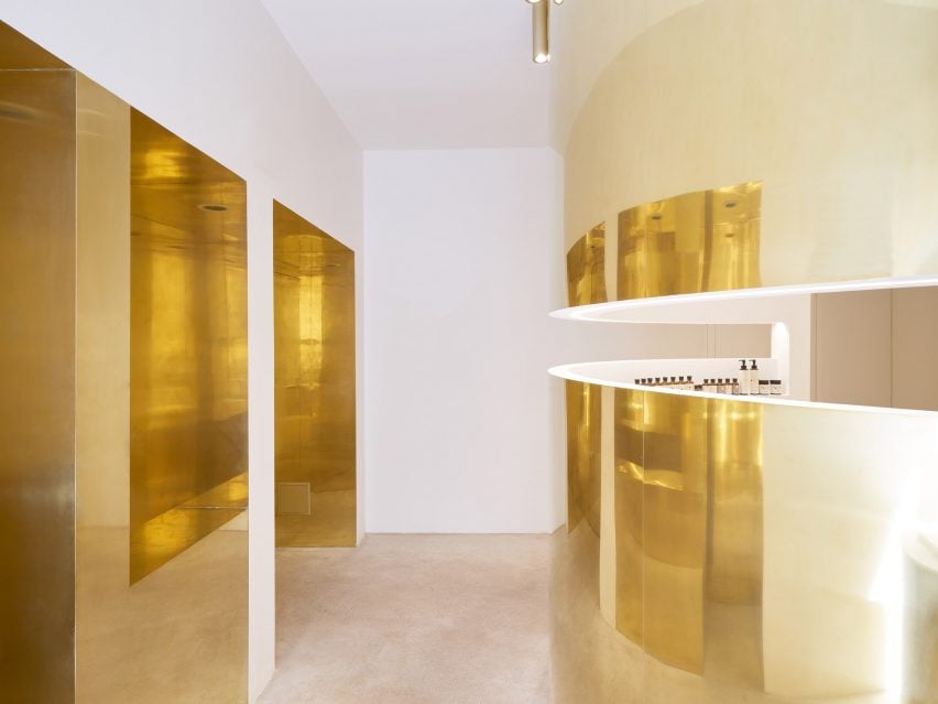
The first room that customers arrive at is an entrance space that contains an enclosed boutique where products are displayed.
The second room contains the counselling and treatment space, the third contains a "hall" and two enclosed massage spaces, while a product gallery and the small circular blending counter are in the fourth space.
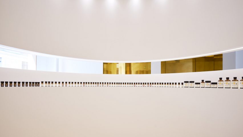
"The external surfaces of the circle partitions are finished in polished brass to bring a distorted and warm reflection," explained the architects.
"This beautiful expanded space creates the feeling for the visitor step into an elegant and extraordinary world."
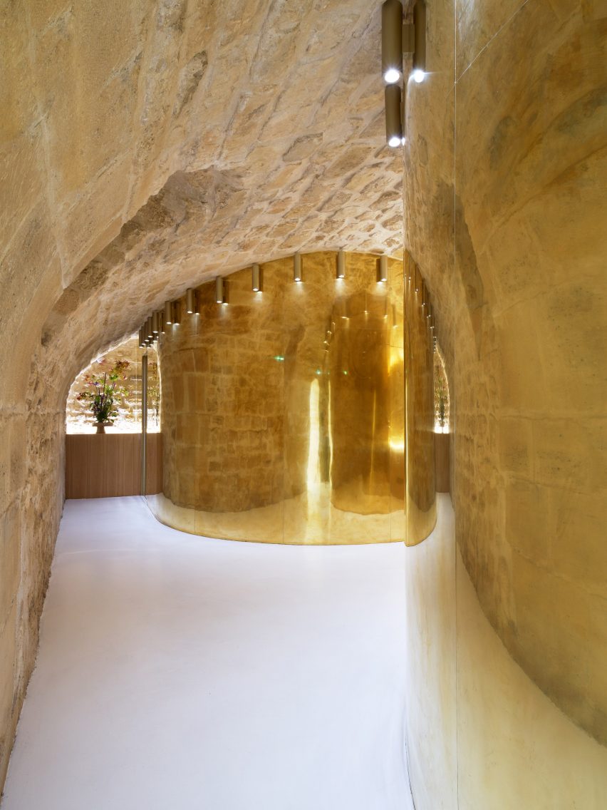
"All of the partitions are composed in circle forms to create soft rounded internal spaces, which are suitable for private uses such as counselling, treatment, massage and essence blending," the architects explained. "The internal surfaces of the circle spaces are finished in white to express a pure space."
The area outside of the partitions serves as a connecting pathway that guides customers through the store.
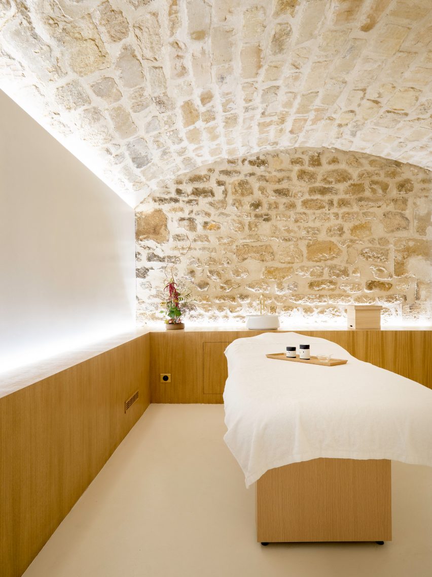
"This remaining space between the existing walls and the integrated circle partitions creates a geometrically curious form and an original circulation with an aesthetical experience," said the architects.
"The customer cannot get into each service rooms directly, but must walk along a winding path toward the destination. This method that let the visitors walk along and enhance his expectation is typical Japanese way of hospitality, as in the traditional tea culture."
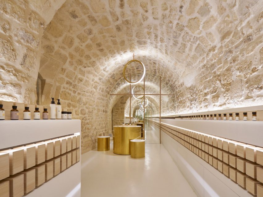
In the store's long stone-vaulted hall space in the basement, products are displayed along either side on shallow backlit shelves.
Below the shelves, the bottles are stored in boxes made from Japanese paulownia wood recalling wine bottles in a cellar. A mirror at either end of the hall gives the illusion of an elongated space.
"The impressive point of this brand is to exhibit all its products," explained the architects. "This reminds the excitement in a wine cellar. The display of products is inspired by the method of storage of French wineries. Each bottle is displayed separately with special lighting."
Other projects by the Parisian studio include a souvenir shop where all the products are simply hung from key rings fixed to the undulating walls in vertical or diagonal rows.
Photography is by David Foessel.