Ste Marie evokes "old-world Italian charm" in Vancouver's Caffè La Tana
The owners of this weathered and cosy Italian cafe in Vancouver, designed by local studio Ste Marie, imagine it as a den for their pet fox.
Caffè La Tana is a dimly lit restaurant with muted green interiors in Vancouver's Little Italy neighbourhood.
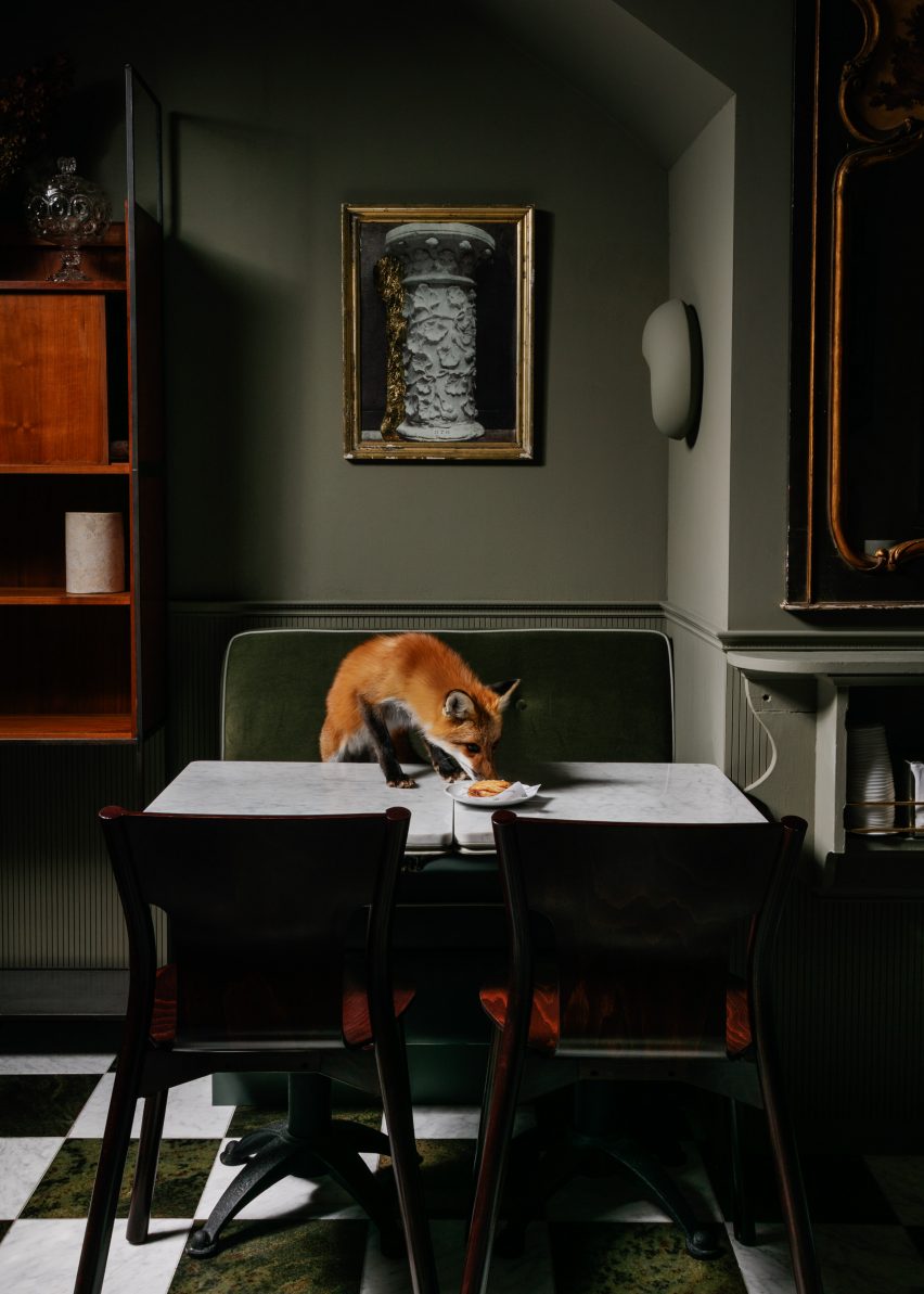
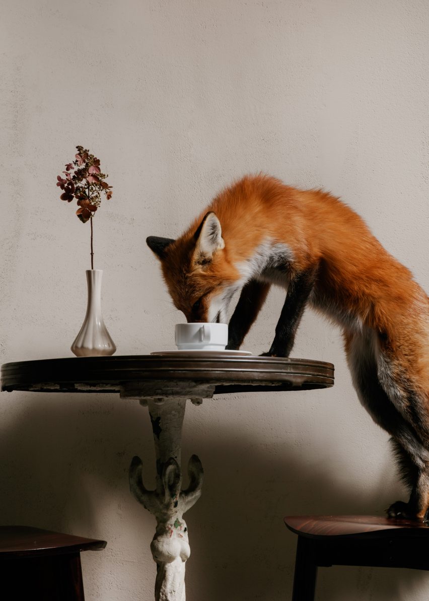
The cafe's name La Tana loosely translates from Italian to "the den". Aspects of the interiors were chosen as if they could be the home of the restaurant owner's beloved fox, Savio, which also informed another restaurant designed by Ste Marie in the city.
"The idea for the name was a play on the name of our other restaurant: Savio Volpe – La Tana being the idea that it's the Cantina of our cunning fox where he keeps his treasures," said co-owner Craig Stanghetta, who worked closely with his colleagues Carmen Cheung and Kate Richard at Ste Marie to design the space.
Ste Marie has a department that focuses solely on positioning, narrative and concept development. For Caffè La Tana, the aim was to evoke the delight of bustling cafes in Italy – a concept that Stanghetta said he had been wanting to do for a long time.
The team also portrayed a fox foraging around the cafe in the project photography.
"I wanted a place that would bring me back to my favourite memories of travelling in Italy with my family and happening upon a tiny hole in the wall that turns out to be warm, welcoming and special," Stanghetta said.
"Our vision was to create a space that encapsulated the grocers and cafes in Italy during the 19th century, having that old-world Italian charm when you walked through its doors and imbuing a sense of familiarity, charm and comfort," added Cheung.
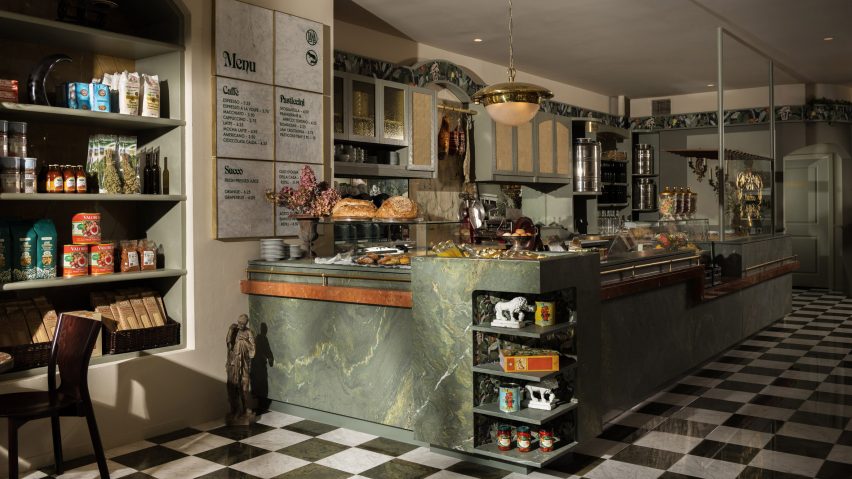
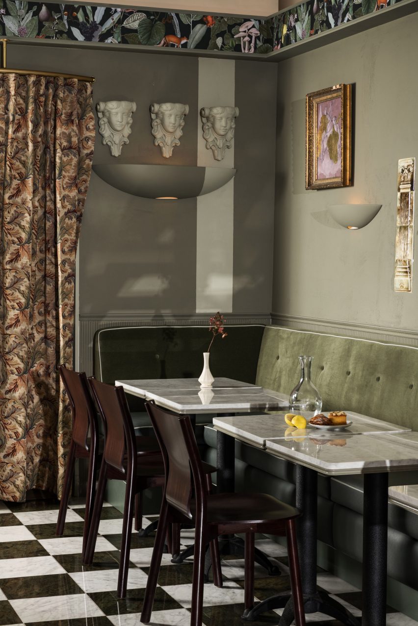
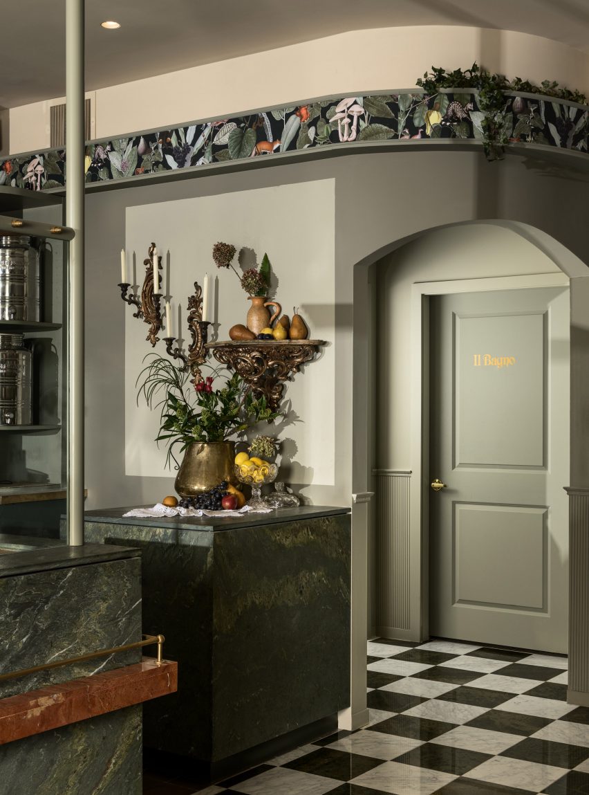
The eatery is wrapped with sage green walls and matching banquette seating. There are also slabs of dark green marble and black-and-white chequerboard tile flooring.
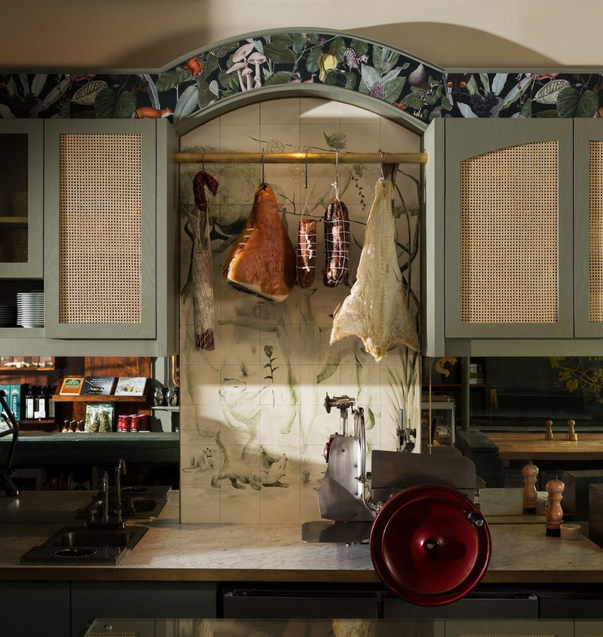
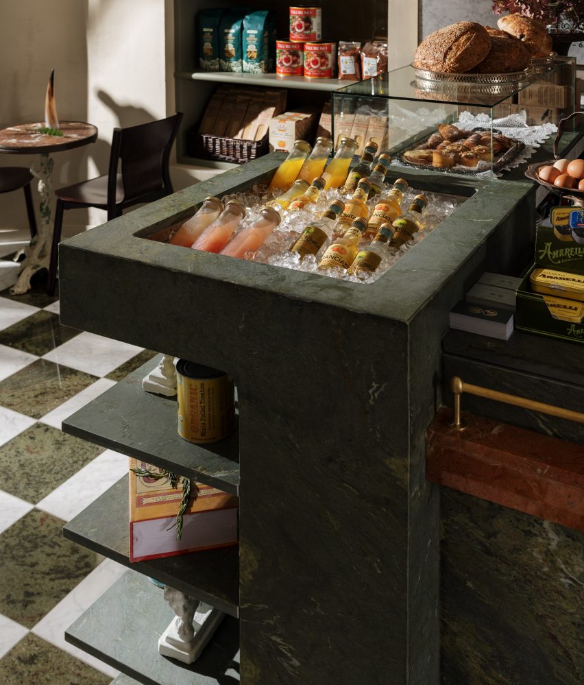
"Stone, marble and painted wood were used thoughtfully in order to set the framework and shape the interior forms, allowing them to almost feel sculpted from a common block of material or colour," said Ste Marie.
Much like Italian precedents, the hub of the eatery is provided by a bar that acts as a check-out counter and space for preparing fresh pasta. The station features a glass front and wooden dowels.
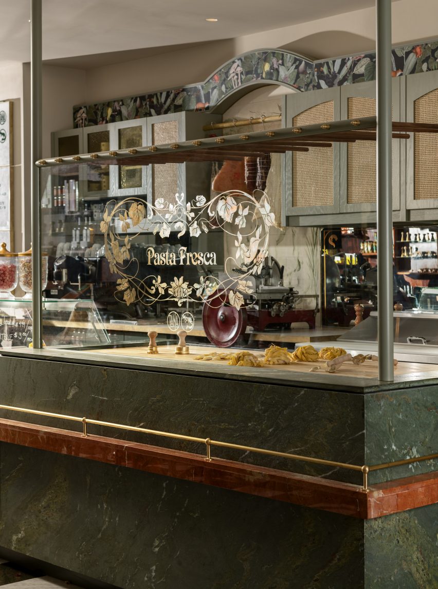
Green marble with yellow grains covers the bar, with other subtle hints of orange around the cafe for contrast. Nearby are shelves storing Italian goods, with seating nooks integrated throughout.
Nods to the weathered elements of traditional Italian eateries are provided by antique shelving, custom woodwork, moulding, and plasterwork with ornate rosettes and wall mount sculptural elements.
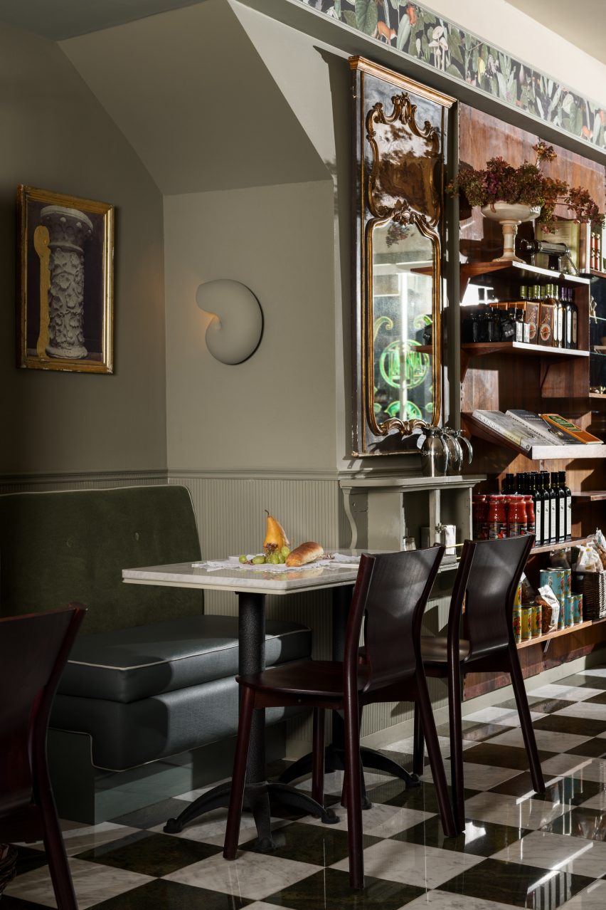
On the walls is Italian art sourced from the New York Public Library. The pieces are arranged in 16 separate frames as a homage to the work of architect and photographer Carlo Mollino, and his 1945 Casa M2 Photo Panel.
Finishing off the eatery is a collection of antiques: a brass pendant fixture designed by Luigi Caccia Dominioni in 1965, a 60-year-old map of the Venice trading routes, and a late 19th-century mirror.
Ste Marie has designed a handful of other restaurants in Vancouver, including a floral-inspired eatery The Botanist and an Italian cafe Savio Volpe – named after the owner's pet fox – with creamy and light wood elements.
Photography is by Conrad Brown unless stated otherwise.
Project credits:
Creative director: Craig Stanghetta
Design lead: Carmen Chung
Brand and graphic design: Glasfurd & Walker
Art direction and styling: Kate Richard with Conrad Brown, Glasfurd and Walker with Ian Lanterman
Custom painted tile mural: James Daviduk
Custom artwork: Kate Richard for Ste.Marie
Antiques and objects: Scott Landon
Hand-painting and gold leaf work: Seen Signs
Construction: Chris Lloyd Contracting