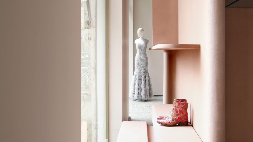
Design studio Marcante-Testa used pink clay partitions, copper pipes, and panels of plexiglass to form an "architectural landscape" inside this Milan fashion store.
Formerly host to characterless white surfaces and concrete shelves, Imarika has been redesigned by Turin-based design studio Marcante-Testa to feature bold display fixtures that have "an architectural element and a clear functional identity".
"We received a brief that focused on functions and needs that related to the shop's activity, not visuals or style," the studio's founders, Andrea Marcante and Adelaide Testa, told Dezeen.
"The expression and consideration of material do not interfere with the architectural shell, but instead create an architectural landscape."
The boutique is situated in Milan's Porta Venezia district and over the past 30 years has become a go-to spot for womenswear, recognised for its extensive selection of pieces from emerging fashion designers.
Marcante-Testa has loosely divided the 180 square-metre store with a dusty-pink partition made from clay.
A grooved sideboard made from the same material rests at the bottom, where small accessories can be displayed.
It's joined by a bench that has a peachy velvet seat cushion built in at the end, offering customers a place to sit and comfortably try on shoes.
Plexiglass ledges that appear throughout the space are supported by slim copper poles intermittently wrapped in red cord – their verticality is meant to draw attention upwards to the plaster ceiling, which is bordered by an undulating pattern.
"It turns the ceiling into a sort of upside-down carpet," explained the studio.
The pipes and partitions in the store are also loosely inspired by the aesthetic of retail spaces created in the 1950s for Italian typewriter manufacturer Olivetti, which featured arced display units and floor-to-ceiling timber beams that propped up shelves.
Glossy white laminate and pink-coloured briar wood have then been used to form a handful of hexagonal display plinths and the store's cash register counter.
Pastel shades like butter yellow and sky blue have been applied to the peripheral walls, contrasting against grey marble floors which the studio preserved from the store's original fit-out. Pale green clay also forms the changing room block.
Similar to Marcante-Testa, Studio David Thulstrup employed glass brick partitions and parchment-hued panels to create a "perfect framework" for designer Mark Kenly Domino Tan's minimalist clothing collections. The store, which is in Copenhagen, also features chunky birch veneer display tables and freestanding metal rails.
Photography is by Carola Ripamonti.
Project credits:
Project designers: Andrea Marcante, Adelaide Testa
Collaborators: Alessia Castelli, Giada Mazzero, Aga Slusarczyk
General contractor: Ghibli Solutions
Mechanical services: PGS Ingegneria

