Bernard Dubois channels childhood memories into Aesop interior in Brussels
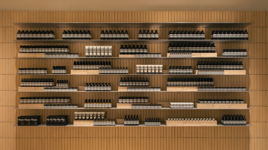
Distinctive yellow Belgian bricks of the 1930s and 1960s are reinterpreted in this store designed by architect Bernard Dubois for skincare brand Aesop.
The new Aesop store on Brussels' Rue de Namur occupies the street level of a six-storey building, and features an interior covered in yellow bricks, complemented by brushed aluminium surfaces.
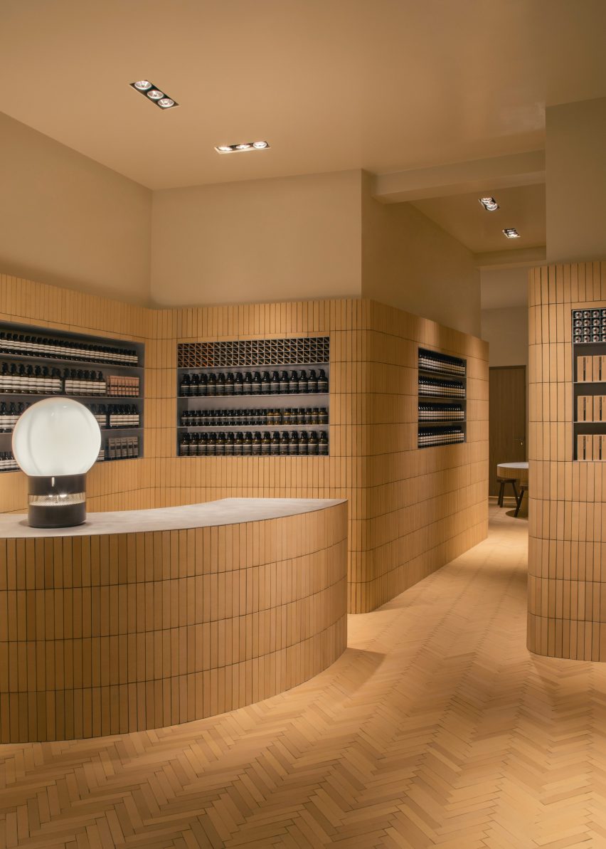
The yellow bricks are a direct reference to the distinctive brickwork used in buildings across Belgium in the 1930s and again during the post-war period. But rather than laying them horizontally, architect Bernard Dubois chose to arrange them vertically.
"I think most Belgians have a really familiar feeling with this yellow brick," Dubois told Dezeen.
"Wherever they see it it makes them feel at home because it reminds them of childhood holidays on the rainy North Sea. But these bricks can be very beautiful and no one has used them for the last 30 years."
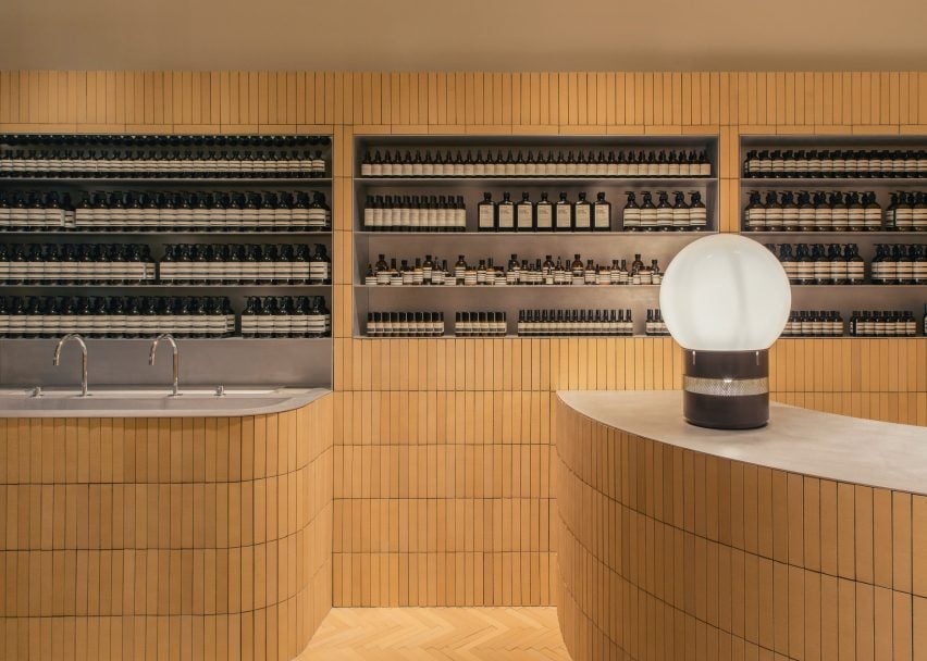
In their original use, vertically laid bricks were used for the lintels of the buildings to help navigate curves. Dubois' interior features a curved sink unit and counter, so the vertical arrangement allowed the brick to follow the shape of the design.
The architect reversed this pattern to mark out the top of each shelving recess. The pattern is changed again to create a parquet effect on the floor.
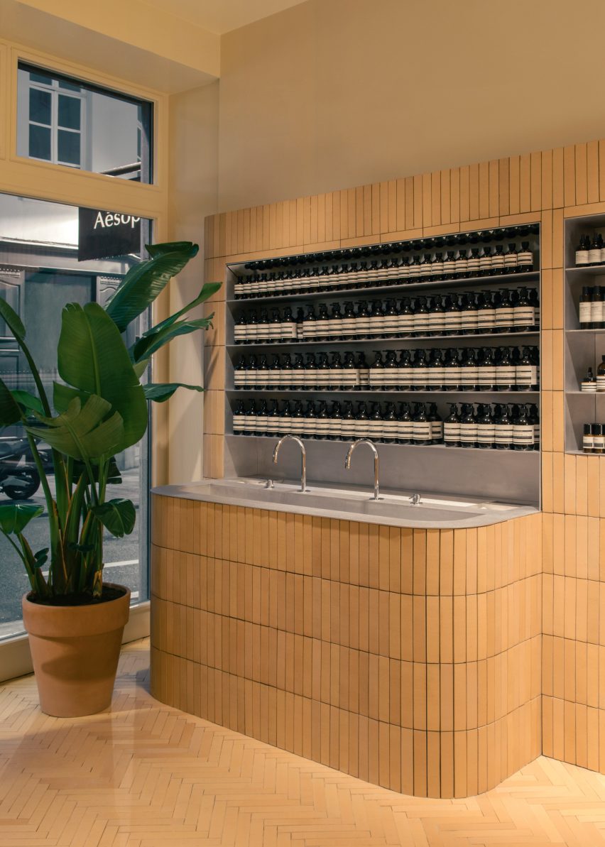
"It's a whole game of using very familiar architecture, but using this the other way around to make an interior out of something that would usually be on the exterior," explained the architect, who added that the vertical arrangement was also a reference to holiday homes in warmer climates.
"Just by switching the direction of it, we give an almost tropical feeling to this extremely Belgian, North Sea, grey context," he said.
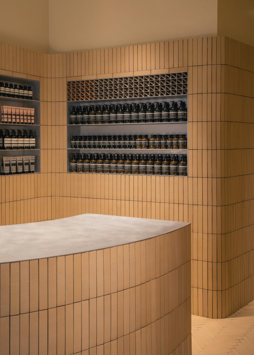
The bricks are no longer manufactured in the narrow briquette form that Dubois needed to make them fit exactly within the interior.
A manufacturer quoted eight weeks to make them, but this would have exceeded the timeframe for the entire project, so the construction company that was building the project cut standard bricks to size individually. Dubois described the approach as obsessive.
"It was a really technical thing," he said. "The bricks start on the left wall and then they continue to the back. That is a finite number of bricks. So it was all designed in an extremely precise way in order that we should not cut a single brick."
The front portion of the store contains the double sink, payment counter and recessed shelves for Aesop's products.
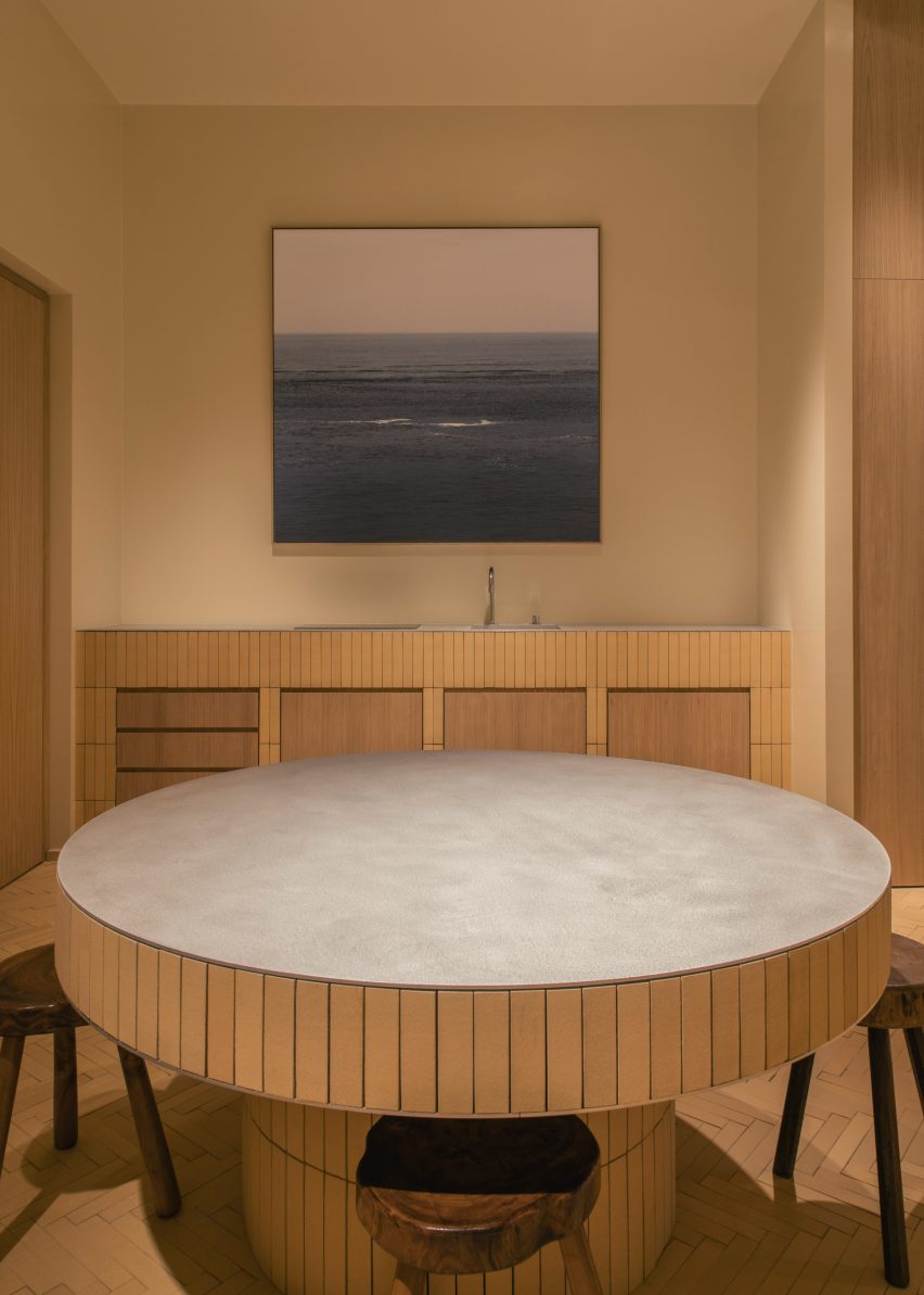
A narrow corridor leads to an additional space at the back, with a kitchen, washroom, storage made from oak and wooden seating for staff and customers.
The ceiling of the store is painted with a shiny gloss – a nod to the shiny paint often used in the bathrooms of typical Belgian holiday homes in the 1960s and 1970s.
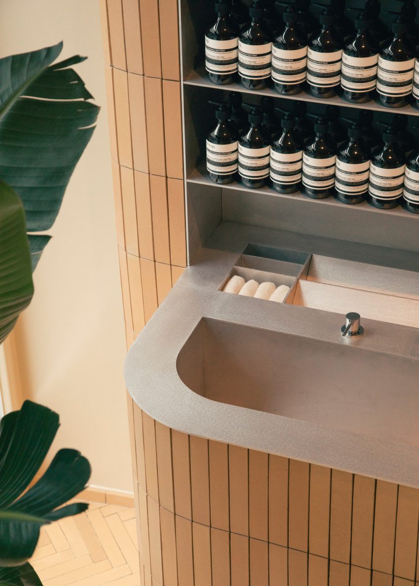
The brushed aluminium surfaces are a reference to original fittings from these Modern houses as well as tables by Belgian design icon Maarten van Severen.
"It's a lot of little references to things we like and that we feel are very local somehow," said the architect. "[The references] wouldn't make any sense to someone who is not particularly familiar with it, but when put together they make [a different kind of] sense."
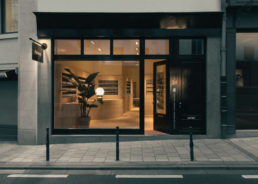
Aesop is known for its approach to store design, with no two branches the same. It regularly works with local architects and designers to create its interiors.
Recent examples include the Bath store by James Plumb, which references stone-fronted buildings and Roald Dahl stories, and a branch in Montreal by Alain Carle Architecte that uses green suede and brass details.
"There is a brief, which is very precise about the functionality of it, the amount of products, the sizes, the way the cashier works, the perfume dispenser, etc," explained Dubois. "But design-wise it's carte blanche, so that's very interesting."
Dubois initially studied photography, before turning his attention to architecture. After a period working with OMA, he opened his own studio, with his early projects including co-curating the Belgian pavilion at the 2014 Venice Architecture Biennale.